Planner-izing and Realizing
September 12, 2025
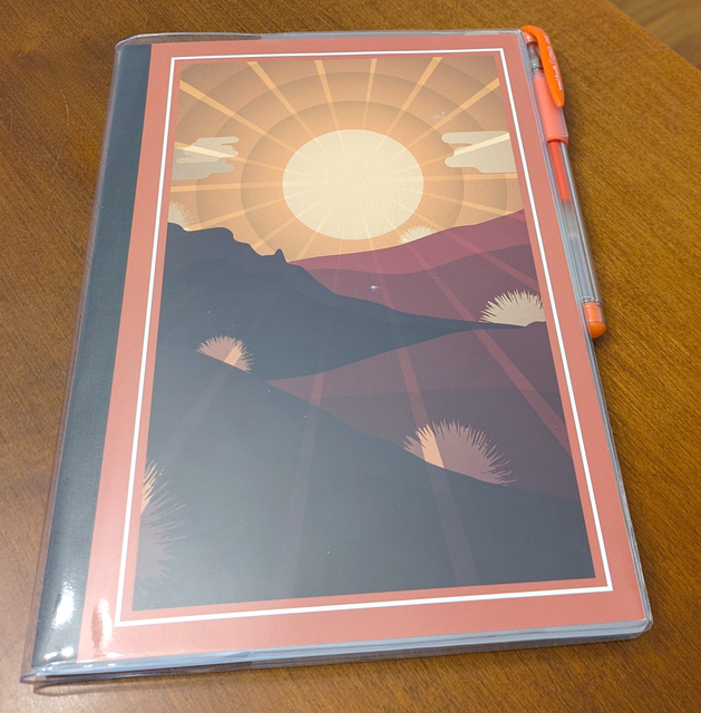 For the last four years I’ve used Agendio planners at work. You can pick & choose from different pages, components, and layouts to customize the
Home Front — August Notes #2
August 29, 2025
For the last four years I’ve used Agendio planners at work. You can pick & choose from different pages, components, and layouts to customize the
Home Front — August Notes #2
August 29, 2025
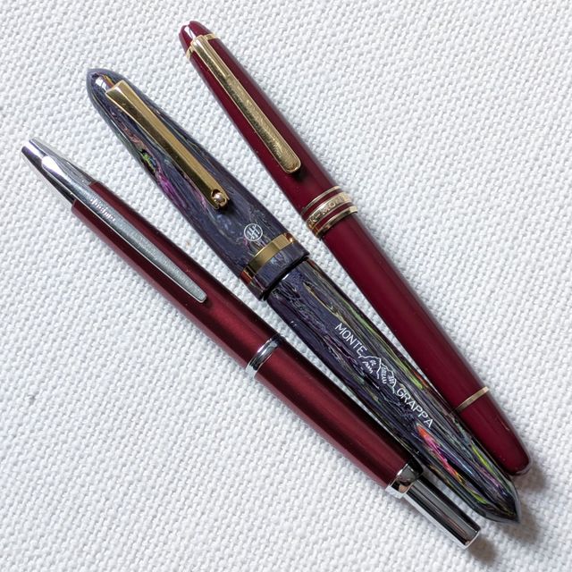
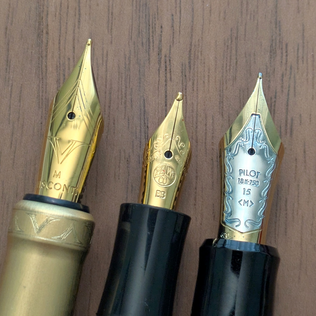 A few weeks ago, we saw work pens. This time it’s a look at pens that do most of the writing at home. These have all been excellent writers and a
Prime Number of Notebooks
August 18, 2025
A few weeks ago, we saw work pens. This time it’s a look at pens that do most of the writing at home. These have all been excellent writers and a
Prime Number of Notebooks
August 18, 2025
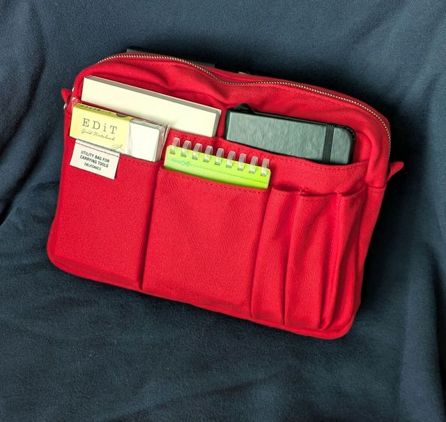 We’ve all tried to play clowns in a Volkswagen with the stuff we accumulate in this hobby. How many pens actually fit in this 6 pen case? How many
Pen at Work — August Notes #1
August 15, 2025
We’ve all tried to play clowns in a Volkswagen with the stuff we accumulate in this hobby. How many pens actually fit in this 6 pen case? How many
Pen at Work — August Notes #1
August 15, 2025
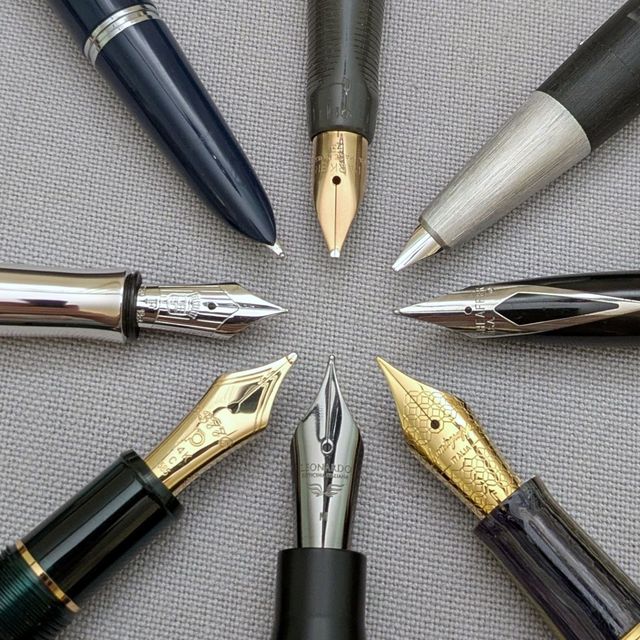
 Am I making this reference? Or am I making that reference? I don’t think you go wrong either way. The other option is I just show the pens I’ve used
Chopping Block
August 8, 2025
Am I making this reference? Or am I making that reference? I don’t think you go wrong either way. The other option is I just show the pens I’ve used
Chopping Block
August 8, 2025
 After sending about a dozen pens out the door in January, I’ve got another group lined up to have their fates decided. These aren’t as easy to say
My Visconti Returns. My Kaweco Sport…Not so Much
July 28, 2025
After sending about a dozen pens out the door in January, I’ve got another group lined up to have their fates decided. These aren’t as easy to say
My Visconti Returns. My Kaweco Sport…Not so Much
July 28, 2025
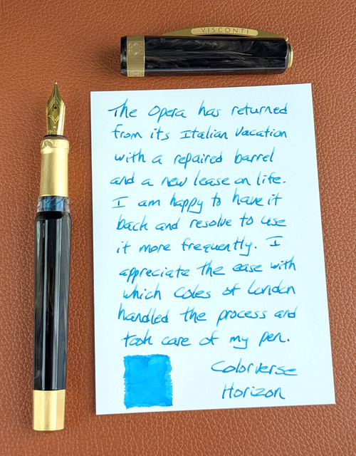 Updates on two pens that were (or remain) out of action. Three months ago, I found my Visconti Opera Gold had a cracked barrel. And now… In other
Pictures of Words — July Notes
July 7, 2025
Updates on two pens that were (or remain) out of action. Three months ago, I found my Visconti Opera Gold had a cracked barrel. And now… In other
Pictures of Words — July Notes
July 7, 2025
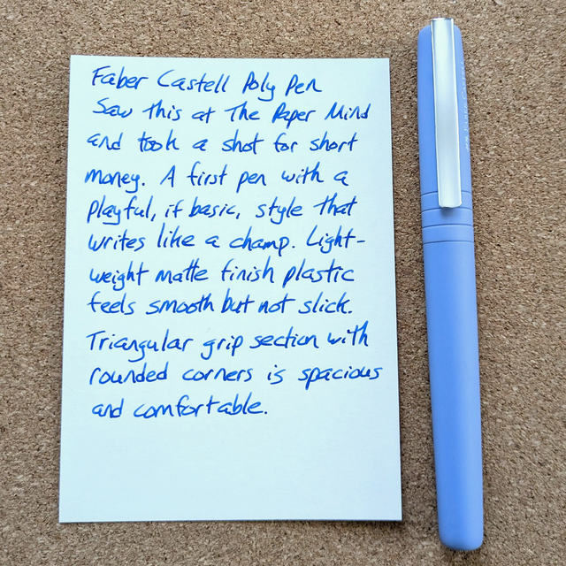
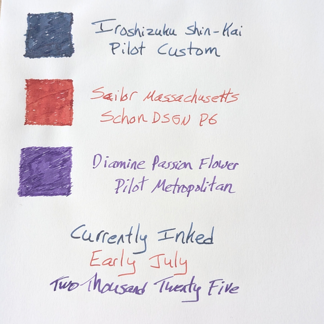 A slight change of format this time around. Rather than type out the notes for the currently inked pens I decided to write a few sentences with each
Maybe It’s Not Coming Back
June 30, 2025
A slight change of format this time around. Rather than type out the notes for the currently inked pens I decided to write a few sentences with each
Maybe It’s Not Coming Back
June 30, 2025
 At the beginning of this year, I sent a pen to a nibmeister for a custom grind. There was no estimated timeframe but I figured 3-4 months was
(un)Plans: May & June Notes
June 15, 2025
At the beginning of this year, I sent a pen to a nibmeister for a custom grind. There was no estimated timeframe but I figured 3-4 months was
(un)Plans: May & June Notes
June 15, 2025
 This June marks completion of my second year writing here. To anyone who reads, I appreciate your time and interest. May’s pens were the Montblanc
Play It as It Lies
May 26, 2025
This June marks completion of my second year writing here. To anyone who reads, I appreciate your time and interest. May’s pens were the Montblanc
Play It as It Lies
May 26, 2025
 2025 has been a different year for my writing, a/k/a “using my stuff.” 2024 made use of The Daily Stoic as a base camp for writing. It worked better
Next page
 |||
|||