What’s What 12/30/24
December 30, 2024
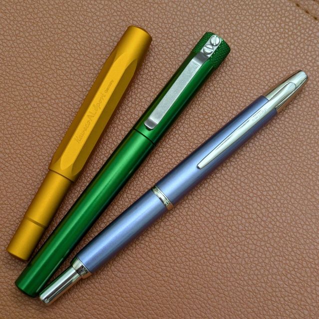 Inked Right Now Kaweco AL Sport with Kaweco Black Pearl Karas Fountain K with J. Herbin Lie de Thé Pilot Decimo with Teranishi Night Time
2024 Journal Recap
December 16, 2024
Inked Right Now Kaweco AL Sport with Kaweco Black Pearl Karas Fountain K with J. Herbin Lie de Thé Pilot Decimo with Teranishi Night Time
2024 Journal Recap
December 16, 2024
 At the end of 2023 I was given The Daily Stoic, a book by Ryan Holiday that presents a passage per day from ancient Stoic thinkers. I chose to start
Year End Pens: December Blues
December 2, 2024
At the end of 2023 I was given The Daily Stoic, a book by Ryan Holiday that presents a passage per day from ancient Stoic thinkers. I chose to start
Year End Pens: December Blues
December 2, 2024
 As November wound down, my main work pen (Parker 45) and daily journal pen (also a 45) ran low on ink. I had two other pens going — a Sailor that
What’s What 11/23/24
November 23, 2024
As November wound down, my main work pen (Parker 45) and daily journal pen (also a 45) ran low on ink. I had two other pens going — a Sailor that
What’s What 11/23/24
November 23, 2024
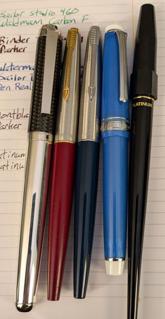 Just a quick update as days get shorter and busy gets busier. Inked Right Now Waldmann Cabon F with Sailor Studio 460 Parker 45 with Binder
What’s What 11/4/24
November 4, 2024
Just a quick update as days get shorter and busy gets busier. Inked Right Now Waldmann Cabon F with Sailor Studio 460 Parker 45 with Binder
What’s What 11/4/24
November 4, 2024
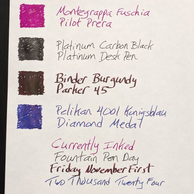 Pentel show & tell and it’s that time of year. Inked Right Now Pilot Prera with Montegrappa Fuchsia Platinum Desk Pen with Platinum Carbon Black
Identifying as a Pencil Pusher
October 20, 2024
Pentel show & tell and it’s that time of year. Inked Right Now Pilot Prera with Montegrappa Fuchsia Platinum Desk Pen with Platinum Carbon Black
Identifying as a Pencil Pusher
October 20, 2024
 Recently on the Pen Addict Podcast, Brad Dowdy ranked his top 10 mechanical pencils. I was intrigued by some of his choices and a few rang out as
What’s What 10/4/24
October 4, 2024
Recently on the Pen Addict Podcast, Brad Dowdy ranked his top 10 mechanical pencils. I was intrigued by some of his choices and a few rang out as
What’s What 10/4/24
October 4, 2024
 Back to normal-ish, journaling small & steady, could have called it Inked Right Now Pilot Murex with Sailor Nadeshiko Sheaffer Balance with Herbin
What’s What 9/19/24
September 19, 2024
Back to normal-ish, journaling small & steady, could have called it Inked Right Now Pilot Murex with Sailor Nadeshiko Sheaffer Balance with Herbin
What’s What 9/19/24
September 19, 2024
 Many pens, fewer notebooks. Lamy 2000 with Sailor Massachusetts Esterbrook J with Diamine Oxblood Pilot Decimo with J. Herbin Lierre Sauvage
2024 Commonwealth Pen Show Notes
September 16, 2024
Many pens, fewer notebooks. Lamy 2000 with Sailor Massachusetts Esterbrook J with Diamine Oxblood Pilot Decimo with J. Herbin Lierre Sauvage
2024 Commonwealth Pen Show Notes
September 16, 2024
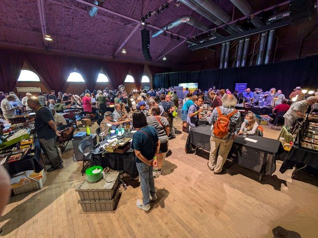 I attended the 2024 Commonwealth Pen Show in Somerville, MA this past weekend. It was a two day show with hours of 10am-5:30pm Saturday and 9am-3pm
Pen Show Shopping List
September 13, 2024
This weekend sees the return of the Commonwealth Pen Show just outside Boston after it was canceled last year due to an issue on the part of the
Next page
I attended the 2024 Commonwealth Pen Show in Somerville, MA this past weekend. It was a two day show with hours of 10am-5:30pm Saturday and 9am-3pm
Pen Show Shopping List
September 13, 2024
This weekend sees the return of the Commonwealth Pen Show just outside Boston after it was canceled last year due to an issue on the part of the
Next page
 |||
|||