Nib Work by Kirk Speer (Pen Realm)
May 19, 2025
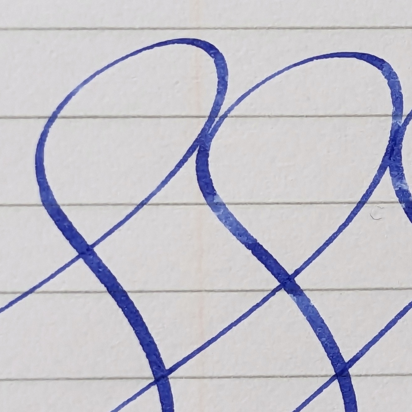
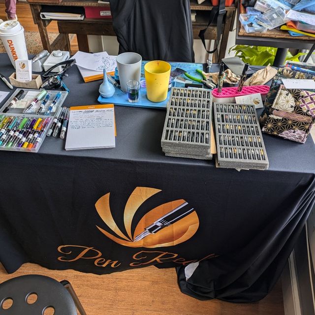 In April I had the pleasure of meeting Kirk Speer during his stop at The Paper Mouse in Newton, MA. I had two pens with me, a Montblanc 144 and a
Ouch — Discovering A Damaged Pen
May 5, 2025
In April I had the pleasure of meeting Kirk Speer during his stop at The Paper Mouse in Newton, MA. I had two pens with me, a Montblanc 144 and a
Ouch — Discovering A Damaged Pen
May 5, 2025
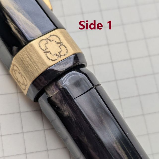 A week and a half ago I was planning a visit to a local pen shop where Kirk Speer was griding nibs. I looked over several pens to pick which one to
April Notes: Currently Inked and What About That
Journaling?
April 27, 2025
A week and a half ago I was planning a visit to a local pen shop where Kirk Speer was griding nibs. I looked over several pens to pick which one to
April Notes: Currently Inked and What About That
Journaling?
April 27, 2025
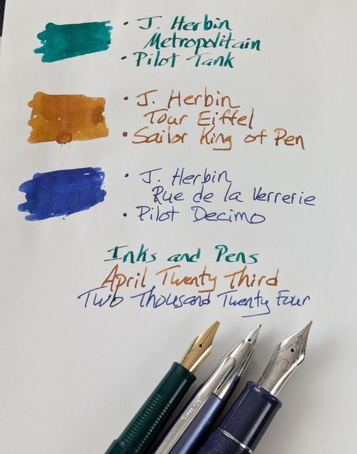 This month’s pens are all using J. Herbin inks from the Colors of Paris set. I was browsing Ink Flights at InkJournal and there were some of these
Lacking Pictures (fixed)
April 23, 2025
I was planning to have new content today but, for some reason, no images are loading in my post. Going back though previous posts shows the same
March Notes: Best Perspective & Gold in the
Gray
March 19, 2025
This month’s pens are all using J. Herbin inks from the Colors of Paris set. I was browsing Ink Flights at InkJournal and there were some of these
Lacking Pictures (fixed)
April 23, 2025
I was planning to have new content today but, for some reason, no images are loading in my post. Going back though previous posts shows the same
March Notes: Best Perspective & Gold in the
Gray
March 19, 2025
 March is perhaps the most up and down month for weather here. It’s not out of the woods for winter’s cold and snow; yet a day or two of 60 degrees
What Works: Pocket Notebooks
February 24, 2025
March is perhaps the most up and down month for weather here. It’s not out of the woods for winter’s cold and snow; yet a day or two of 60 degrees
What Works: Pocket Notebooks
February 24, 2025
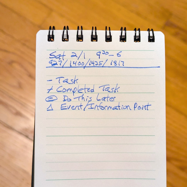 Through nearly 10 years at my current job in the grocery business, there have been a lot of different pocket notebooks. Their primary function is to
New Series Idea: What Works
February 18, 2025
The idea for What Works is to talk about different items in the context of how I use them at work. I won’t tell you exactly how many consultant
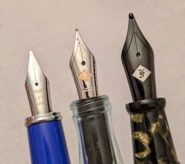
February Notes: New Nibs, Pen Departures
February 7, 2025
Through nearly 10 years at my current job in the grocery business, there have been a lot of different pocket notebooks. Their primary function is to
New Series Idea: What Works
February 18, 2025
The idea for What Works is to talk about different items in the context of how I use them at work. I won’t tell you exactly how many consultant
February Notes: New Nibs, Pen Departures
February 7, 2025
 Inked Right Now Pilot Prera with Colorverse Morning Star Franklin-Christoph 65 with Iroshizuku Yama-guri Edison Brockton with Franklin-Christoph
The Bye-Bye List
January 27, 2025
Inked Right Now Pilot Prera with Colorverse Morning Star Franklin-Christoph 65 with Iroshizuku Yama-guri Edison Brockton with Franklin-Christoph
The Bye-Bye List
January 27, 2025
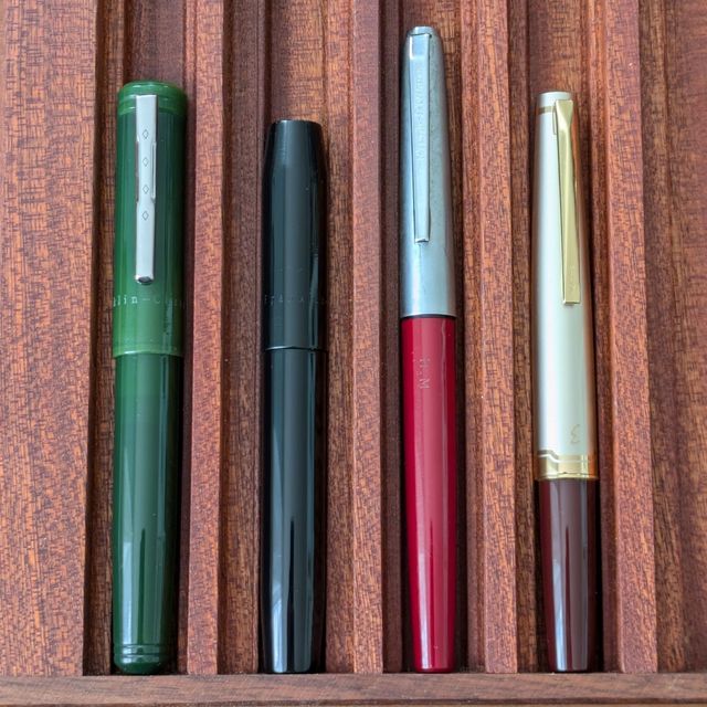 A primary goal for the pen collection in 2025 is to move out those I don’t need or want anymore. These pens are headed out the door.
2025 Journal Underway
January 6, 2025
A primary goal for the pen collection in 2025 is to move out those I don’t need or want anymore. These pens are headed out the door.
2025 Journal Underway
January 6, 2025
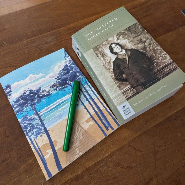 This year’s daily journal starts with transcribing some Oscar Wilde. The notebook is a Quartier Libre A5 I found at Barnes & Noble. The cover makes
Next page
This year’s daily journal starts with transcribing some Oscar Wilde. The notebook is a Quartier Libre A5 I found at Barnes & Noble. The cover makes
Next page
 |||
|||