 |||
|||
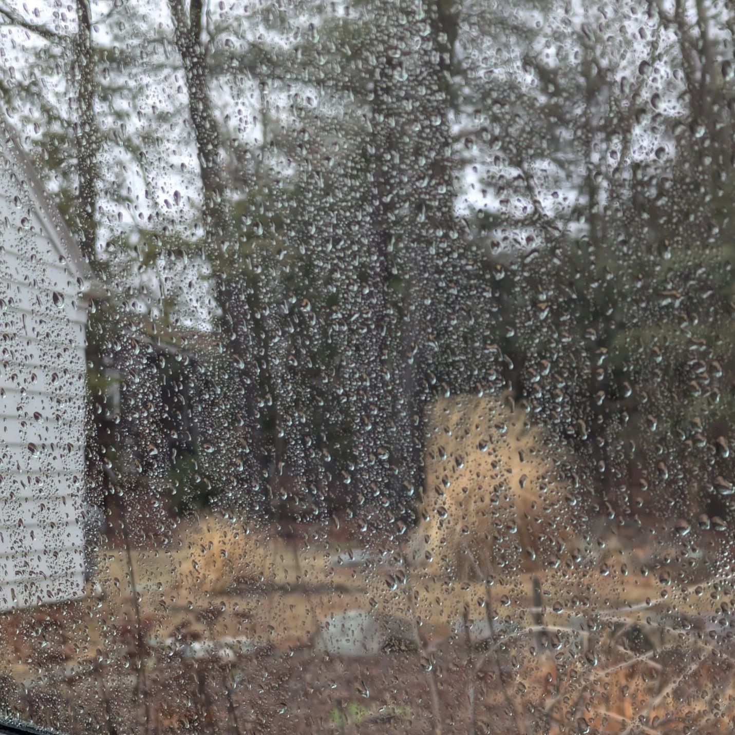
March is perhaps the most up and down month for weather here. It’s not out of the woods for winter’s cold and snow; yet a day or two of 60 degrees with bluebird skies feel like a running start toward spring. Today happens to be gray and rainy. However, something gold and gleaming sits in our midst to brighten things up.
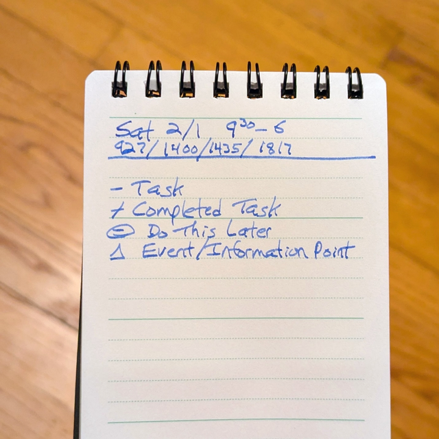
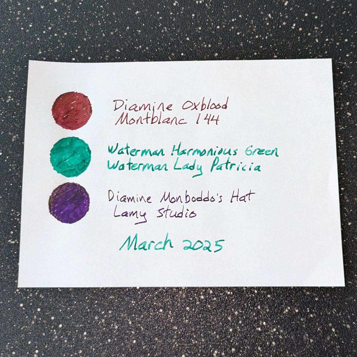
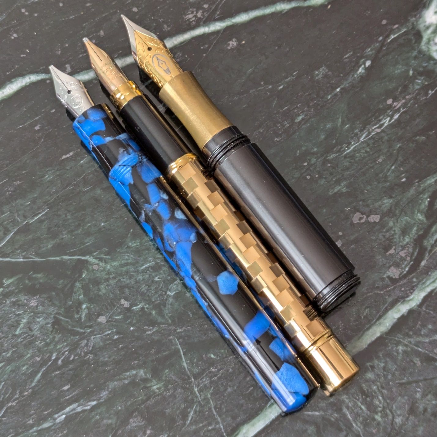
Inked Right Now
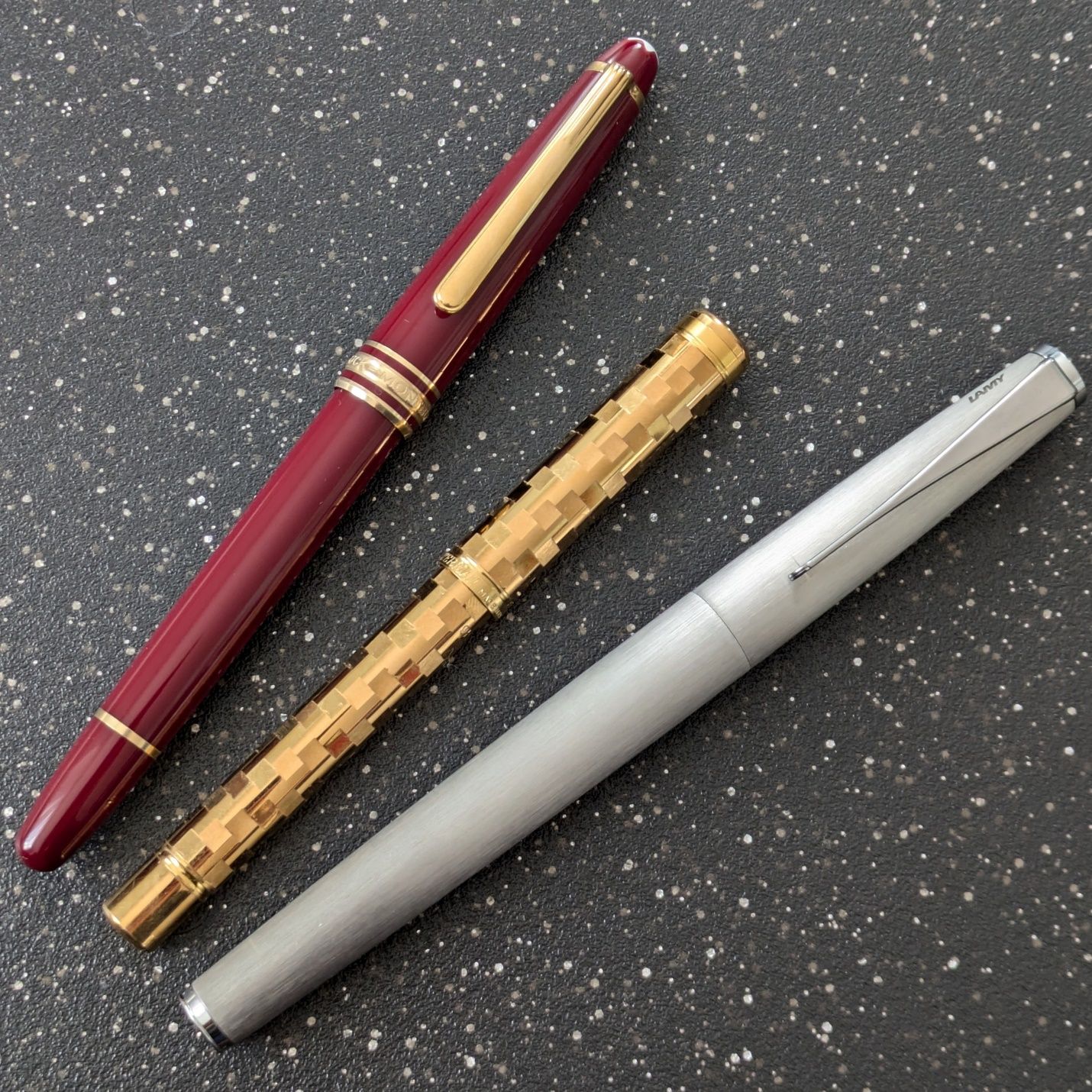
Montblanc 144R with Diamine Oxblood
Waterman Lady Patricia with Waterman Harmonious Green
Lamy Studio with Diamine Monboddo’s Hat
The Studio is killing as a work pen, mostly due to the nib — a 14k broad with the Perspective grind by Custom Nib Studio. The Perspective is a naginata-style grind that works great in many different scenarios. The thing I’ve found most valuable at work is the nib’s ability to easily transition from writing small to medium to large with no loss of feel or control. The line offers character and performance in all sizes. Of all the nib grinds I’ve purchased, the Perspective surpassed my expectations the most and still wows me with its versatility.
Monboddo’s Hat is a great ink. Dark blurple with copper sheen that comes out on almost all papers, including standard 20lb copy paper, Staples mini legal pads, and regular yellow Post-its. The only place the sheen doesn’t appear is in my Field Notes HD pocket notebook. It’s just too absorbent. That’s a bit of a bummer since the Field Notes is where I do the most writing at work but the nib is so much fun to use, I don’t mind.
The 144R has been used for journaling and incidental work at home. Oxblood is a pleasant match for this pen. The nib has always been a nice writer but I’m wondering if it could use a grind. Either a cursive italic or stub is my natural inclination and would increase the appeal of an already very good pen.
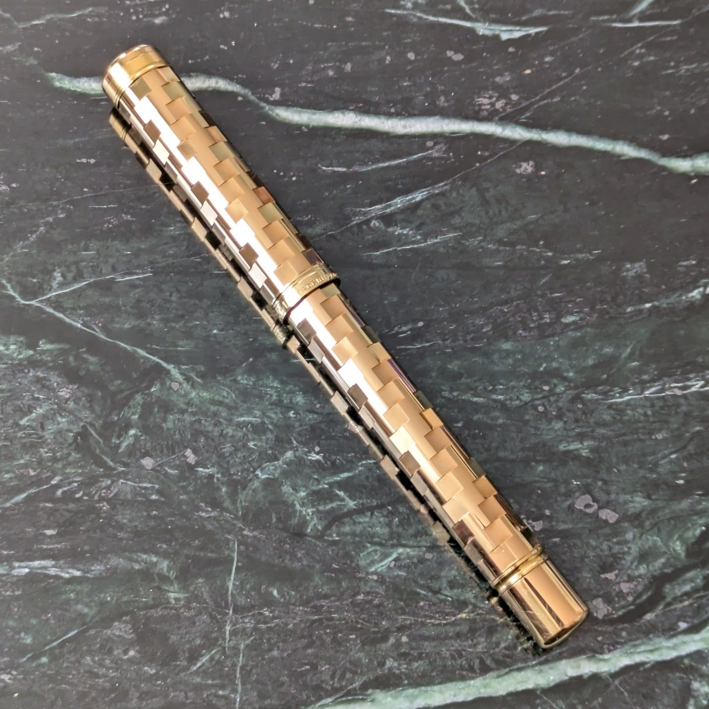
And that little gold number in the middle? Let’s look a bit closer.
Waterman Lady Patricia
 Waterman Lady Patricia
I don’t know much about Waterman’s catalog overall compared to Parker or Sheaffer, but from what I’ve read this Lady Patricia is from the late 1980s and the body pattern of offset square cuts is sometimes referred to as mosaic. A period catalog image on Fountain Pen Network shows two other variants with alternating gold and colored squares, one in blue and the other bordeaux. Waterman also made celluloid Lady Patricia pens in the 1930s-40s. This is not a reincarnation of that model, but using old names for new products has always been a thing.
As evidenced by the group picture above, the Lady Patricia is a small pen. It’s diminutive next to the 144 and Studio, both of which are slim moderate length pens. Let’s look at it next to other pocket size pens.
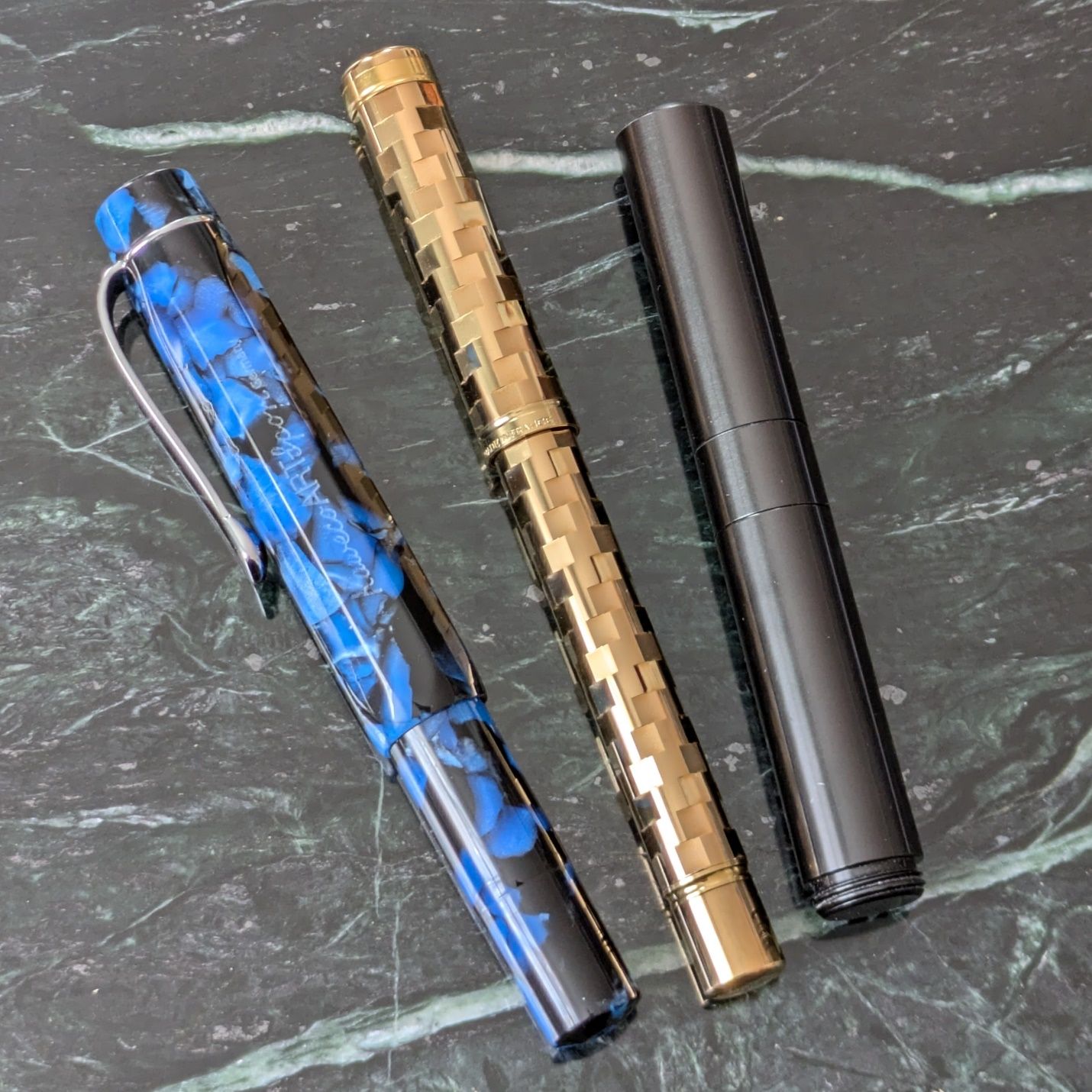 From left: Kaweco Art Sport, Waterman Lady Patricia, Schon DSGN P6.
 Uncapped
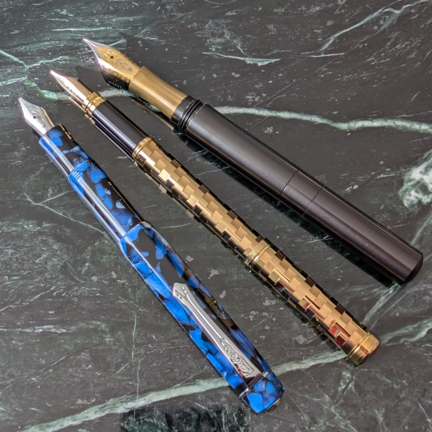 Posted
The Sport and P6 highlight the narrowness of the Waterman. None of these pens are obtrusive in the pocket. The Waterman really disappears wherever you carry it. Like the Sport, I can use the Waterman unposted but posting provides better comfort to write more than a few sentences. That said, there was a level of hand fatigue after using the Waterman for 2-3 pages of journal entries transcribing poems. Based on experience I would not expect the same fatigue using the Sport or P6 because the wider contoured sections make for an easier grip.
There’s also a matter of cartridge compatibility. The seller included an older box of small Waterman cartridges. They look like short international so I figured I would just fill a random empty rather than clean out a sealed one. Except that didn’t work. The Waterman cartridges have slightly different shape and dimensions compared to short international, which means a short international won’t fit in the back of the Waterman feed.
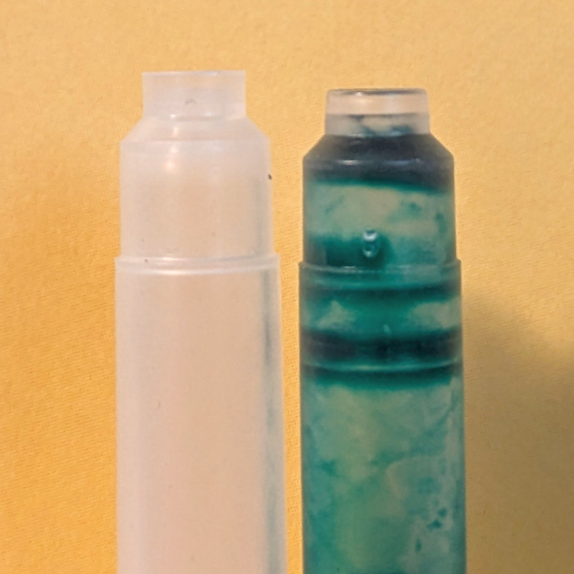 Standard short international (left) and short Waterman cartridges
So, I emptied one of the included cartridges and filled it with Harmonious Green. It seated securely and soon after ink was flowing from the nib. Speaking of…
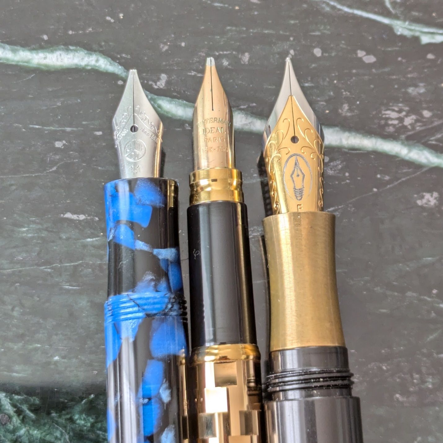
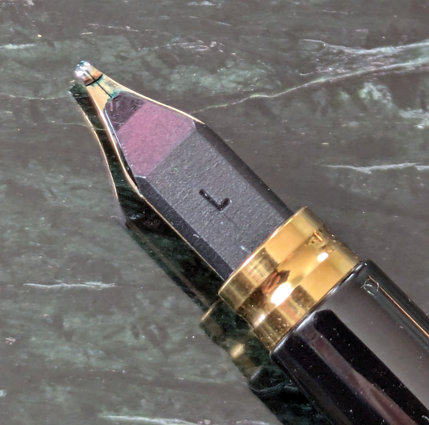
The nib is a 14k broad that writes wet and smooth. It has a bit of hard starting if it sits idle between words so it may benefit from some micromesh work.
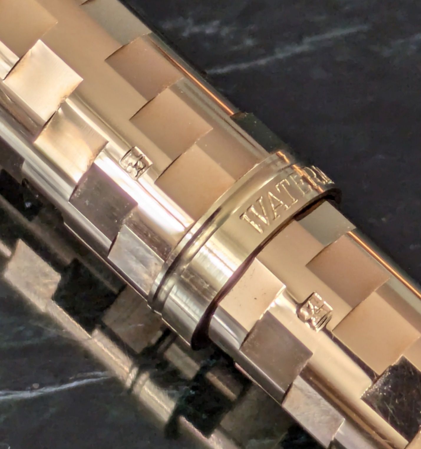 Gold hallmarks
The quality on this pen is excellent all around. The machining is crisp but not sharp. It would surely wear to a smoother feel over years of use. The gold-plated finish is nicely polished. The cap closes firmly with a solid click. It posts smoothly and holds securely.
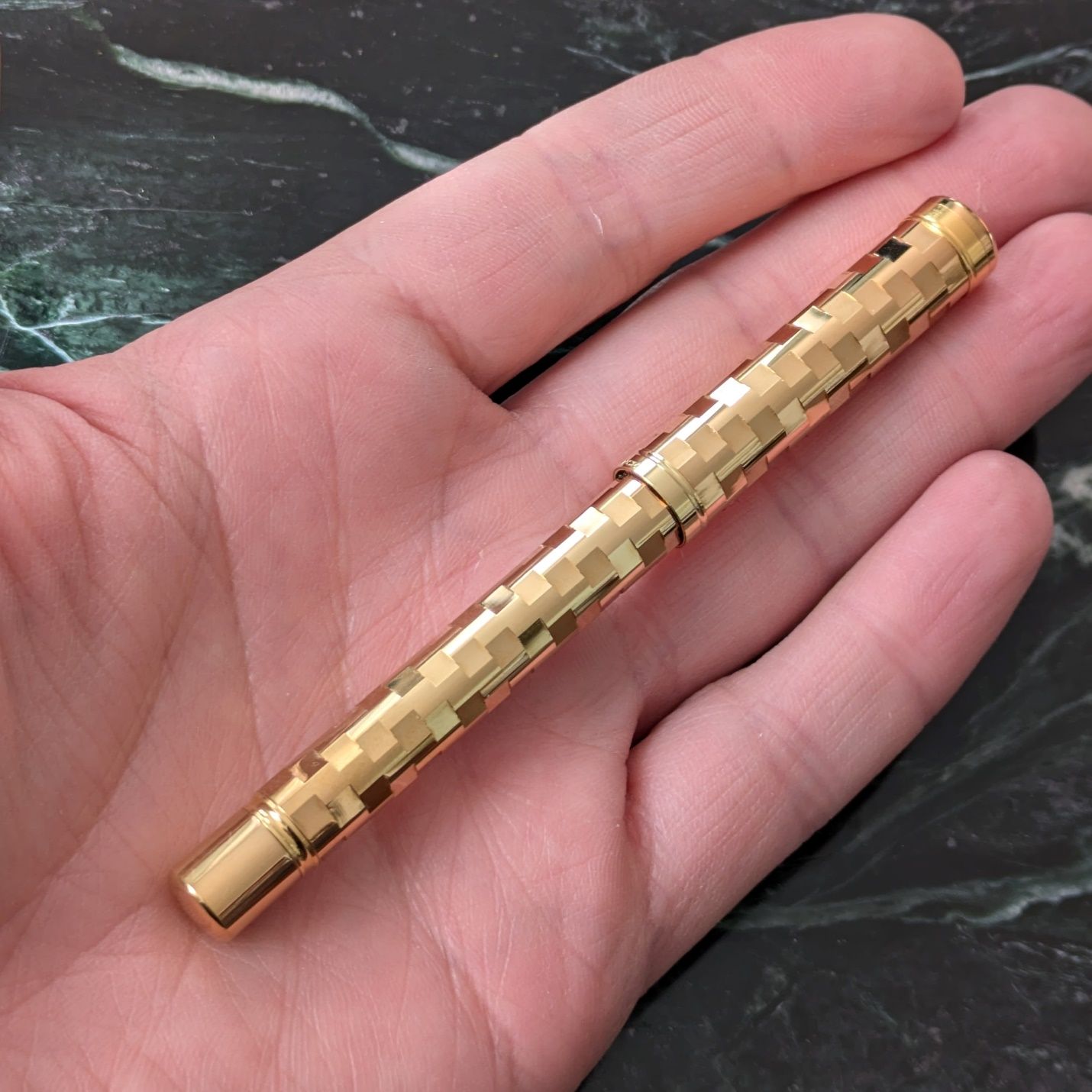
The Lady Patricia isn’t my usual cup of tea but has a certain appeal that got me. The look is flashy, or maybe beyond that, and I can deal with it more easily in a small pen. This finish on something the size of a Montblanc 149 would be shouting. The Lady Patricia is not shouting. It makes a quieter but no less assured declaration of itself.
The Lady Patricia’s last little bonus comes when you hold it in direct bright light to get a mini disco ball effect.
https://youtube.com/shorts/XOF0i6mjLY8?feature=share
On a gray day in March that’s a fun thing to enjoy.