 |||
|||
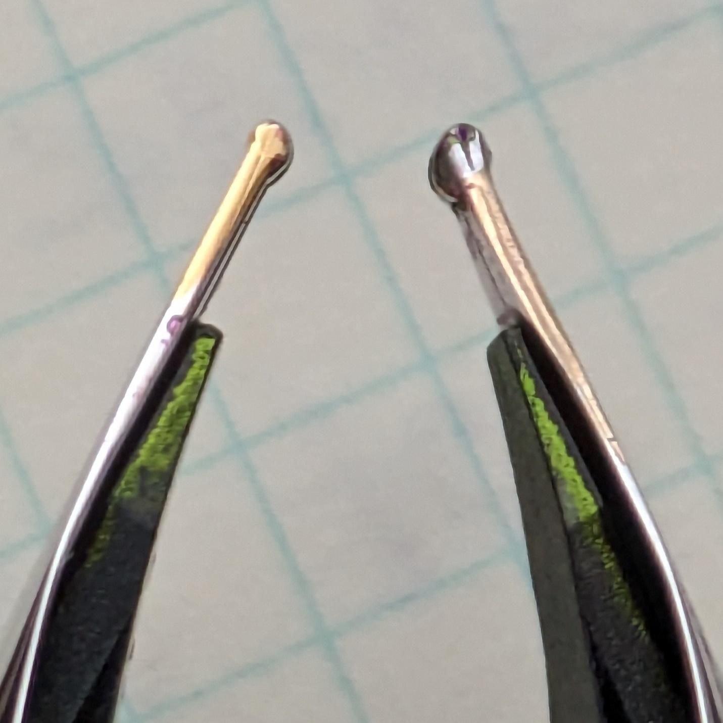
 Face to face.
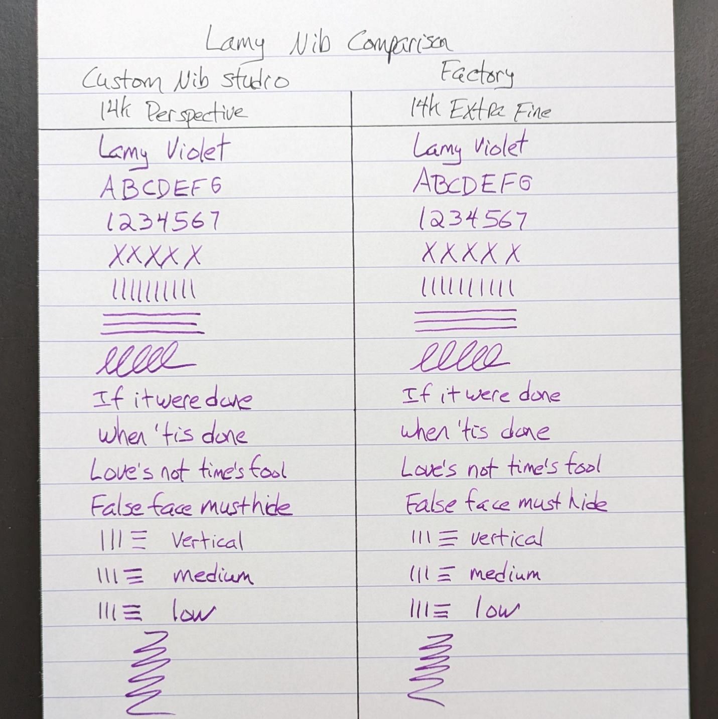
I like Lamy’s gold nibs. I like them a lot. They are wetter than the steel equivalents and quite smooth. The first one I had was an oblique medium (pretty sure it was medium) that wrote beautifully but the sweet spot was tricky to maintain for me. It meant I had to write more slowly and deliberately to keep the optimum angle to the page. I felt it wasn’t the best match to my needs at the time so I traded it for an extra fine. The extra fine surprised me because the shape of the nib lent itself to some natural architect-like variation, thinner down strokes compared to wider cross strokes. It’s not a big difference from one to the other given the small size of the tip but noticeable.
I picked up a broad Lamy gold nib a while after the extra fine. It worked as I would expect with a wet, easy monoline. Good for showing off ink, especially ones that shade. I figured at some point I would get it ground to a more interesting shape. Enter Gena Salorino at Custom Nib Studio, who transformed the broad nib with a Perspective grind.
 Shoulder to shoulder.
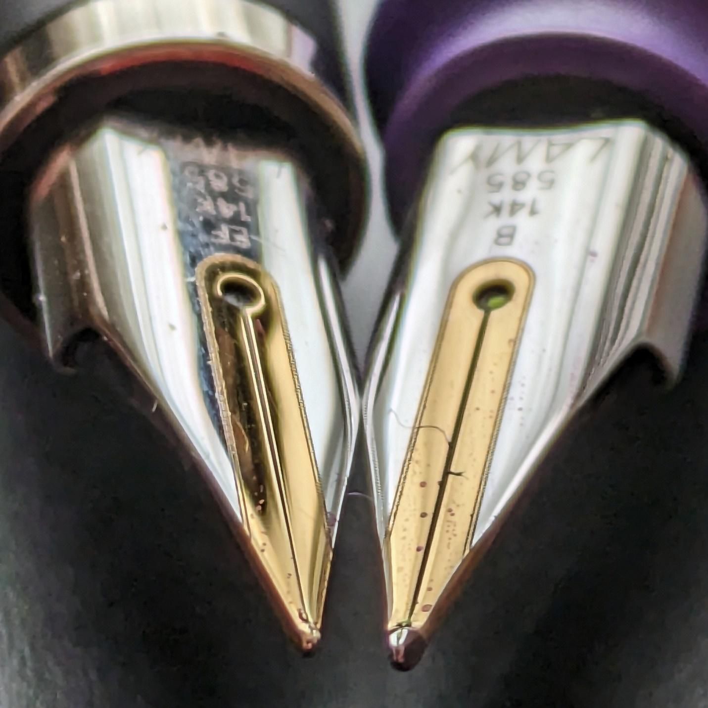
Gena’s Perspective is a Naginata-style grind. You get thinner down strokes and wider cross strokes but the size of the cross-stroke changes based on how high or low you hold the nib to your paper. A higher angle gives thinner cross strokes that aren’t much different to the down strokes. Lower your angle to 45 degrees or so and there’s more nib meeting the paper with more ink delivered. Lower the angle even more and you can get a bit more width but there is a point past which you’re too low for writing comfortably, at least I found it that way.
 Feed sheen courtesy of Lamy Violet, a great ink.
Looking at that, you’d think that the Perspective would deliver a much bigger line than the extra fine. They turned out much closer to one another than I expected.
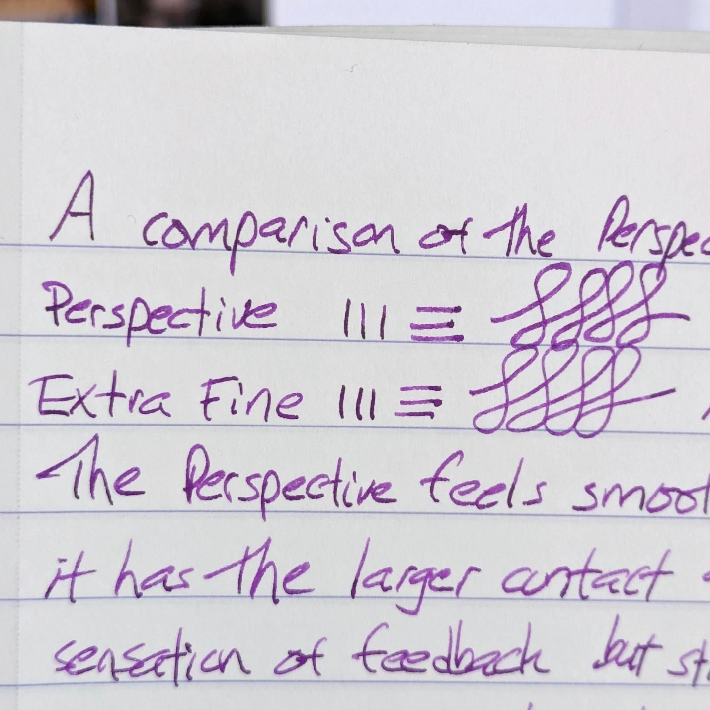
The text of my notes reads:
The Perspective feels smoother most the time because it has the larger contact area. The extra fine has more sensation of feedback but still just as quick on the page. It needs a steadier hand to look as even as the Perspective. The Perspective will have more natural variation line to line and letter to letter. Both nibs are great to write with so it’s mostly a question of which might be the best in all situations. I think the Perspective wins there because of the variability that it can offer with a simple change of angle.
(At the very end of the article will be a larger side-by-side comparison of each nib’s output.)
My writing is done in many places on many papers. I imagine it’s the same for a lot of us. I can be sitting, standing, or walking. I can have a notepad flat on a desk, be holding it in my hand, or be putting it against some other surface for stability. All these variables mean the angle at which the nib hits the paper is always changing. The Perspective nib changes line width based on these factors but it is always smooth and clean on the paper.
This is the main difference I would note between a Naginata-style grind and an architect. The architect provides sharper contrast between strokes but the front of the grind is a straight line from top to bottom. Having the angle too high or too low will lead to the line losing consistency and perhaps feeling scratchy. (Note that architect grinds can vary just like an italic grind, from crisp and hard to softer and more forgiving.) The curve of a Naginata-style grind means you don’t often get the on-off smoothness that an architect can sometimes have. A Naginata always writes but the line will be different based on all the factors mentioned above.
If you want to use a Naginata to make deliberate strokes that change for specific lines and special characters, you can do that. If want to jot down your grocery list while walking into the market, you can do that too. It will handle both tasks with ease.
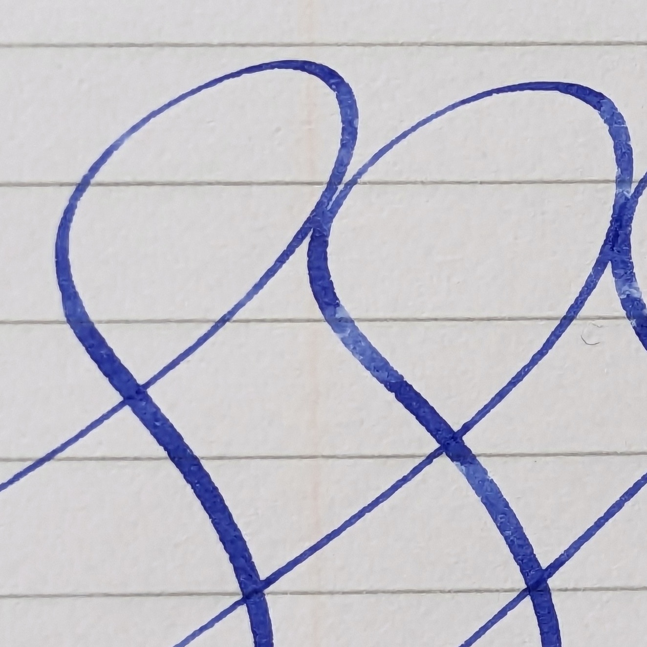
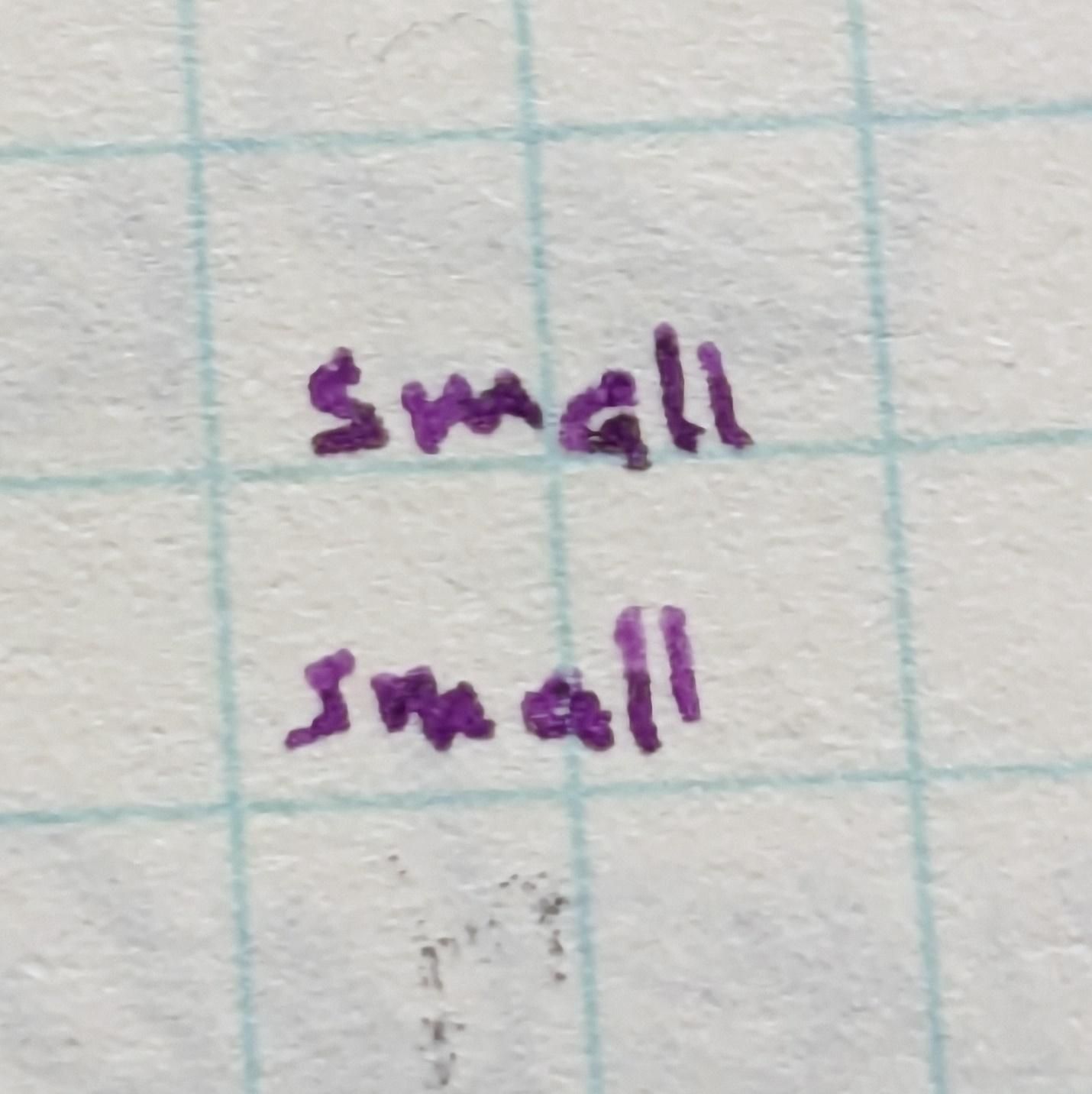
An interesting side note is the reverse writing. It can be small if you want it to be, awfully small. This was magnified 8x on my phone camera, written on paper with a 3mm grind. The letters are about 1mm high.
 Not recommended for everyday reading and writing.
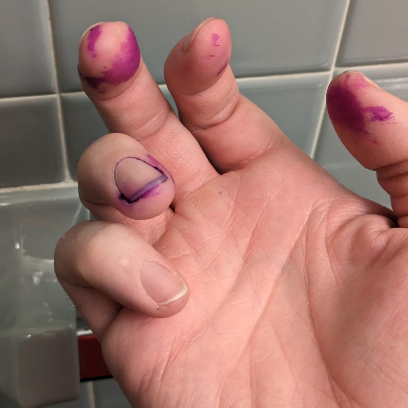
Also on the side, I took ink out of the Safari’s cartridge and transferred it to a converter for use in the Studio with the EF nib. It turns out that no matter how often I may have done this with the appropriate tools, things like this still happen.
If you found this informative, or maybe flat-out annoying, let me know via linevariation at gmail.