Some spur of the moment inspirations and a practical change. Plus, racing colors!
Inked Right Now
Sailor Fude de Mannen with Diamine Shimmering Seas
Sheaffer Old Timer with Sheaffer Skrip Red
Delta Write Balance with Colorverse Horizon
Parker Rialto with Waterman Mysterious Blue
Kilk Orient with J. Herbin Bleu Azur
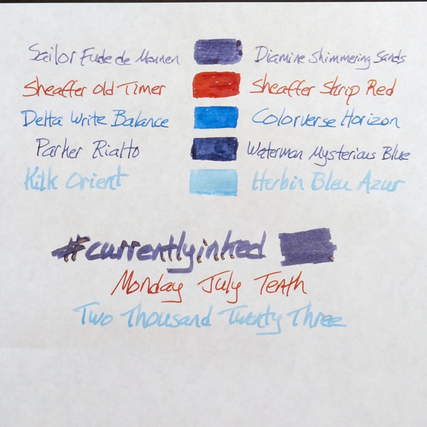 I made a mistake with the Diamine ink name in this list. It is Shimmering Seas, not sands. I'd already redone the list once, didn't feel like doing it again.
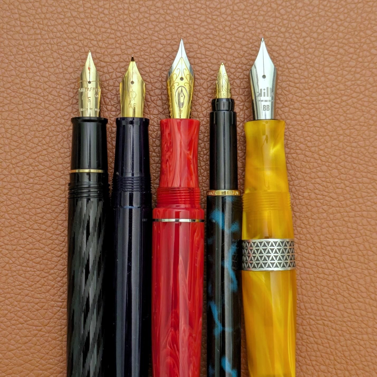 Yes, the Rialto is that slim compared to the rest but still comfortable to use.
Gone from last week: Lamy Studio, Lamy Safari, and Parker 45. Splitting the ink to use in both Lamys cut their time short. The Parker got used for a lot of incidental writing at home during the week and petered out on Saturday.
The Sheaffer remains a champ. Looks great, writes great. I like the pairing with Skrip Red, which is the best basic, true red ink I’ve used.
I took the original nib out of the Delta and installed a steel fine that came with my Edison Brockton. A precise writer, a bit wet, with a nice pencil-like feel on the page. More useful and consistent than the “flex” option it came with.
I don’t think the fill in the Rialto will last much longer. It’s been a good introduction to a part of the Parker line I’d never used.
The two new pens were both choices inspired by things I didn’t expect.
First, I took my most dynamic nib and filled it with my most dynamic ink.
Practical? Not really.
Fun? Yes.
 Flashy letters
Shimmer isn’t my thing for ink but if you’re going to shake things up you may as well shake them hard. This choice came from wanting to use the ink I never figured on using because it’s fun to say the hell with it and do what you wouldn’t normally. It remains to be seen how the ink will get along with the nib in the coming days. The flow has been kinda on/off so far. When it’s on, though, it’s Donkey Kong.
Second, why the Kilk and why a pale blue ink? Because McLaren had a great weekend.
It’s been a long stretch in the desert for McLaren’s Formula 1 team. Little blips of hope came here and there but things have been lean overall, markedly so for a team that was a perennial power for years. So, when Lando Norris and Oscar Piastri qualified 2nd and 3rd, respectively, for the British Grand Prix at Silverstone I had cautious optimism. When Lando finished 2nd and Oscar 4th in the race, I was genuinely excited.
Livery colors and schemes change over the years. Some are memorable, many aren’t. As much as we wish they could stay, none of them last forever. The McLaren team, founded by Bruce McLaren in 1963, was known for their orange painted cars in F1 and sports car series like Can-Am in the late 1960s and early 1970s.
Side note: Can-Am was an amazing racing series with incredible machines using unique technology. Look for a movie called Can-Am: The Speed Odyssey if you want to get a taste of it. McLarens ruled the first several seasons in their Chevy-powered M8 models. The series’ original run was essentially capped in 1973 by the domination of another iconic car and livery - the blue & yellow Sunoco Porsche 917/30 driven by Mark Donohue. Check out the performance specs on that car and consider for a few moments that it was running 50 years ago.
McLaren’s particular shade of orange is referred to as papaya. As the 70s progressed, orange was phased out of the color scheme in the F1 cars but did make rare appearances, like the car below they ran in 2005 preseason testing. That was the first year I really got into watching F1 and I’d have killed for them to keep this color the whole season but they did not. Too bad, because the ’05 McLaren was a monster that could well have won the title had it been more reliable for Kimi Raikkonen.
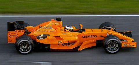 Photo Credit: Cesar Rangel/Getty Images
Starting in 2017, which was the end of the lowest valley in the team’s recent performance, McLaren starting bringing papaya back into their livery. While the shade of orange has changed somewhat in the latest iterations, it’s been nice to see the team’s heritage color, so to speak, return to a place of prominence.
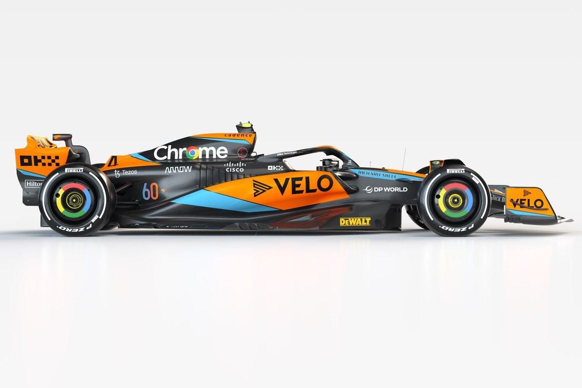 Photo Credit: McLaren
At this point you’re asking what any of that has to do with a pen and ink combination. As I said, McLaren’s great performance this past weekend had me feeling good and I thought “I should ink up something orange to mark the fun of the occasion.”
I’ve got some good orange inks but only one orange pen, the Kilk Orient. It’s a swirled and chatoyant acrylic, very pretty. Not a one-to-one match for McLaren papaya but it’s the closest thing I’ve got. Plus, the Orient was lingering in the haven’t-used-it-in-a-while-should-come-back-to-it pile.
As for the ink, only one blue would fit– J. Herbin Bleu Azur. If memory serves, this was the first Herbin ink I bought. It was the first I got in a bottle for sure. It shades wonderfully and the color is idyllic. Thing is, you need the right nib and paper to get good readability for whatever you write. A broad or stub nib on white Tomoe River is the best way to go for Bleu Azur in my experience.
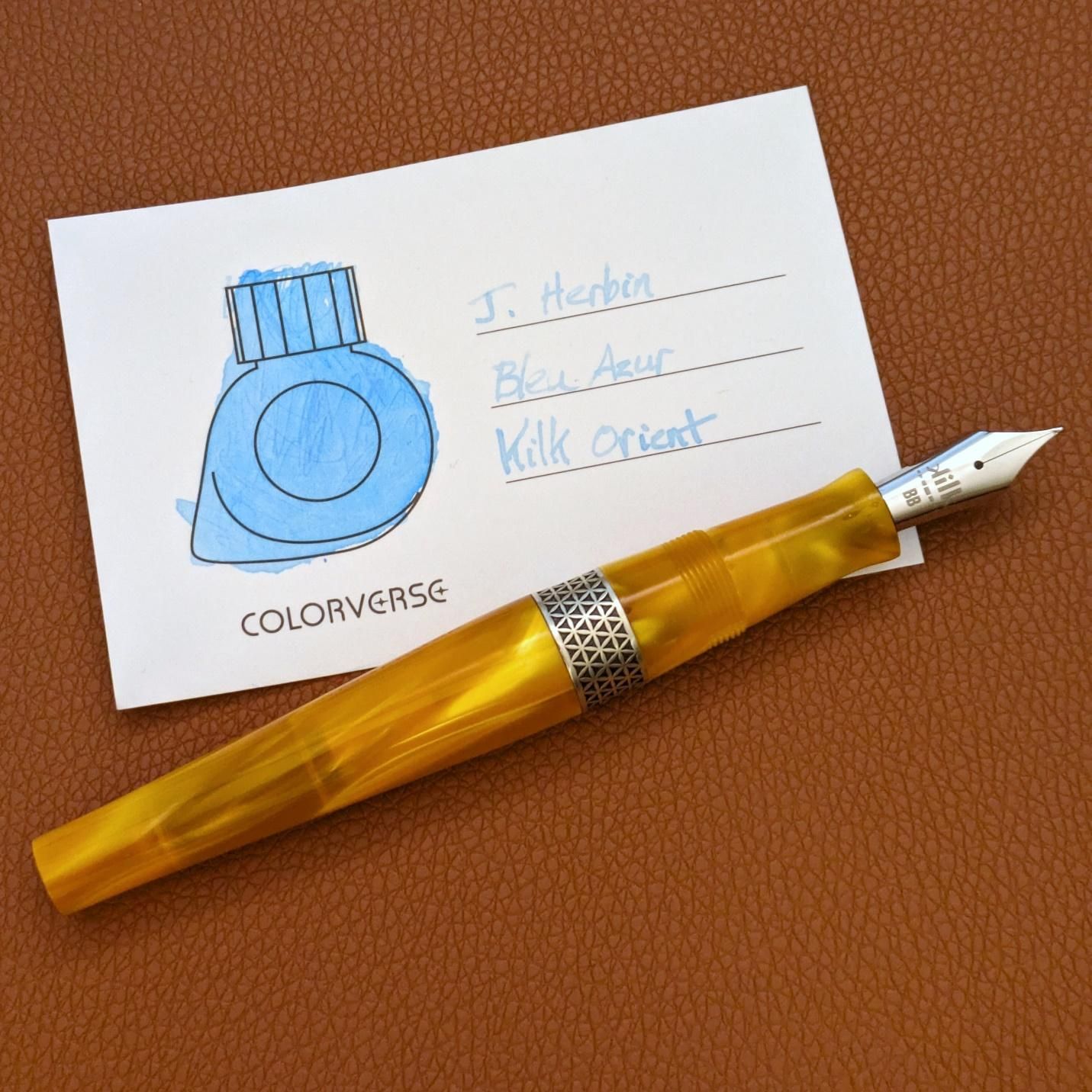 Kilk Orient double broad with J. Herbin Bleu Azur on a Colorverse ink swatch card
This was my tribute to the folks at McLaren for a true bright spot after an extended darkness. Will it lead to more success? Hard to know because winning in F1 is difficult, but it’s a good place to plant a flag and march forward.
Incoming
Still nada.
Thinking About
I had to pass a skill check on the no new pens mandate not long after I set it. There was a Homo Sapiens on Virtual Pen Show that looked straight at my wallet and seductively said “Come hither.” The right nib, right size, right trim, and a nice price. I let it go, but it took a few minutes to talk myself off the symbolic ledge. Now, some days removed, it seems like less of a deal, but there was a legitimate push-pull between what I’d told myself I needed to (not) do and what I thought I could get away with rationalizing in the name of “no self-respecting fountain pen person can let this deal go.” Still three weeks until vacation when I see if anything catches my eye at the Appelboom store. Maybe something in papaya orange? Better not to think about it for now and stay focused with what’s on my desk for real.
One of these days someone will write to me about something. linevariation at gmail
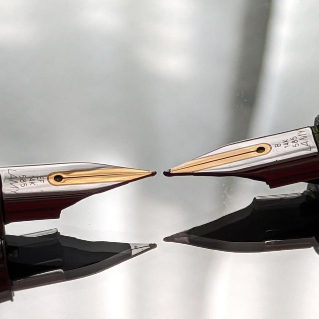 Nib Comparison: Lamy 14k Extra Fine & Lamy 14k
Perspective Grind (Custom Nib Studio)
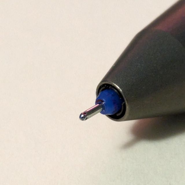 If Not a Fountain Pen, Then What…?