 |||
|||
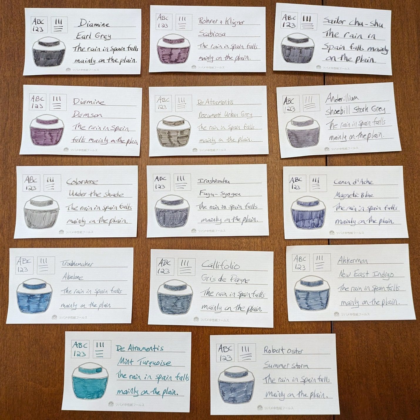
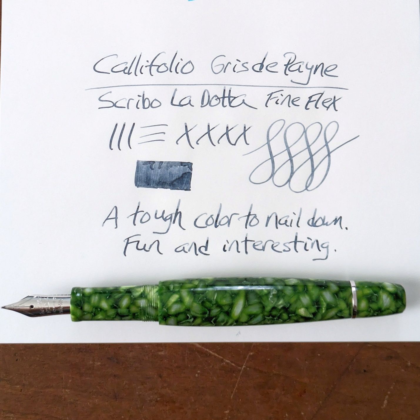
I inked up the second Callifolio sample, Gris de Payne, in the Scribo. I went through my swatch cards and pulled anything grey or grey-adjacent for comparison.
 Fourteen shades of...nevermind.
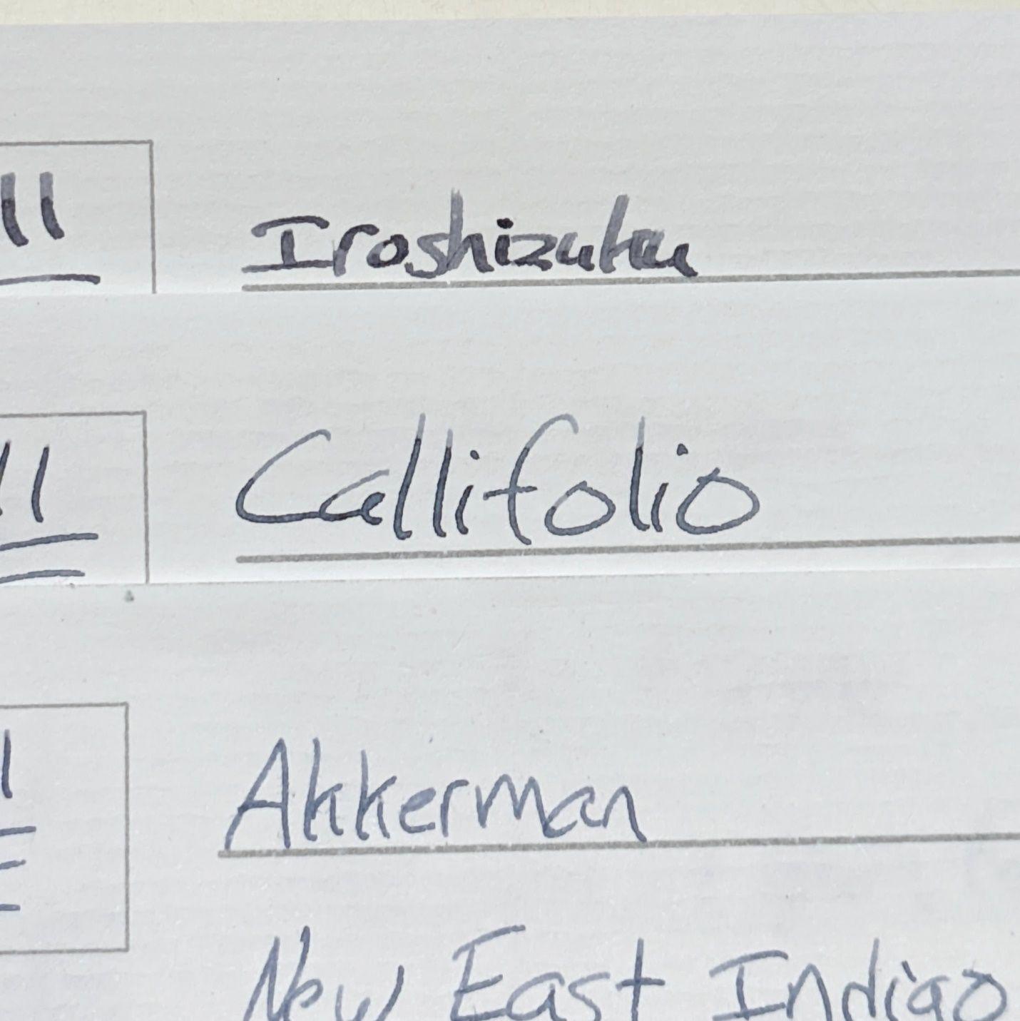
Not exactly apples to apples with the inks done in different pens/nibs at different times, but the best I can come up with is that Gris de Payne is bluer than Iroshizuku Fuyu-Syogun and less blue than Akkerman New East Indigo.
 Should I legally change my name to this? It'd look pretty impressive on a business card.
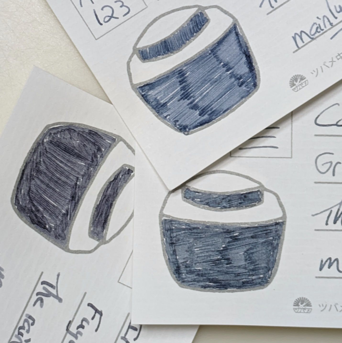 Clockwise from top: Akkerman New East Indigo, Callifolio Gris de Payne, Iroshizuku Fuyo-Syogun
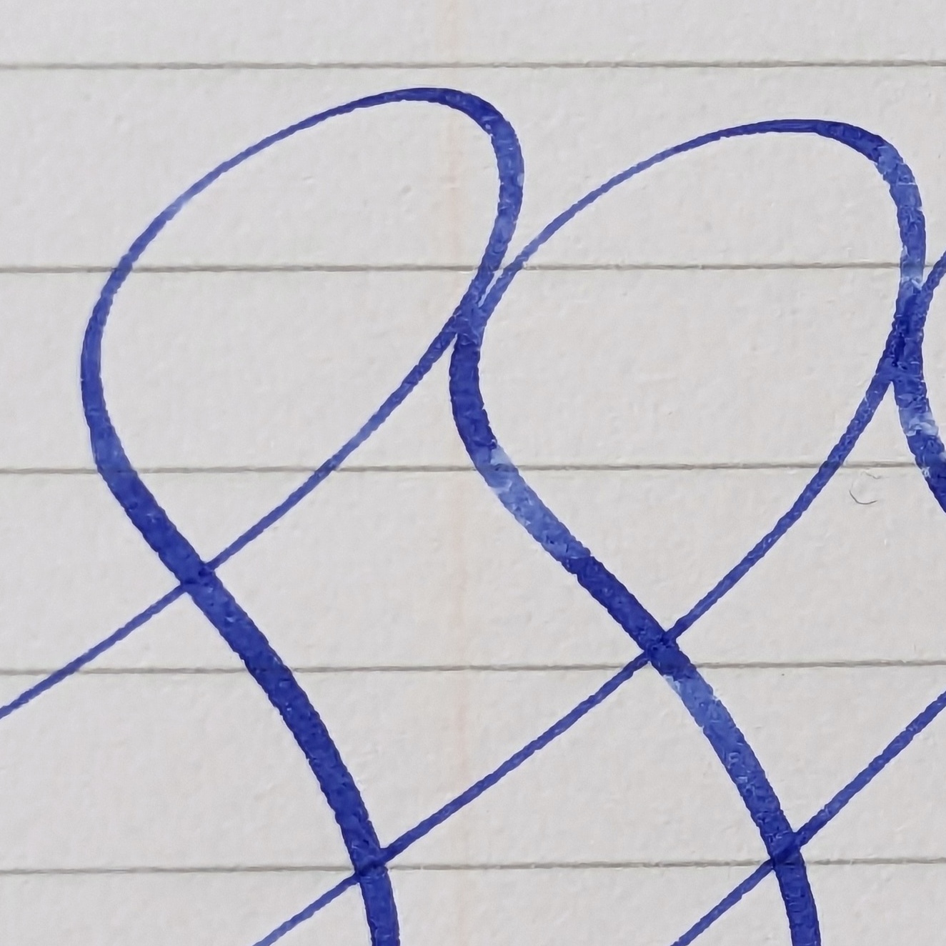
Using the old formula 52gsm Tomoe River paper, Payne’s performance in the Scribo nib is much the same as Anahuac. Smooth, wet flow in normal writing with nice shading. Flexing the nib for broader lines still gives consistent flow but is less wet than non-flex writing. This is a change from past writing with this nib that gave very thick wet lines when flexed; the kind that take forever to dry on this type of paper, or feather & bleed on less suitable paper.
I’m pretty sure I have a Stabilo marker somewhere that is Payne’s Grey. I’ll add some side-by-side pics with that if I find it.
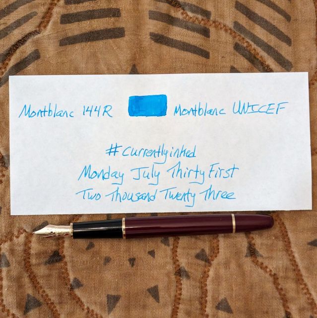
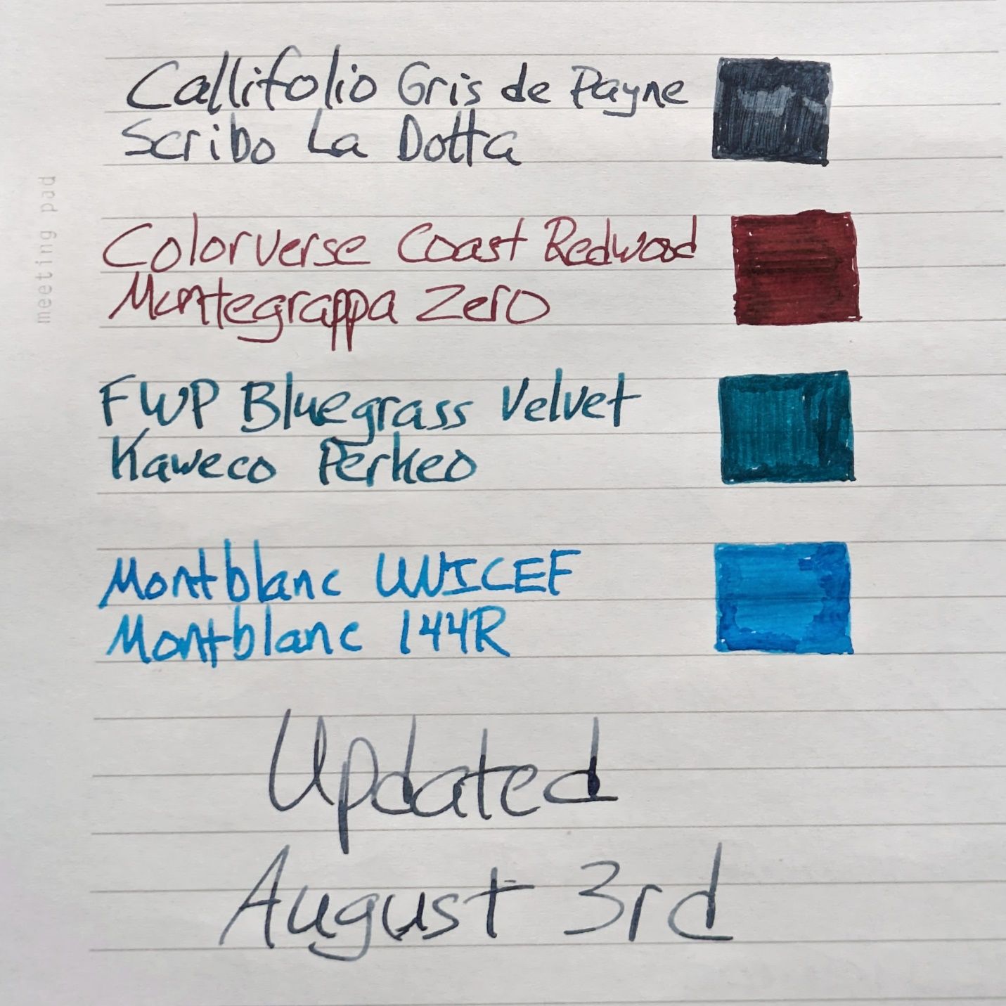
The 144 and La Dotta needed some friends in the pen tray so we have added the following:
Kaweco Perkeo (1.1) with Ferris Wheel Press Bluegrass Velvet. I like the Perkeo so much better with the clip and the stub options that the set provides. Bluegrass Velvet is my favorite FWP ink of the 5 or 6 I’ve tried.
Montegrappa Zero (Fine) with Colorverse Coast Redwood. Given the wider, wetter nature of the other three pens inked, I wanted an option with a more precise and controlled line. The Zero’s fine nib is exactly those two things. Plus, the pen is flat out gorgeous, which never hurts. Coast Redwood was a choice governed only by not wanting another blue/black/gray/purple/teal ink right now. Needed something on the warmer, earthier side of the spectrum.

This batch should last me through next week. I’ve got to get back on the Emerson journal read and transcribe train and these tools are all well suited for that.
Stationery Store Day this Saturday. Appelboom next week. Good times are afoot.