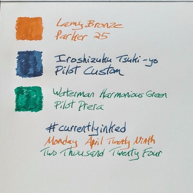
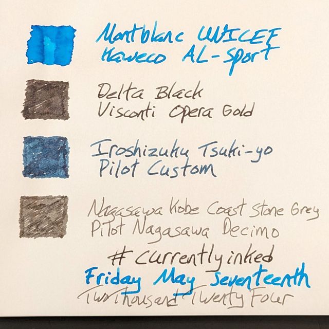
 |||
|||
Last week I mentioned I made a short list of pens that I was actively seeking. One of them was the Visconti Opera Gold.
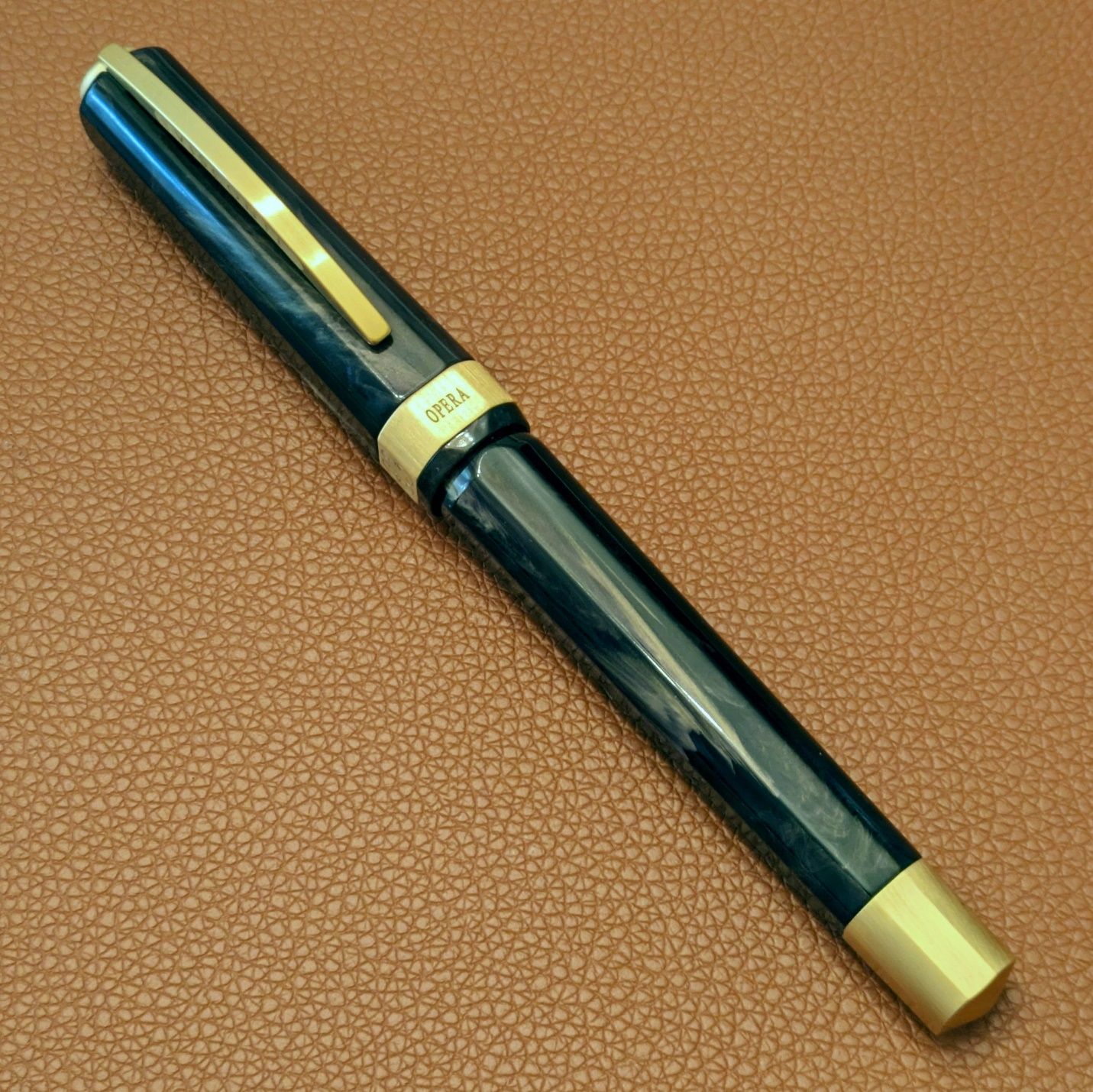
This model came out in spring of 2023. I liked the look. I’d never used or held an Opera before, so I didn’t seriously consider getting one but I filed it away in the “interested” category. Then in August I had a chance to handle the Opera Gold in a store and came away impressed with its build. The Opera Gold moved from “interested” to “I’d like one.” However, the middle of 2023 saw me acquire many pens without much plan or purpose before trying to reign things in, so the Opera Gold was put on hold along with most other pen purchases for a while. I kept an eye out for reviews to glean more information about the pen but there are hardly any extant online. Figboot has the only video review I’ve seen to date. Recently, I found Anderson Pens had a good price on the Opera Gold, so I took the plunge.
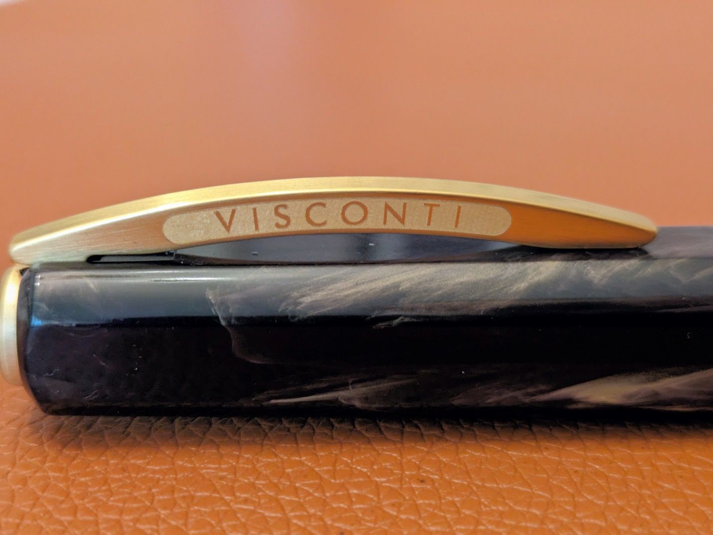 The standard Ponte Vecchio clip.
I think the Opera Gold’s main calling card is that it has features found on Visconti’s higher end pens, like the hook safe cap lock and two-chamber vacuum filler, without the price tag usually attached to those pens. A good chunk of that difference comes from equipping the pen with a steel nib rather than a gold one. The handful of Visconti steel nibs I’ve used were all nice writers, and their gold nibs still lack what I’d call a good reputation for consistent quality and performance out of the box. With those thoughts in mind, the presence of a steel nib makes the Opera Gold more appealing to me.
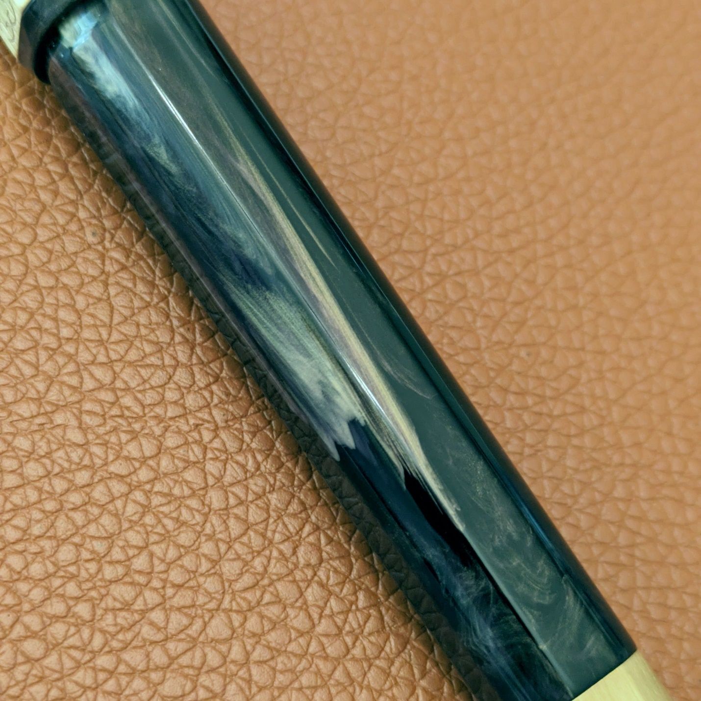
I also think there must be some cost saved with the resin used on this pen compared to others in the Opera, Voyager, and Homo Sapiens lines. It’s less dramatic and eye-catching than something like the recent Mariposa or Earth Origins pens, but those are custom materials from Jonathon Brooks and I presume they cost more as a result. All the same, I find the black and gold mix on this example to be attractive and elegant looking.
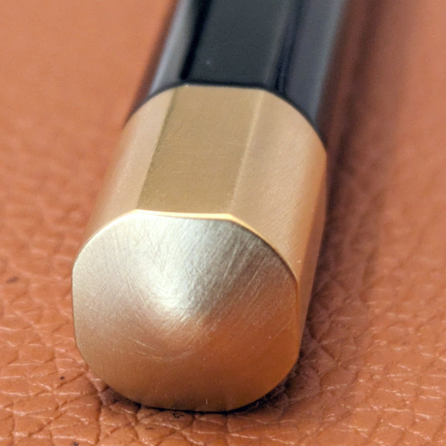
The Opera Gold has brushed trim, like the Mirage Mythos in Visconti’s current lineup. Having used a Rembrandt with a smooth metal grip section I can say I much prefer the feel of the brushed grip on the Opera Gold. I had some reservations about cleaning it off because the pen only fills from a bottle, but it has presented no issues in that regard. The brushed finish also mitigates the appearance of fingerprints.
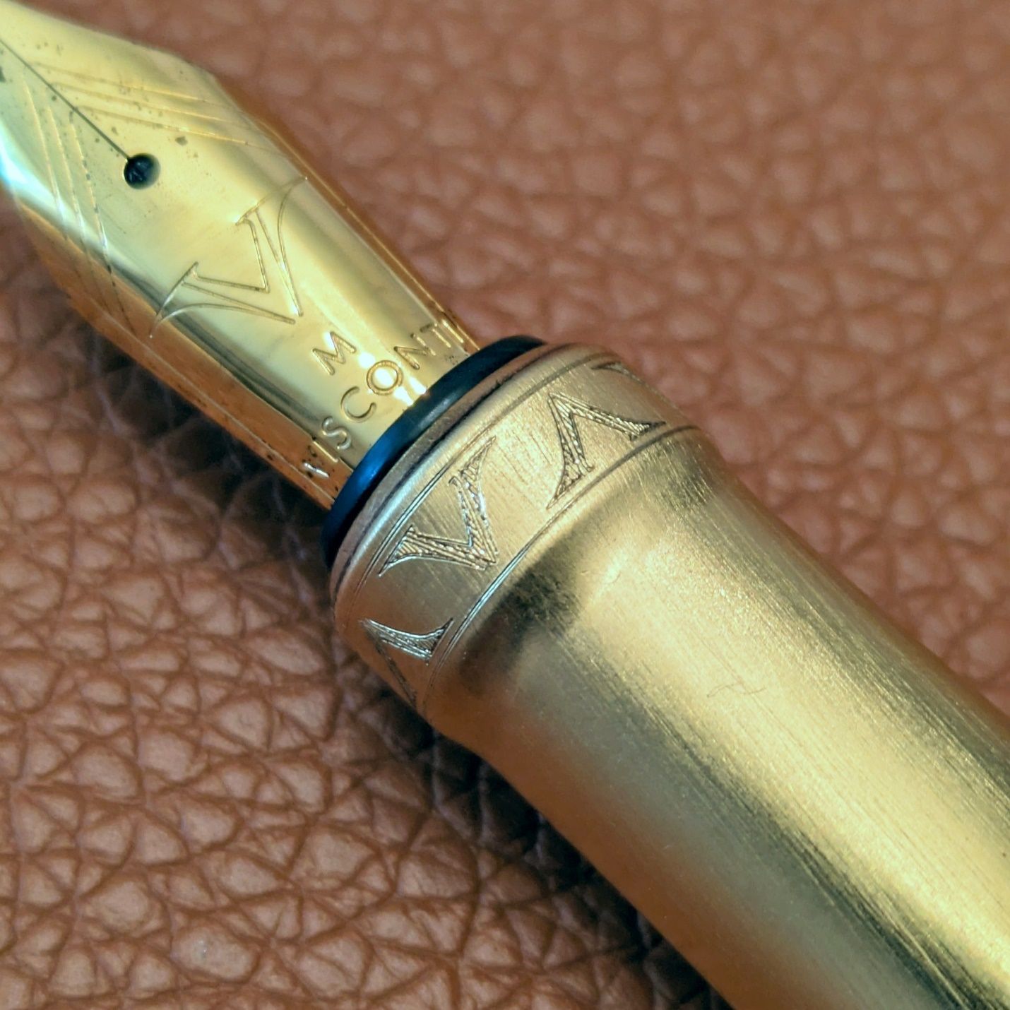 The V engraving at the end of the grip could be a nice embellishment or a superfluous extra. I land more on the former, but I don't think I'd miss them much if they weren't there.
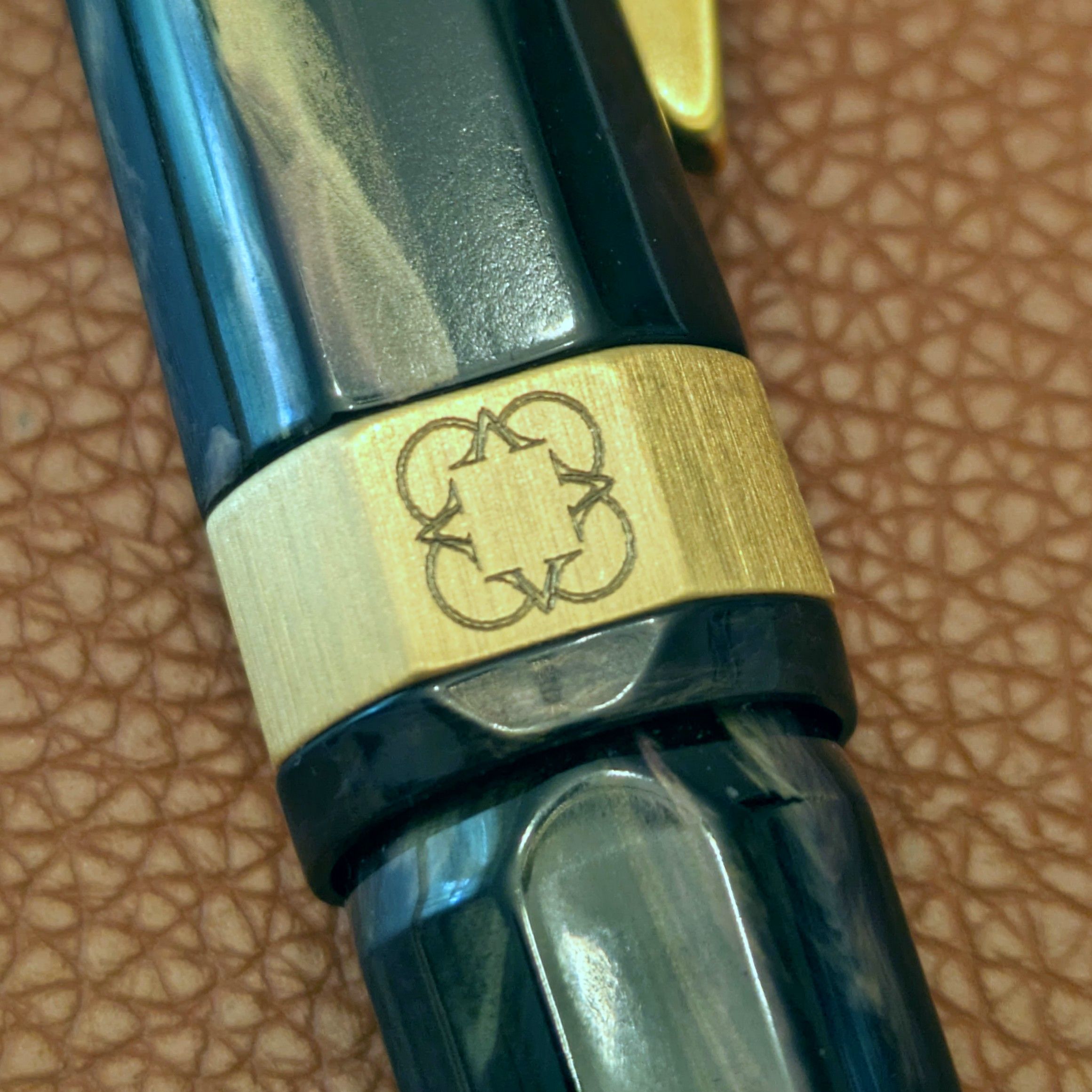
The trim appearance is consistent in all areas from the grip, to the cap band, and the filler knob.
 More V engraving. I wonder if they watched that 80s miniseries called V about aliens invading Earth.
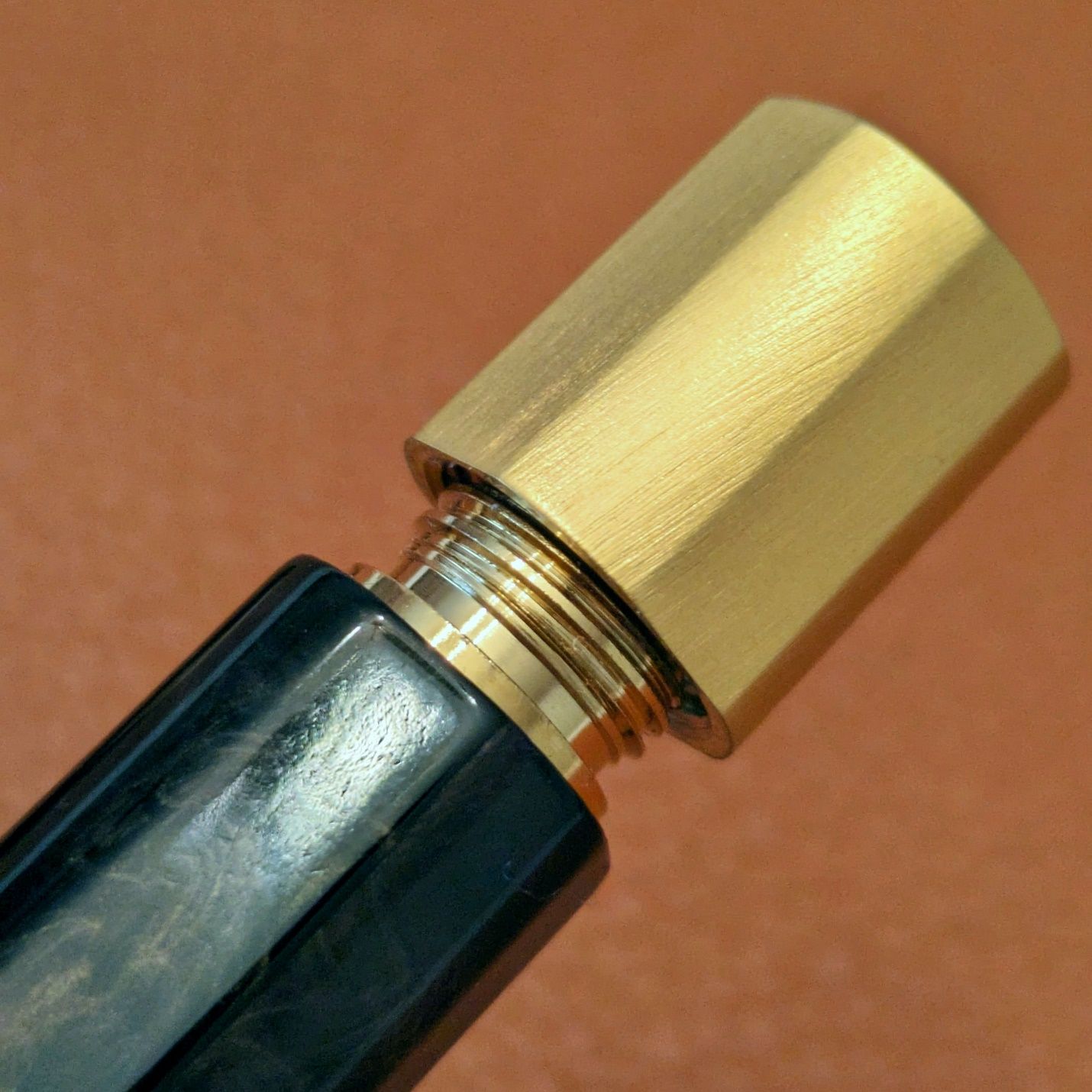
 The end of filler knob protrudes slightly, like small bump.
The filling mechanism looks and feels solid. Every visible part is robust and well finished. The action of the filler knob is smooth and deliberate, like adjusting the volume on a nice stereo. The plunger action feels the same way.
The ink window is the same place where the hook safe cap engages. It is cut and finished cleanly with ample transparency to see the ink level inside. It also has a good fit up to the grip and barrel on either side. The grip is long enough that my fingers don’t touch the window when writing, but if they did, I don’t think it would cause discomfort.
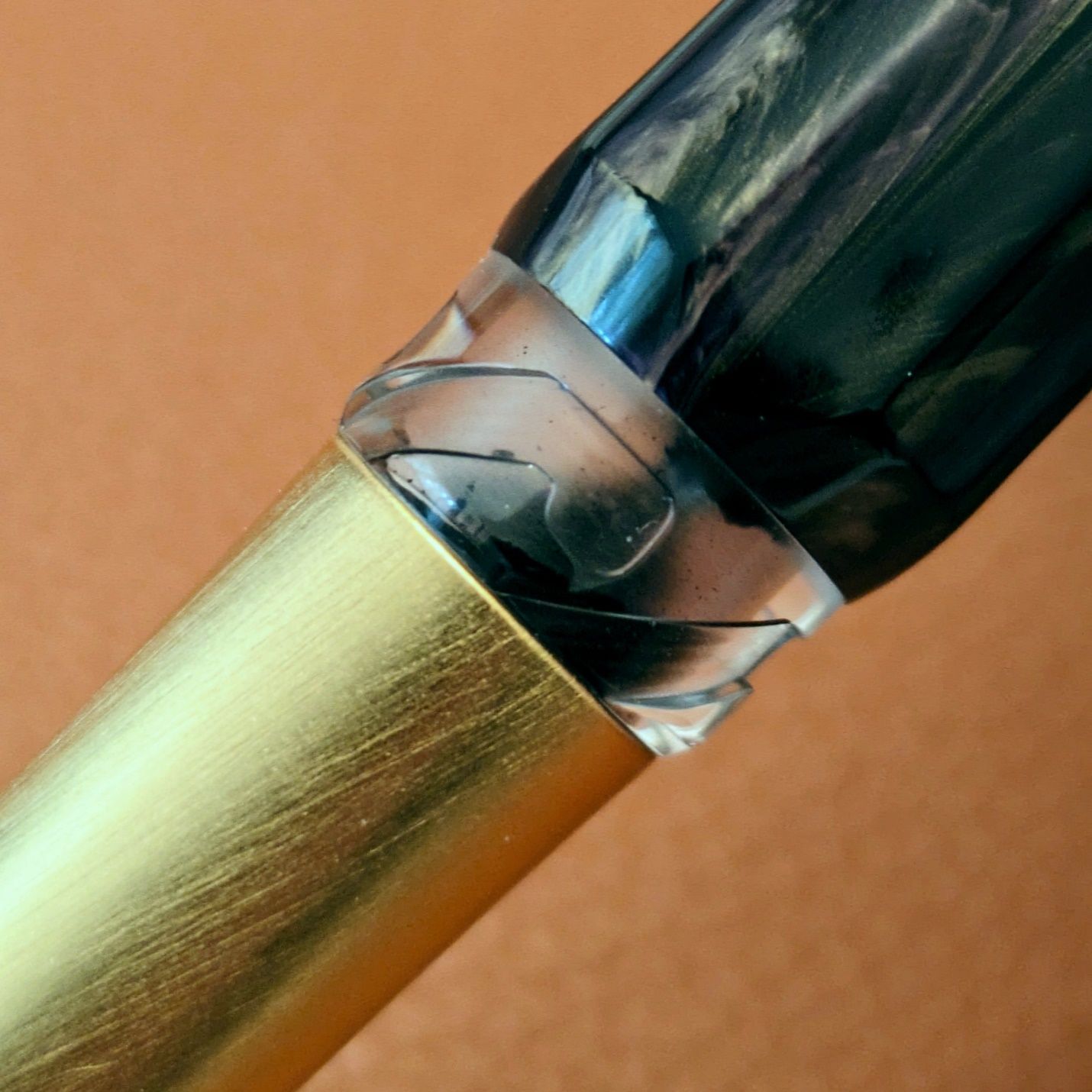 The ink window is finished as nicely as any other part of the pen. Lots of small cuts and angles that could be rough or ragged, but they're not.
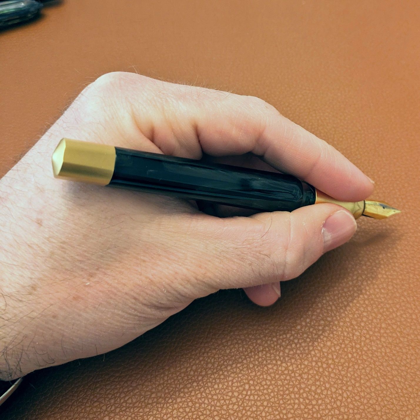
In hand, the Opera Gold is hefty but not heavy. With a partial fill of ink, it weighs 48.8 grams, 18.2 of which are the cap. In short writing sessions so far, the pen’s weight doesn’t cause any problems. The filling system components focus more of the body’s ~31 grams to the back half of the pen. The end of the barrel sits in the web of my thumb when writing so that weight is supported and feels comfortable. I’ve not written for extended periods yet to see if it creates any fatigue.
The Opera Gold is what I call a large pen. It is slightly longer capped than the Montegrappa Venetia and has about the same girth around as a Platinum 3776, but the squared circle design plays a bit of a trick with how the Opera Gold appears. The ends don’t round off like the other two pens so it seems not as sleek in a way, but the angles and facets of the barrel make it look narrower compared to a cylindrical profile. The Operas Gold’s shape certainly stands out in my pen drawer.
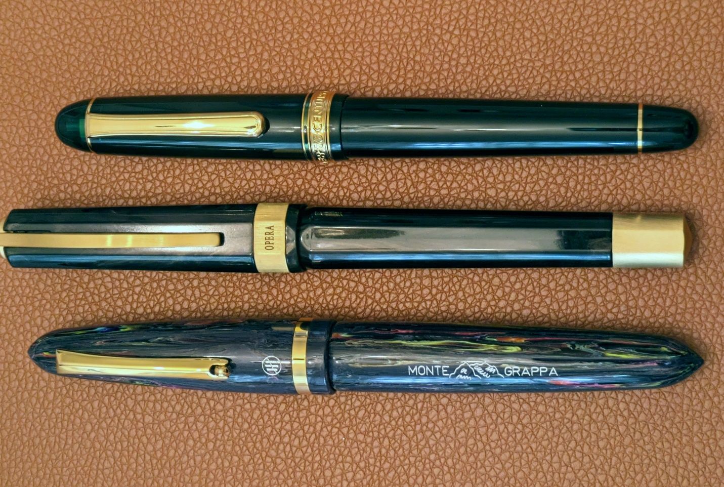 Top to bottom: Platinum 3776, Visconti Opera Gold, Montegrappa Venetia
The Opera Gold’s nib also has a different look and shape compared to other pens. It is #6 size based on feed diameter and the feed looks like Jowo with a slightly different cut to the underside. The shoulders of the Opera Gold nib don’t flare out as wide as the standard Jowo #6 profile on the Montegrappa. The difference is just fractions of a millimeter per side but the reduced taper makes Visconti’s nib appear that little bit different in comparison.
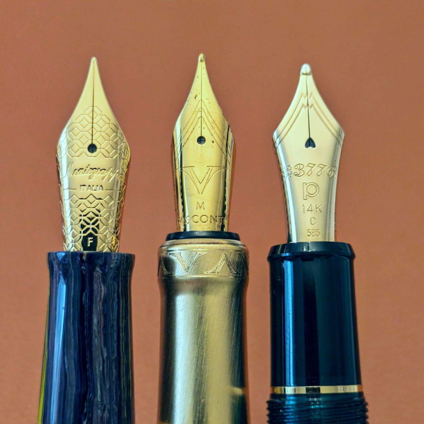 Left to right: Montegrappa Venetia, Visconti Opera Gold, Platinum 3776. The V logo honestly looks more suited to the wide shoulders of the 3776 nib.
And how does that nib write? Nicely.
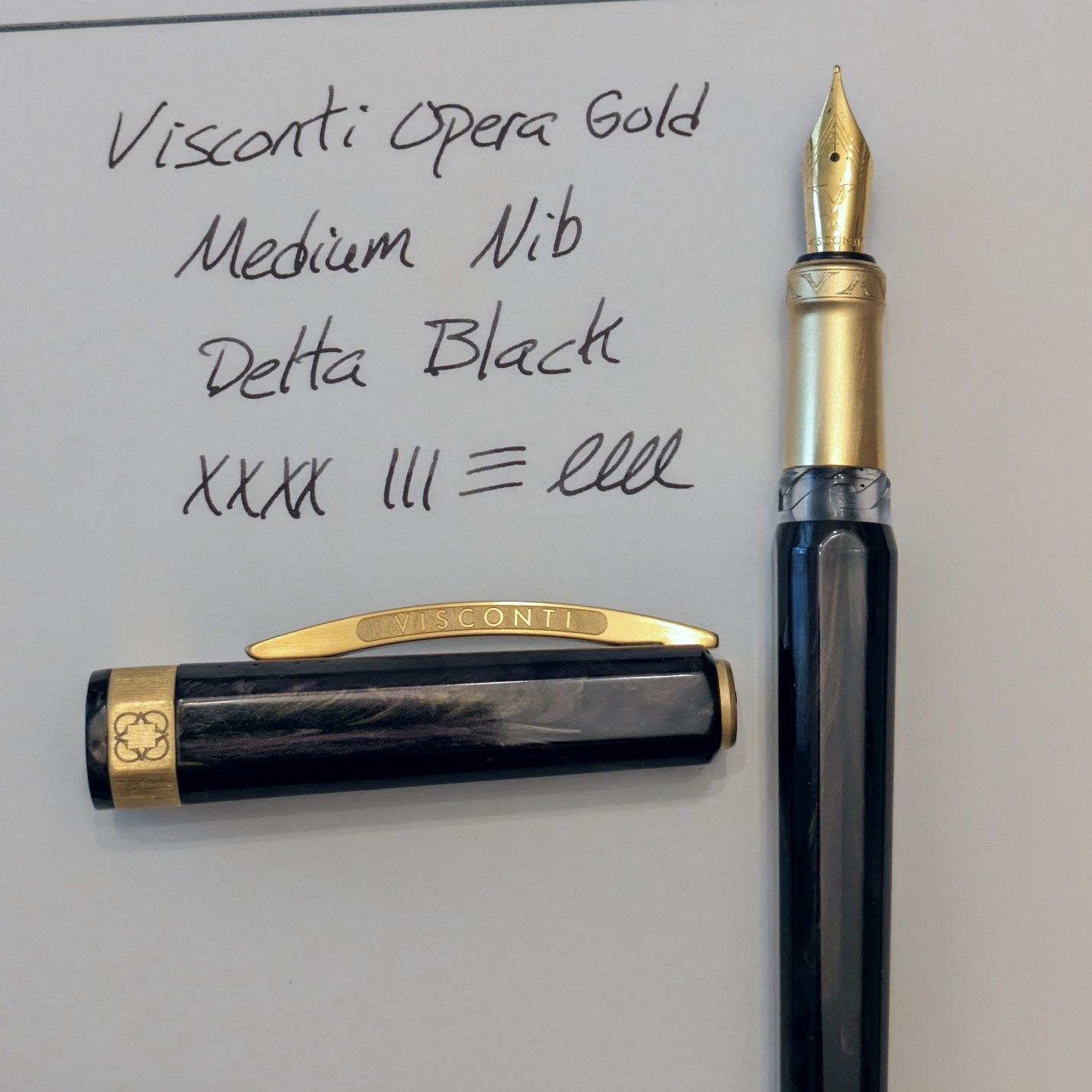
I’ve used Waterman Mysterious Blue and Delta Black. Both inks performed as I would expect in a well-tuned nib. I did a little bit of smoothing on wet micromesh to make the starting stroke more consistent, but no other adjustment was needed. The flow is good though I must keep the nature of the two-chamber ink reserve in mind. Loosening the filler knob to open the seal between the small and large chambers is no problem but it’s not easy to know how much ink is going to flow down when the gap opens. On one occasion after letting more ink in I noticed that tightening the knob back down caused ink to flood the feed. I let the pen sit nib up for a bit so gravity could pull some of that ink back to the small chamber. It may take some more getting used to, but I like this filling mechanism. The fact that the nib unit unscrews makes cleaning quite convenient. Much more so than a lot of vacuum fillers.
As mentioned earlier, the Opera Gold delivers some signature Visconti features without completely emptying your wallet. I got it for $300. It normally streets for $348. There are two ways the discussions tend to go with pens like this. One way says in this price range the pen should come with a gold nib. The other way says there’s more to a pen than the nib and there’s more to the nib than what it’s made of. This is well worn territory among fountain pen users, but I’ll walk it anyway.
It’s easy to get hung up on the nib because the value placed on gold as a material tends to connote more value to a pen, be it actual or perceived. I think all of us experience it at some point. Gold nibs are nice, but like any other nib they’re only nice if they’re well made and work for your hand. There are many gold nib pens available at or under $300. Those pens are often of a more conventional style than the Opera Gold.
So, do we want a gold nib in a package that’s like a lot of other pens we might already have or do we want a different package with a more standard nib material? In practical terms, a nib is the easiest part of a pen to change or modify. Swap in a different unit if the pen allows. Send it to a nibmeister for a custom grind to your personal specs. The options are plentiful. With few exceptions, you can’t change a pen’s grip size, barrel length, or weight balance. Style-wise, you won’t make a Pilot into an Aurora or a Montblanc into a Parker.
We always wish for the best of all worlds, but if you like what a pen offers, why cross it off for the lack of a certain nib material? The first time I handled the Opera Gold I had to think past the steel nib/gold nib difference to see the rest of the pen. It turns out I liked it enough to buy one and the early returns are good.
What pen might you have looked past based on a nib? Would you still?