 |||
|||
Six months ago, I was pleasantly surprised by the notebook selection at a local Barnes & Noble. I was back at the same store this week and, once again, found things that were interesting and new to me.
Having learned from the previous visit where items were randomly mixed across a few displays, I did my best to look methodically shelf by shelf. Several of the items that stood out to me from last time were still there like Kokuyo Campus, Rhodia Goalbook, Rollbahn (saw some different cover designs), Nuuna, and Good Inkpressions. Midori and Laconic, maybe the most unexpected brands I saw in January, were not spotted this time.
What did I discover in this round of shelf combing? Quite a bit.
Stalogy Editor’s Series in A5 (full & half year) and B6 (full year). There were a handful of cover colors to choose from. These are great notebooks, although I would love to see Stalogy make the A5 with 6 or 7mm lined pages. The 4mm grid is fine, mostly because the lines are pale and unobtrusive, but a lined option would suit my needs better.
Castelli were mostly hardbound A5-ish size. The covers in store were all solid colors, none of the more interesting patterns and variations they list online. They were also sealed in plastic wrap so I couldn’t get a sense of the paper.
Karst Stone Paper seems like a nice overall product. I appreciate the idea of recycling a different kind of material to make paper that has some interesting features. However, past experience with stone paper wasn’t great for me. It feels quite smooth to the touch and to write on, but when I used it with fountain pens the inks suffered a lot of fading or color shift over the span of several months. Your experience may vary with different writing tools.
Good Juju had some nice covers, paper seemed okay.
Field Notes had just a few items. The Game Master & Character Journals as well as a plain mixed 3 pack of the classic pocket size.
Blackwing Slate but only in white.
Mossery had some nice looking cover designs. It appears you can get their items personalized when ordering direct online.
Poketo is a brand that does a lot more than notebooks and planners. Their style stands out with bold colors and patterns.
Vent for Change presents a big sustainability message with notebook covers made of recycled plastic and pages of recycled paper.
Tuttle Publishing had a few A5 hardcover journals with nice covers. I’d never heard of this company and the story on their website is worth a look.
Leuchtturm’s section had some notebooks advertising “120g superior paper” that’s “extra smooth” with “low transparency.” Their usual 80gsm paper is okay with fountain pens in my experience but it can vary based on what you’re using. I might try this heavier paper if they put it in a softcover pocket size notebook, but I imagine they’d keep it focused in the more expensive end of the range.
Fin Studio had a few notebooks as part of a separate display table filled with items of similar theme and color. The cover says they are handmade outside of London and the product does have that feel about it.
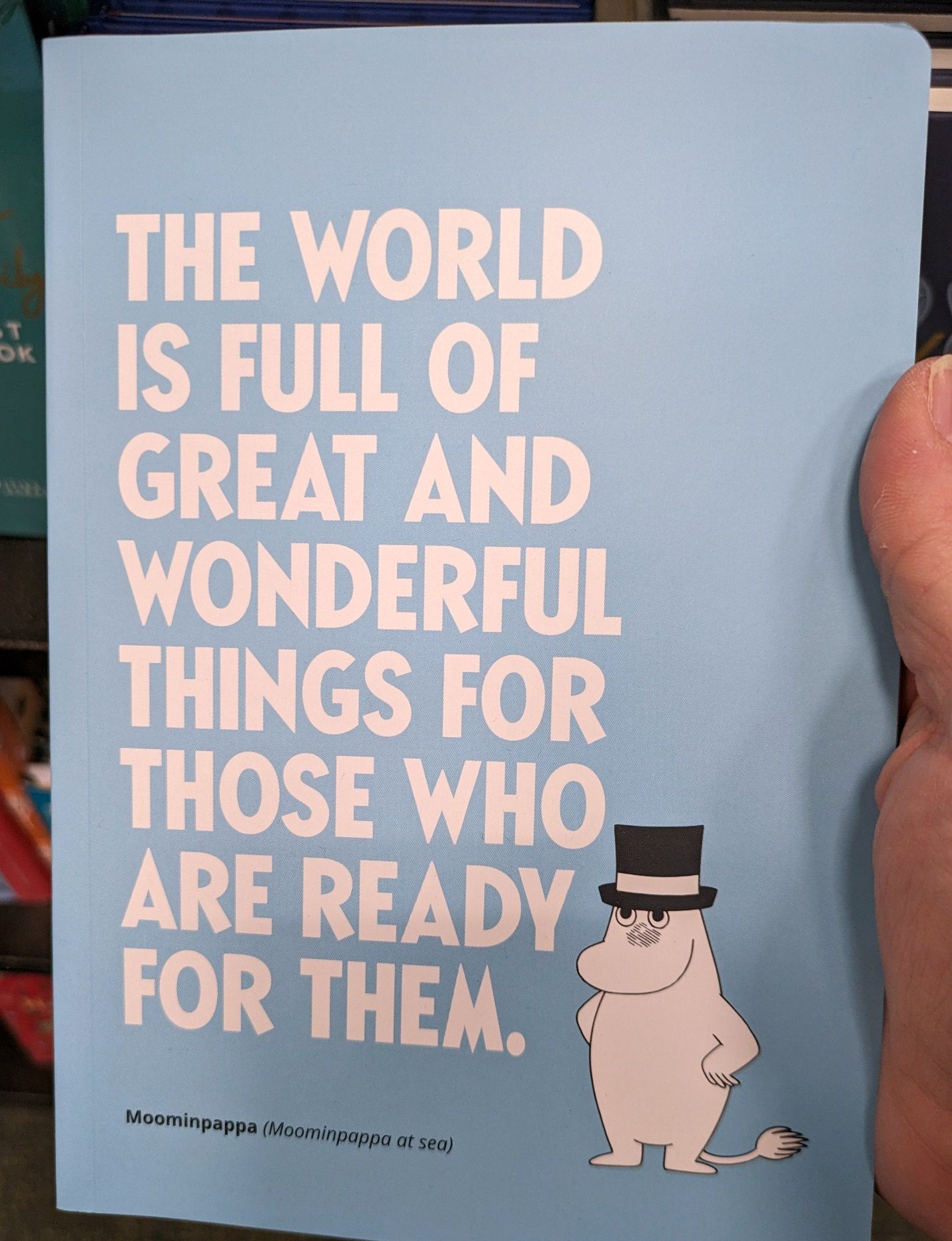
Putinki is from Finland and part of their line is products centered on the Moomin characters. The look is Dr. Seuss-ish but if you’re into this Scandinavian children’s book and comic strip series that started in the 1940s then here is your notebook.
 Finland checking in. Who'd have guessed?
But that’s not quite everything I saw. Here are three notebooks I took home.
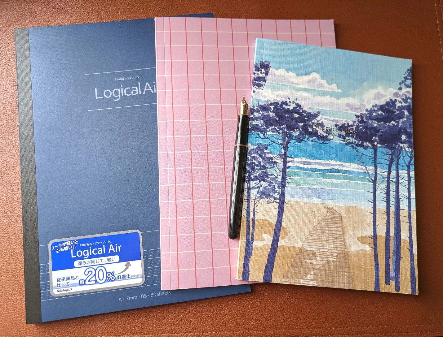 From left - Nakabayashi Logical Air, Notem, and Quartier Libre notebooks from Barnes & Noble.
First up is a Nakabayashi Logical Air B5. Nakabayashi notebooks are like Kokuyo and Itoya Profolio to me in that they tend to fly under the radar despite offering excellent paper quality at good prices. I’ve had a few notebooks with their Logical Prime paper which is thicker and smoother than the Air version. Their selling point is that the thinner Air paper saves weight and bulk.
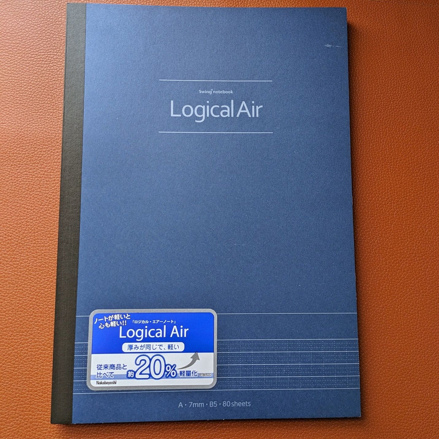 Nakabayashi Logical Air B5
The pages also have a combination of varied lines and markings that can help you organize and subdivide pages based on your needs. The inside cover details this feature for your convenience.
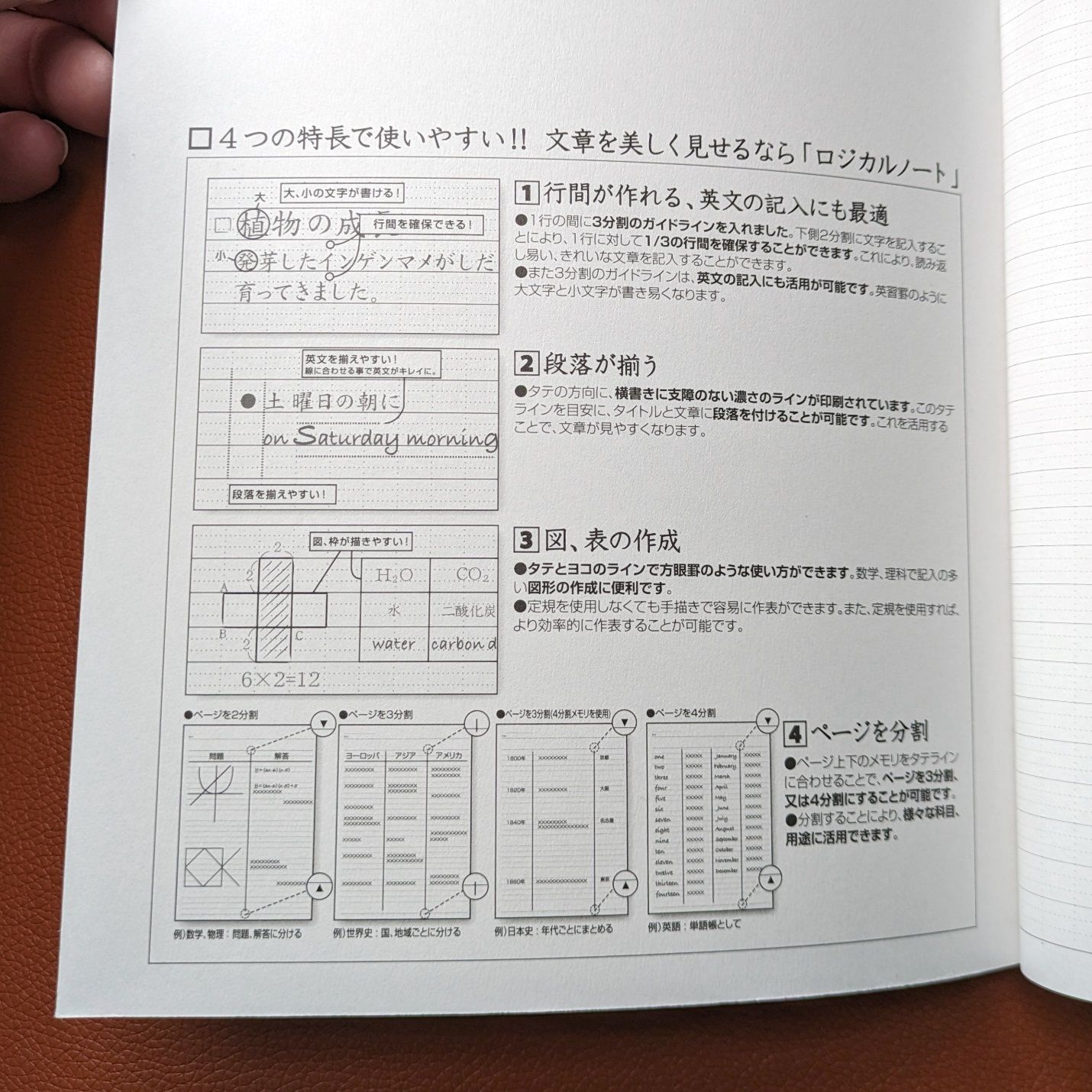 You don't have to do any of this stuff, but it's kind of neat to see the possibilities.
The paper has more texture than I thought it might but not to the detriment of the writing experience. The binding lays flat easily, which is always appreciated. The outside is plain, but for $7 I think it’s strong value for the paper quality and how many pages you get.
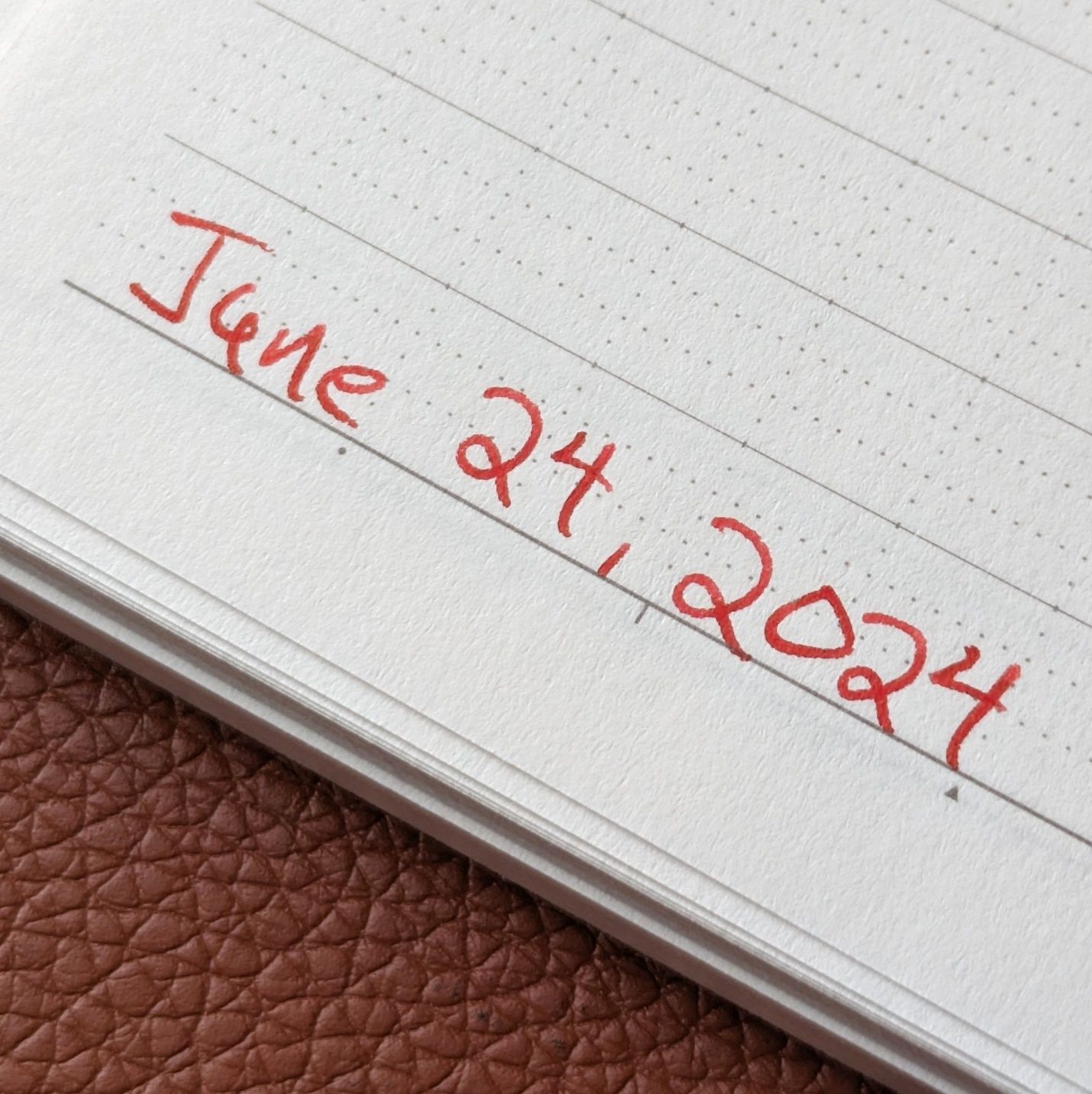 Diamine Wild Strawberry in a Parker fine steel nib on Nakabayashi Logical Air 56gsm paper.
The next notebook is from Notem, a Danish brand I wasn’t familiar with. This is their medium size Vita. It’s about 5% smaller than B5 standard.
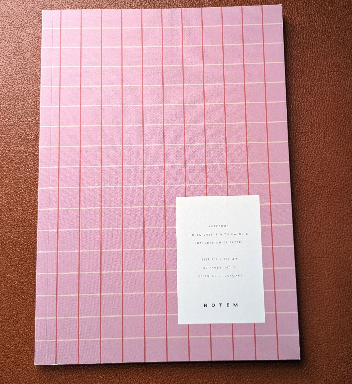 Notem Vita Medium
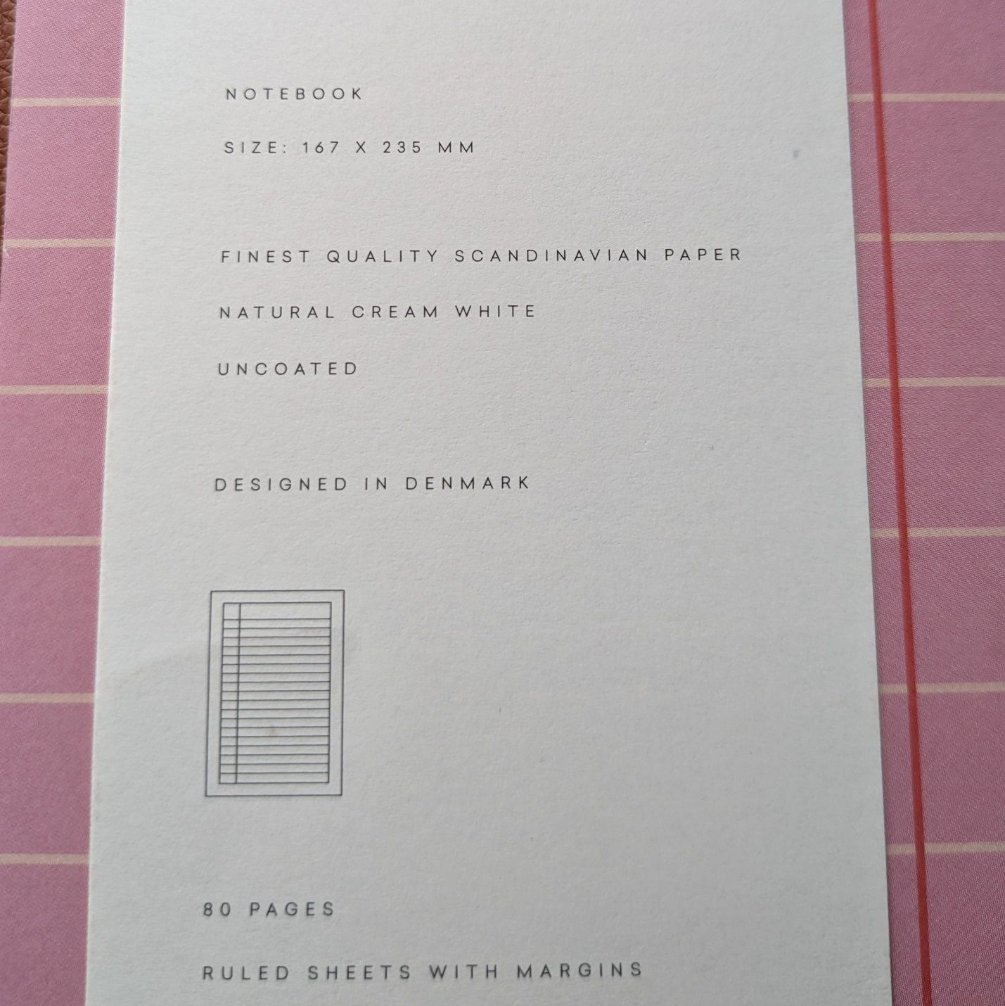
I like the cover’s combination of a basic pattern with a pop of color. The paper is listed at 100gsm and the “finest quality” from Scandinavia.
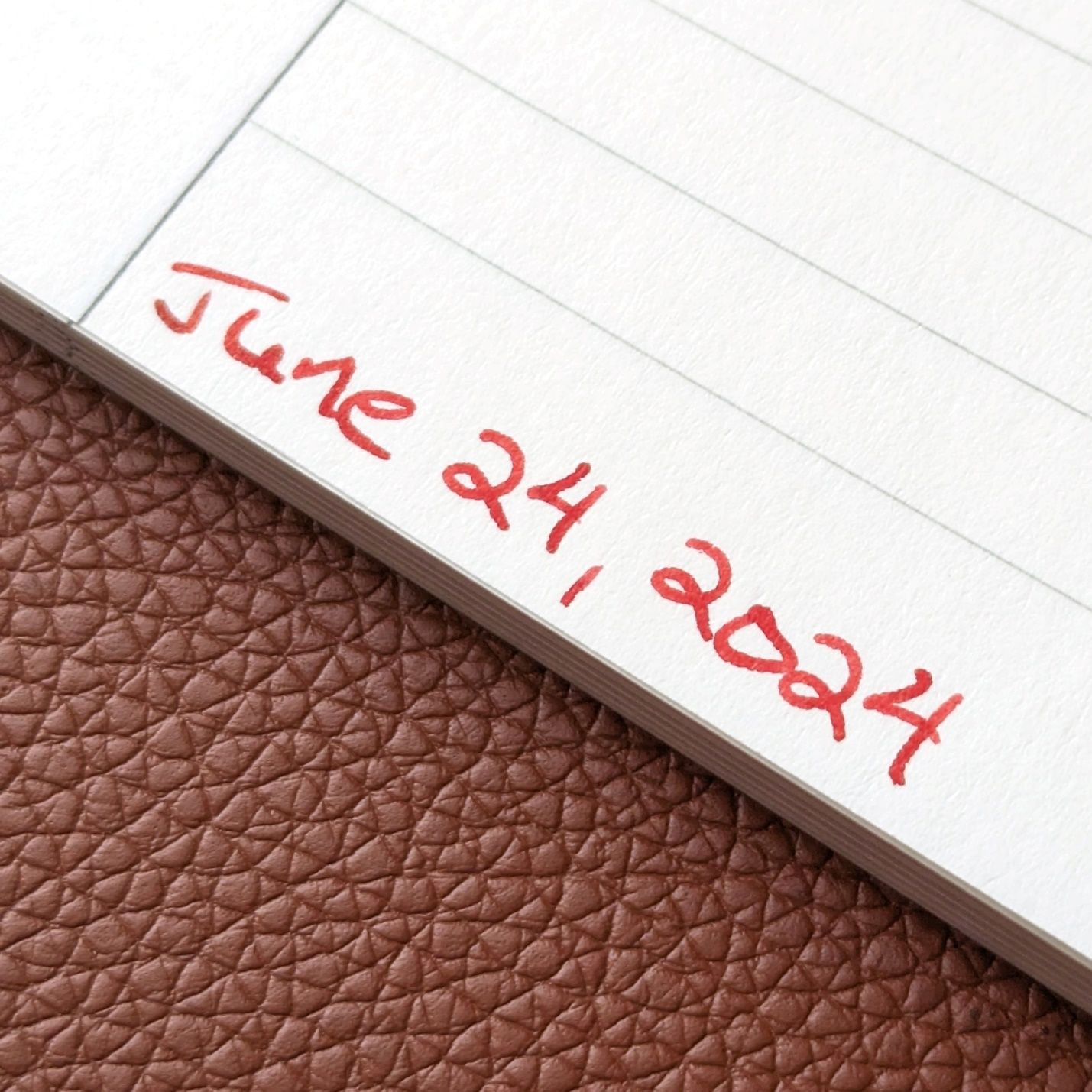
The page format is what interested me most about the Notem. It’s like a composition book except the margin is blank.
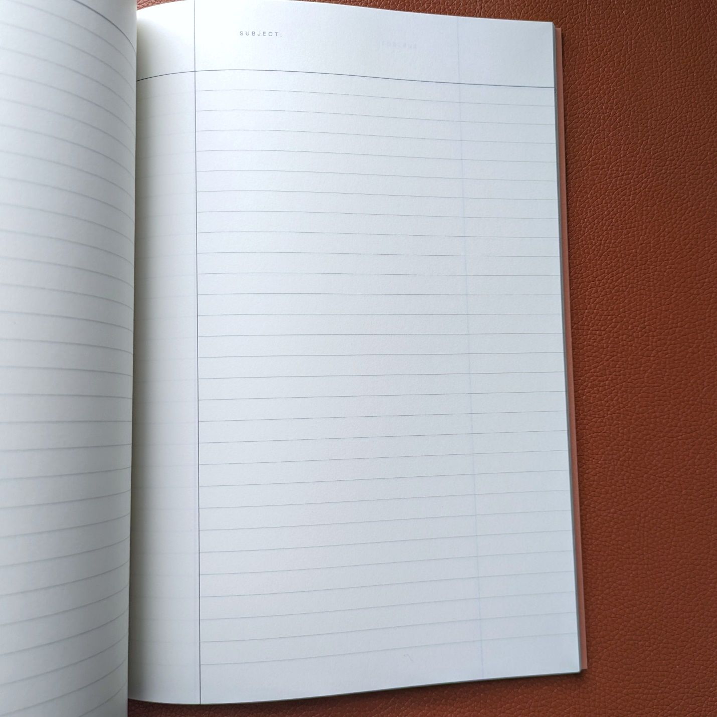
It gives a different look that I like. I always used to doodle or idly scribble in the margins of composition books, so the lack of lines there appeals to me as uninterrupted free space alongside the standard ruling.
The paper is not coated but feels pretty smooth. It gave a little feedback in the writing sample. It handled the ink well and show through level is acceptable. The Notem cost $12.99. The paper size is just a bit smaller than the Nakabayashi, but you get 80 sheets in the Nakabayashi versus 80 pages (40 sheets) in the Notem. Fewer sheets keep the Notem relatively light and portable because 80 sheets of their thicker paper would get a bit hefty.
 Diamine Wild Strawberry in a Parker fine steel nib on Notem Vita 100gsm paper.
Notem’s product aesthetics are in the Ikea vein, which would track with the Scandinavian origins. If that jives with you then I think their notebooks are worth a punt if you see one around.
In some ways, the last notebook is the least “me” of the group but it was the first one I picked up and immediately knew I was buying.
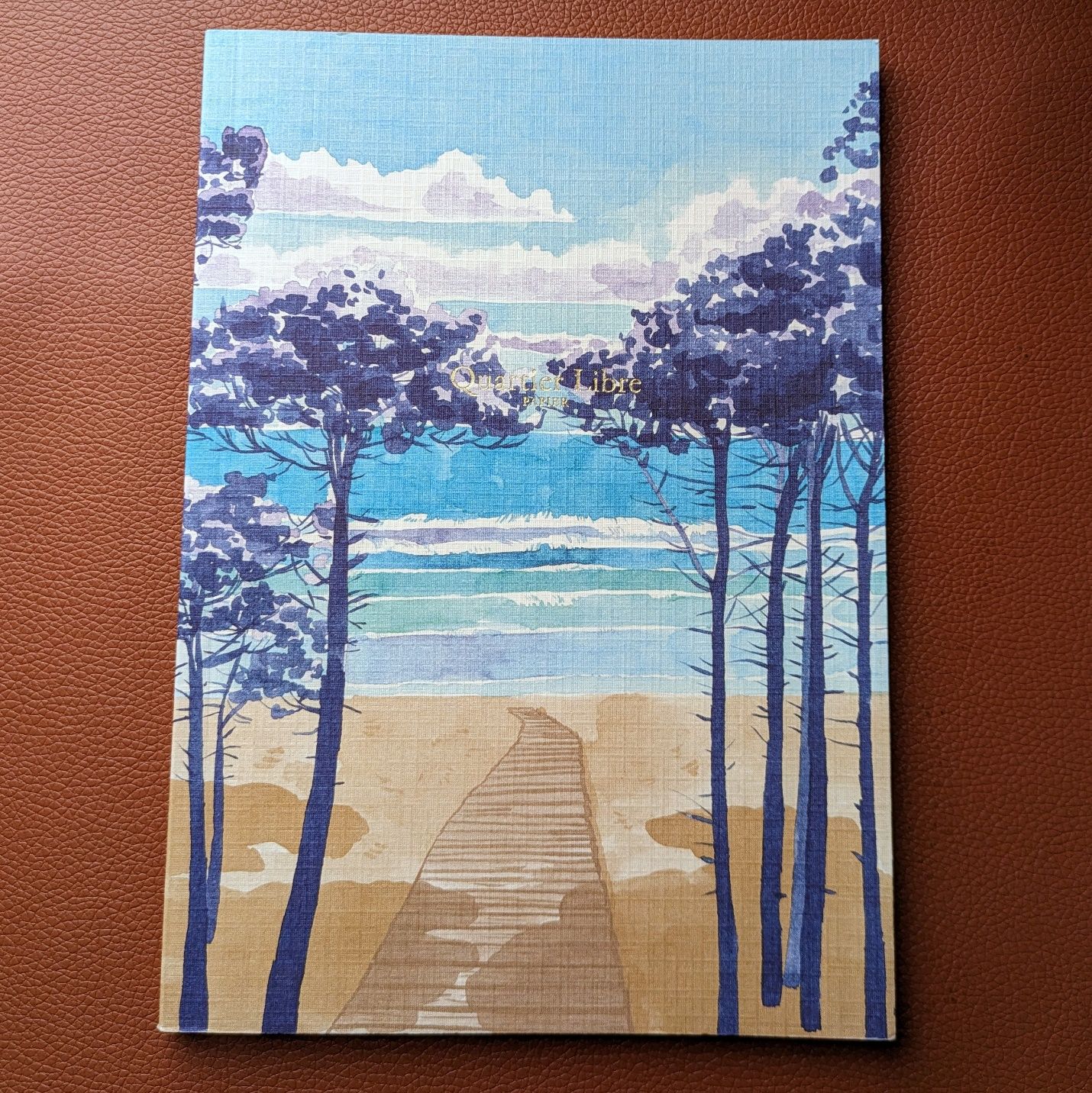 Quartier Libre Landes A5
This is an A5 from Quartier Libre and the cover pattern is called Landes. My French is awfully rusty, but the company website tells me they are headquartered in Toulouse and make their products in the Occitanie region.
The cover art is what got me on this notebook. I like it a lot.
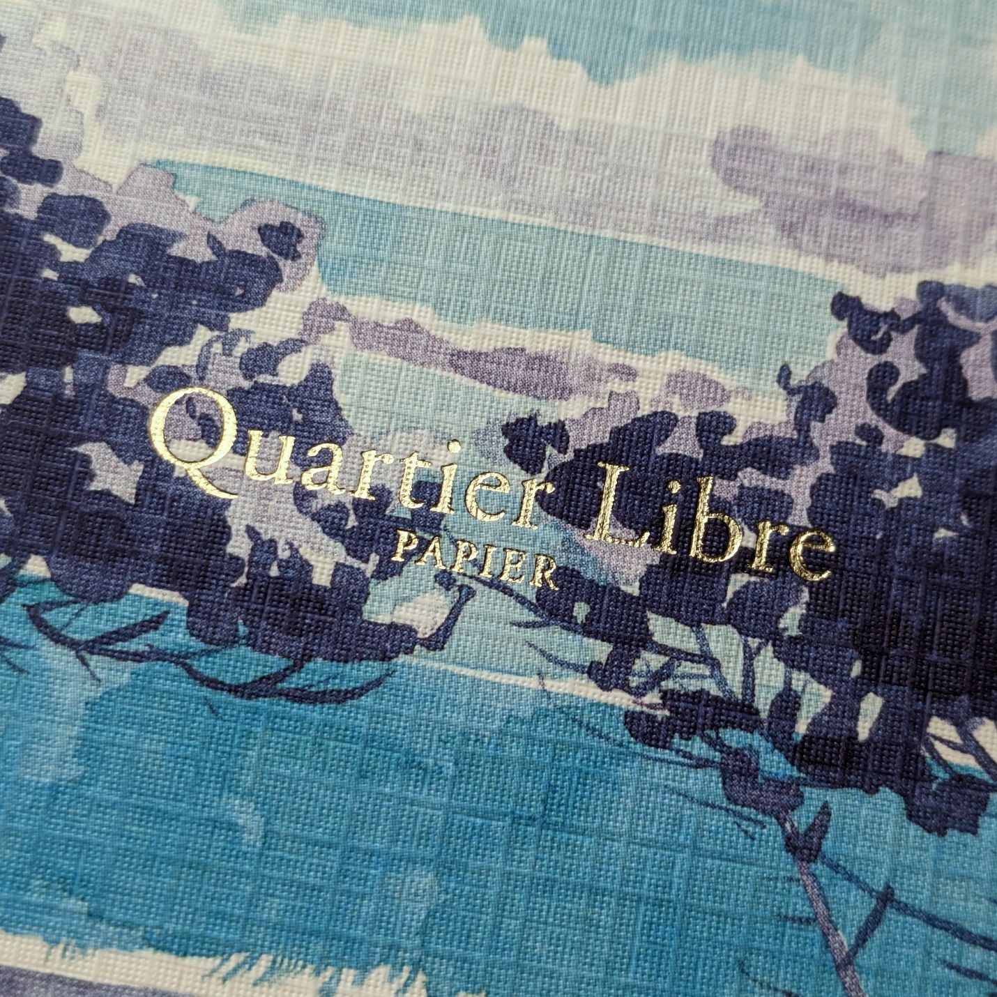 Hot foil stamped logo looks great.
There’s a texture to the cover as well. This may seem an odd comparison, but the pattern and texture are a lot like the dust filter you’d find under the front grille of an air conditioner. As a notebook cover it feels nice to the touch and durable. It gives the artwork an extra je ne sais quoi. [Sorry, I just want my high school French teacher, Mrs. Russell, to be proud of me.]
The inside is where this notebook diverges from my usual taste. There are pencil drawings and quotations from French authors scattered here and there among the pages.
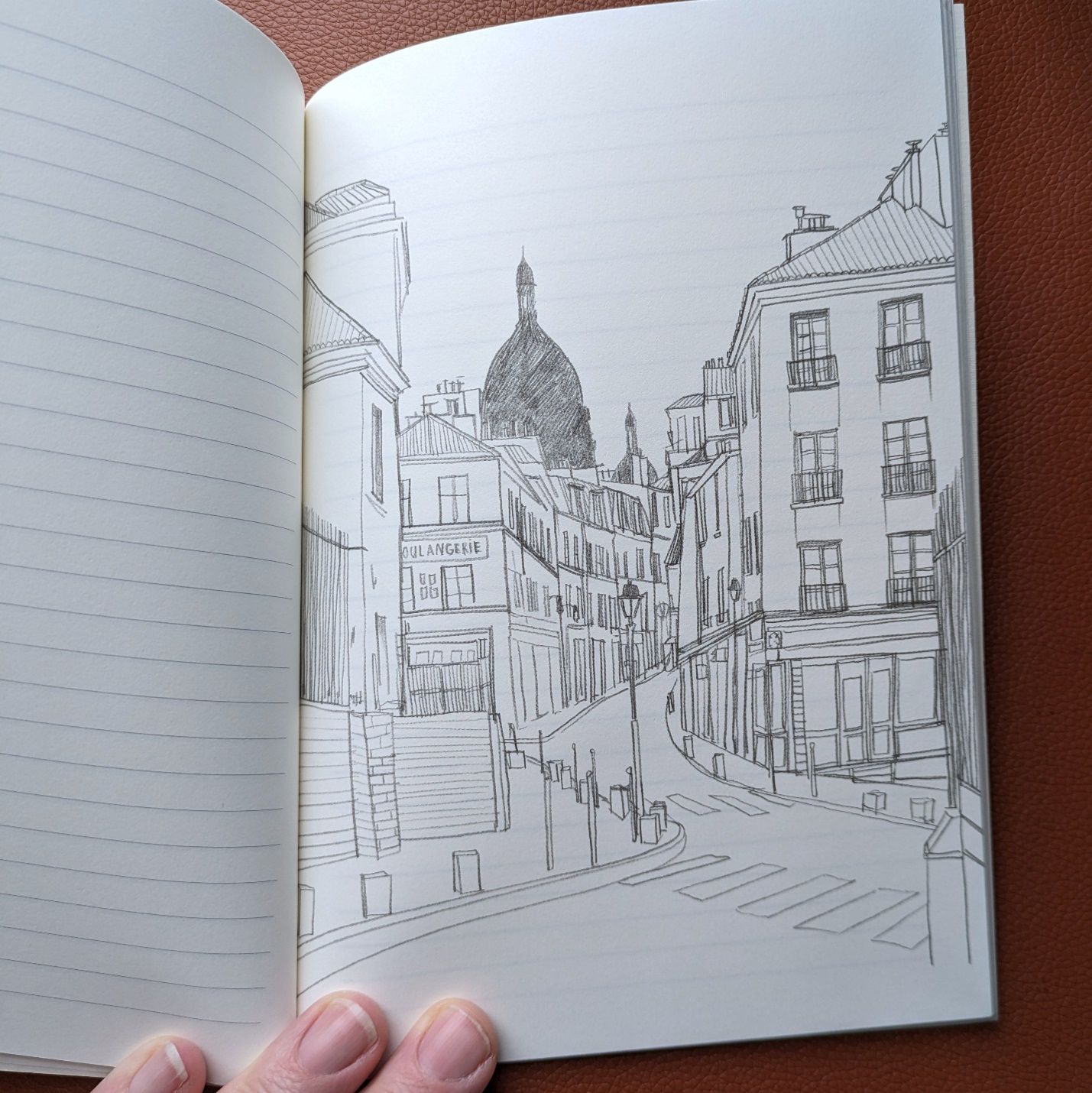 I can almost smell the baguettes.
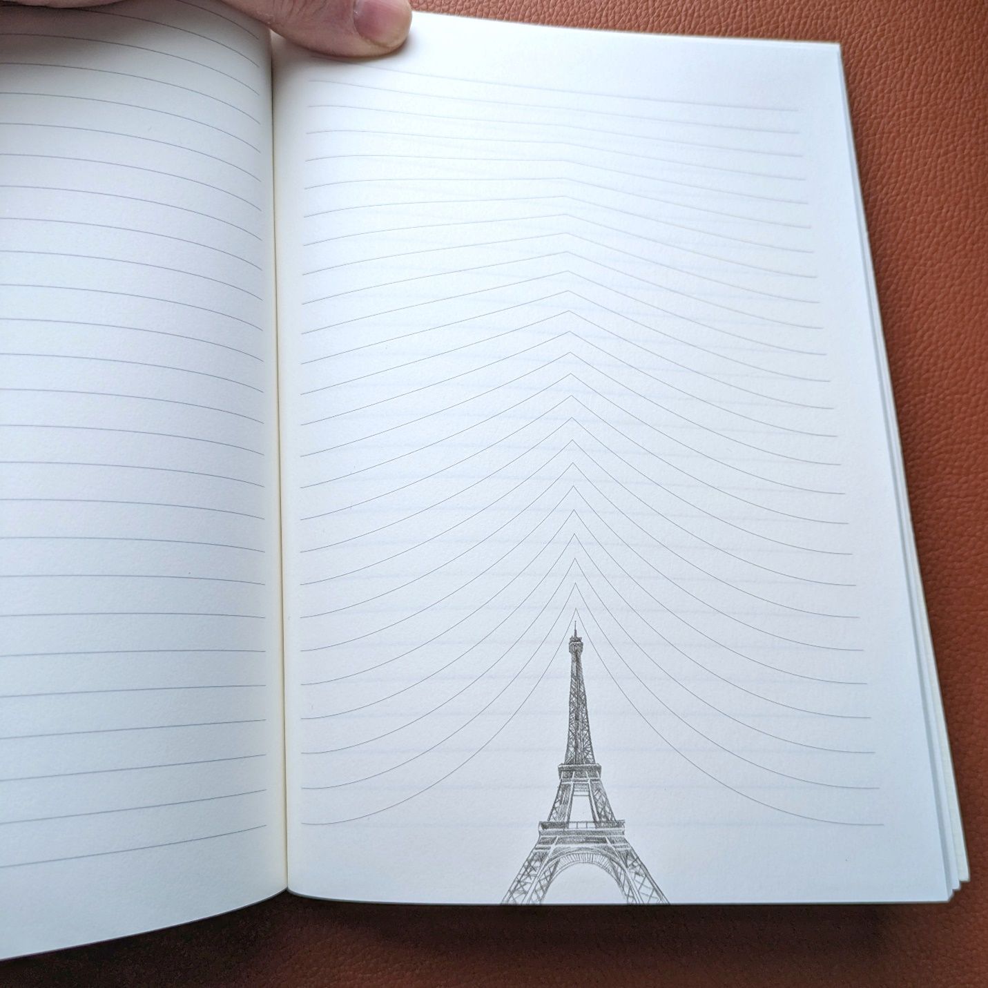 Fun and whimsical but not the best for actual writing.
There’s a bit of getting hit on the head with “We’re French, in case you didn’t notice,” but I don’t mind the added elements for the most part. A few of them, like the Eiffel Tower above, do affect the usability of a page. I just might like it better if the drawing were of a Peugeot 205 Turbo 16 or a Citroën DS. Both are as iconically French as the Tower to me.
The paper is 100gsm and smooth. There’s some texture that reveals itself on the edges of the letters but it’s minor.
 Diamine Wild Strawberry in a Parker fine steel nib on Quartier Libre 100gsm paper.
At $16.99, this is the most expensive notebook I bought. That’s getting a bit pricey for 80 pages of A5 when the primary appeal is not high-end paper or a specialized layout. But I didn’t buy this notebook for the writing experience or the additional Francophilia. I got it because I love the cover. Wouldn’t be the first time I (or any of you) bought a notebook for that reason. Won’t be the last.