You can thank Albert Brooks in Broadcast News for the alliterative title. I watched the movie recently and still marvel at its dialogue.
Anyway, I received my new planner from Agendio. I took the leap on Agendio’s highly customizable, but pricey, options two years ago and haven’t looked back. I find them to be worth the cost because of how much you can fine tune the layouts, colors, fonts, and many other details.
My first Agendio was A4 size. Too big, as it turned out. A5 is a better fit, having enough space to use comfortably but still compact for easy carry in hand or in a bag. I’ve changed the weekly layouts from year to year as I winnow down what works and what doesn’t within them. Let’s look at my 2024-25 model….
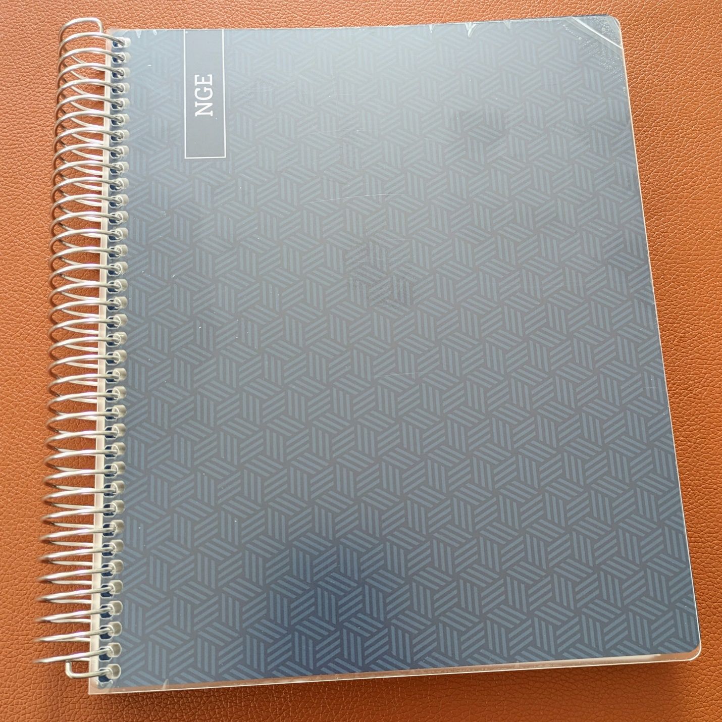 Durable clear plastic covers overlay the printed cardboard designs. They ship with cling film to prevent marks during shipping, which is a nice touch.
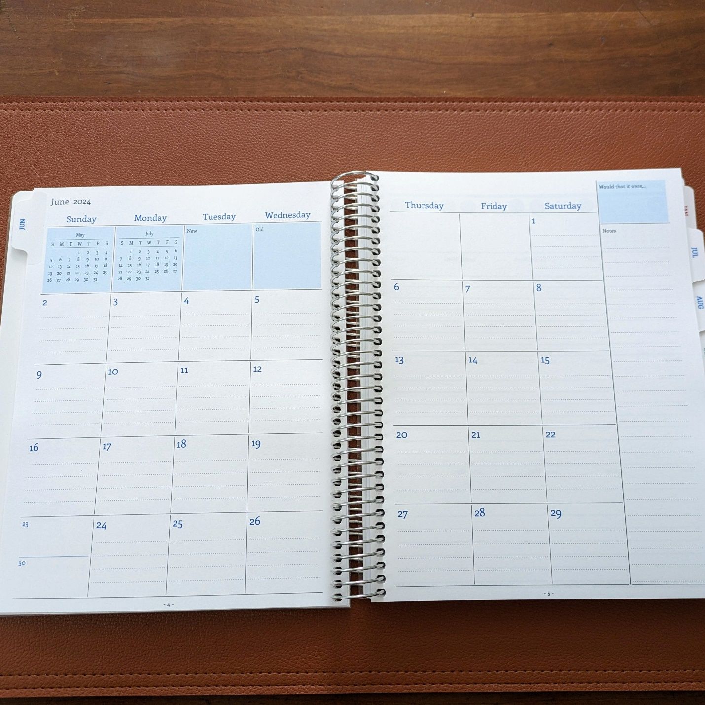
The monthly layout is basic and essentially unchanged from two years ago. I use it as most would, for keeping track of important events in one place for quick overview. There are a few spots where the custom details Agendio allows came in handy.
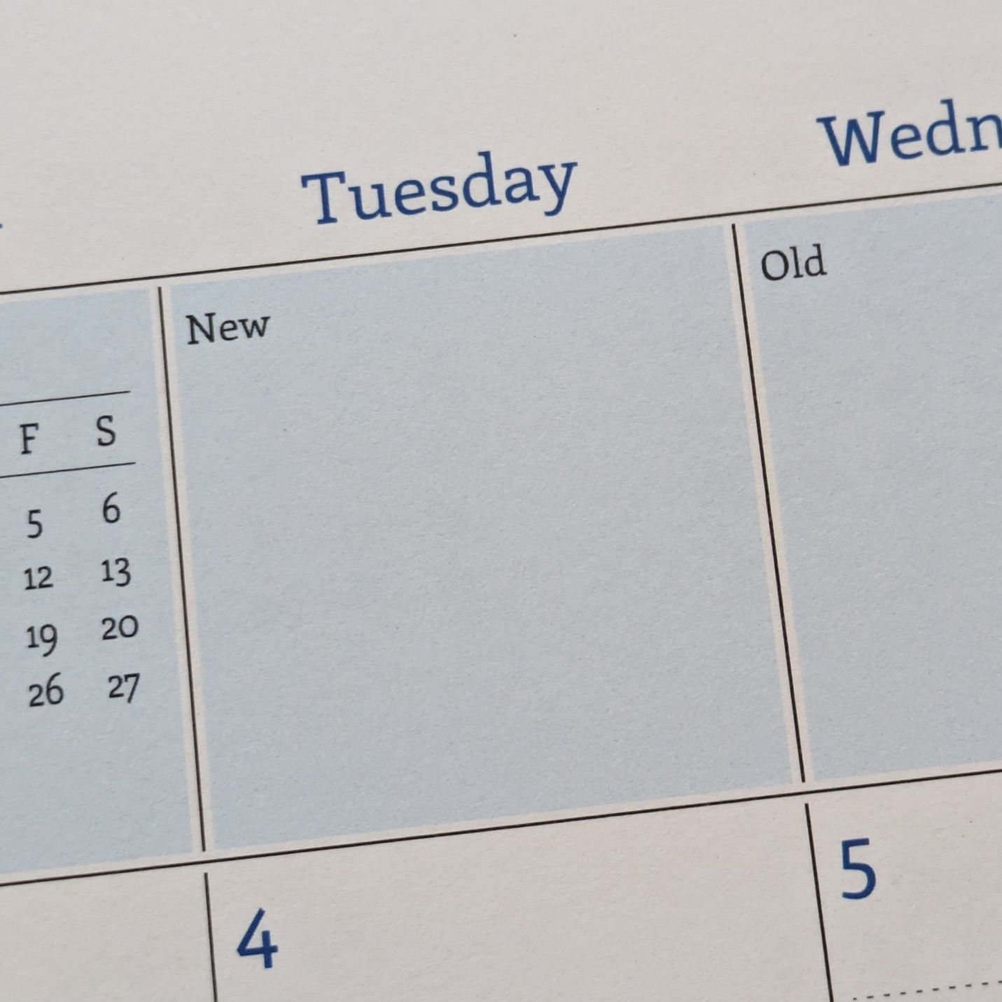
I got the blank blocks next to the previous/next month mini calendars titled New and Old. I envision New as a spot to highlight one or two items that are being changed or introduced for the month. Something like “Summer Menu Rollout” or “Printer Replacement.” Old will be for anything lingering from the past month that still needs to be kept in mind. Could well be printer replacement here too, given the speed of supply chains these days. ;-)
The blank space over the right-side notes column also got a tweak.
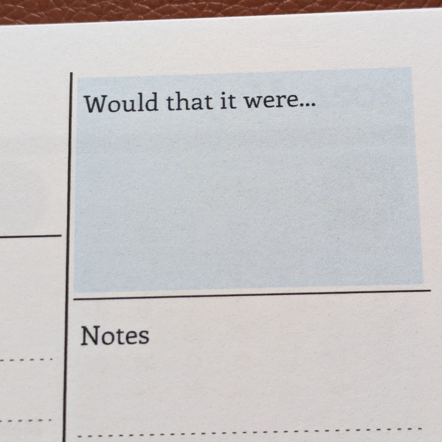
I’m not one for laying out hopes and dreams in my planner, but I thought this small space could be used for a bit of fun in terms of a brief wish or want. In July this could say “Not 90 degrees every day” or “I had a hundred wishes.” Not a place for profound observations, were I even capable of making one, but something silly to bounce off the mundane feelings that can color the work routine for all of us.
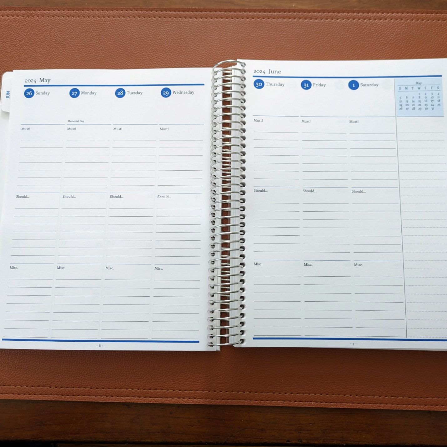
The weekly layout is new for me. I previously avoided the each-day-as-column format because I didn’t think it would give me enough room. But over the past few years I’ve found that a day’s notes are primarily bullet points and to-do items. My thought is a format tailored to that content will help organization and reference.
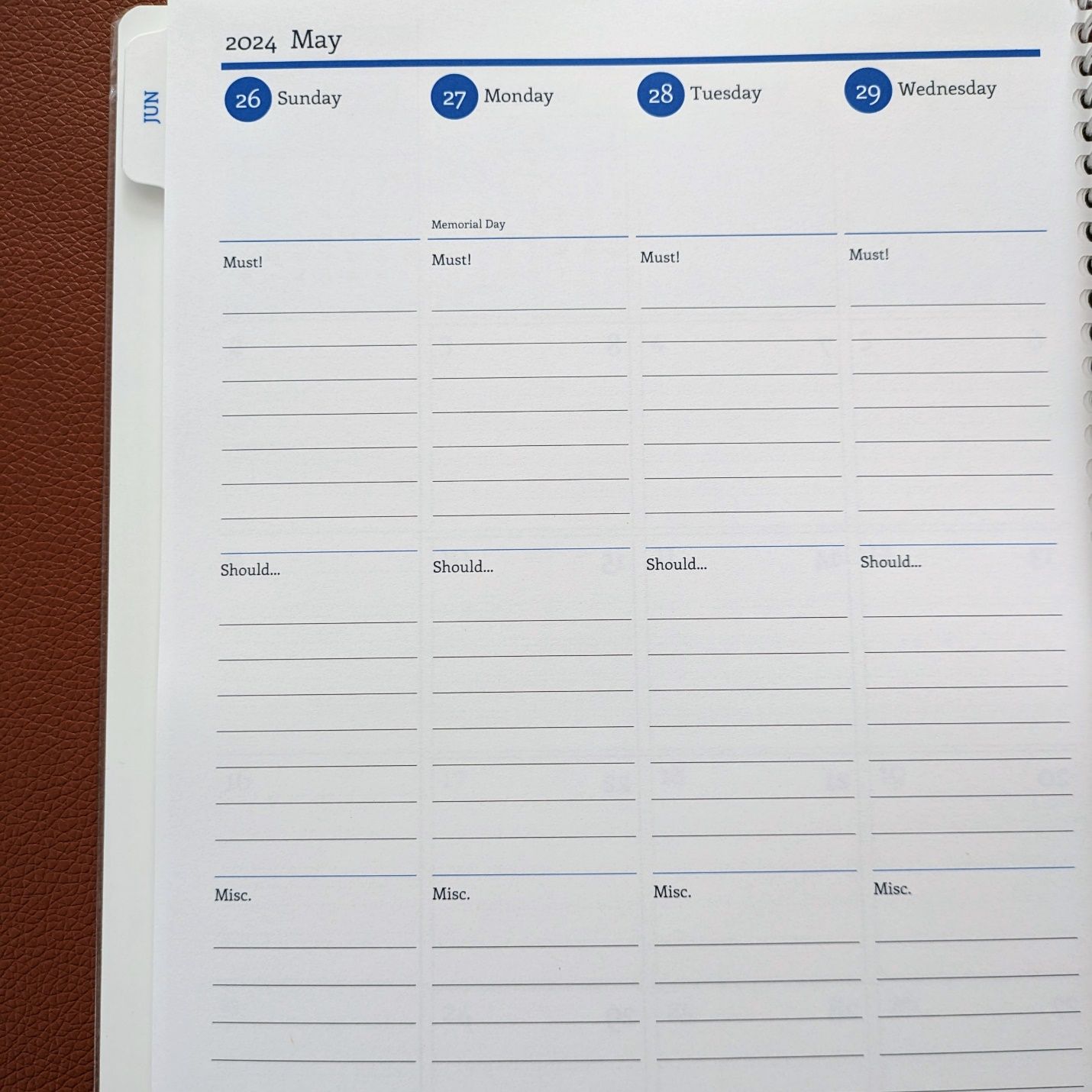
Each daily column has three sections and Agendio lets me give them a custom title. The top section is called Must! to designate the day’s priority tasks and necessary events. Completing my department’s payroll would go here because it is a must-do item every workday. If we were expecting some kind of VIP visit that would go here too. The middle section is called Should… for the items I want to do but aren’t an absolute requirement, e.g., I should try to get ahead on writing performance reviews so I don’t have to do them all in a bunch later. The bottom section is called Misc. to collect the random notes and occurrences that I want to keep tied to that day but aren’t something I’m personally controlling. “Email down for 2 hours” or “High order volume” is something I’d put in Misc.
I could have titled the sections A, B, C or 1, 2, 3 but the use of specific words to connote levels of importance helps my brain with hierarchy. Work days are often full of interruptions and priorities get shuffled based on things we encounter that weren’t anticipated. I know what the daily must-do items are but that doesn’t mean I always keep them top of mind when the day gets rolling and new tasks come up. Putting things in the right category if importance and coming back to the list through the day help keep me on track.
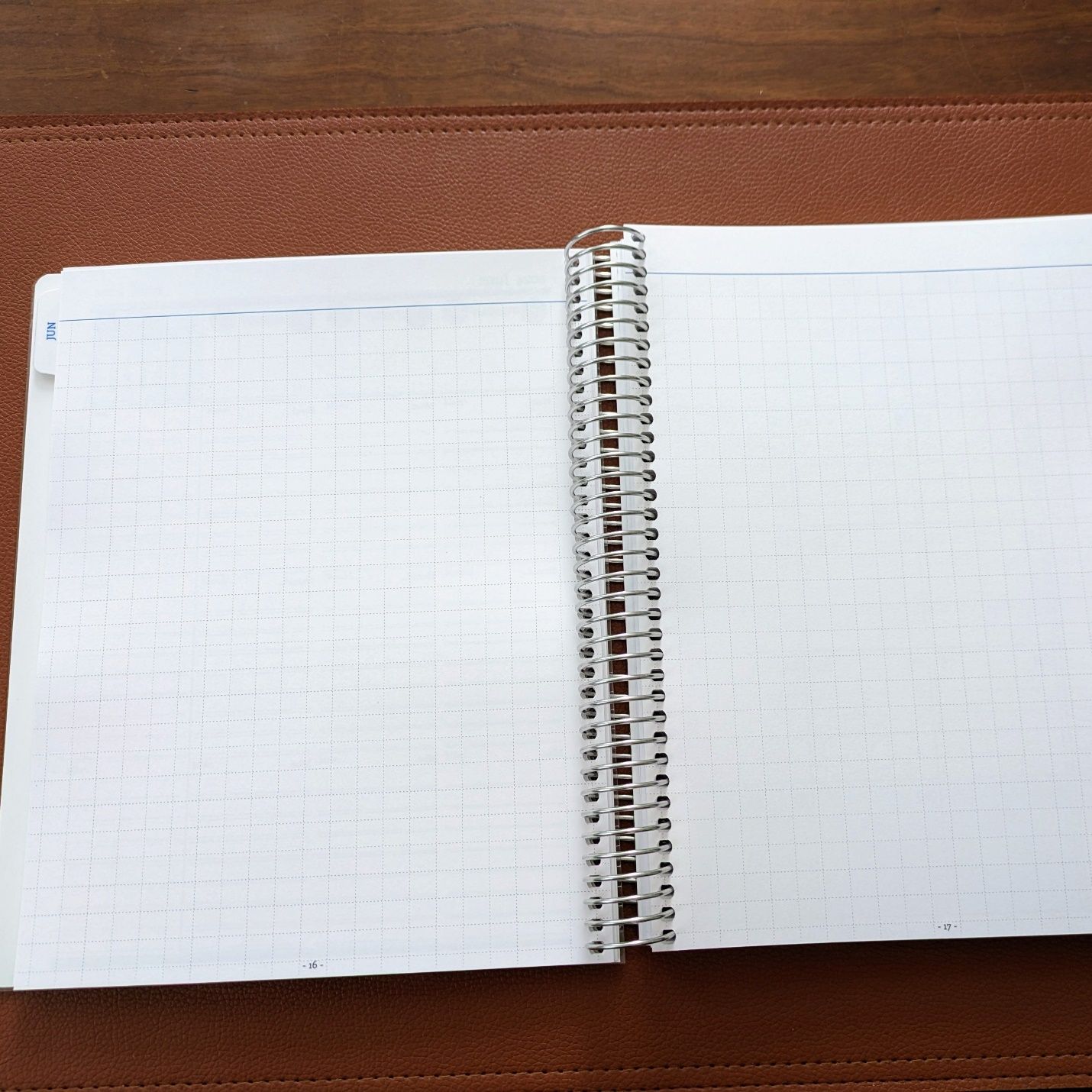
After the weekly pages for a given month, I have a two-page spread with a grid layout. This is the whatever-I-need-it-for space where I prefer grid to lined, blank, or dotted pages. This is where I can take longer form notes, lay out things to work on over the whole month, or keep a shopping list.
Recently I discussed switching to a multipen for writing in my planner. That’s been going for a few weeks and working well. I tried 2-component and 3-component bodies for the Pilot Hi-Tec-C Coleto. Both have pros and cons. I prefer the 2-component body for a few reasons. First, it has a slimmer body but still enough diameter for a good grip. Second, two color options cover what I want for the planner. Third, the clip fits neatly on the planner’s spiral binding so I can keep the pen there. Lastly, it’s a clear demonstrator. I’m usually a sucker for that look and the 2-component setup has a nice symmetry this pen can display.
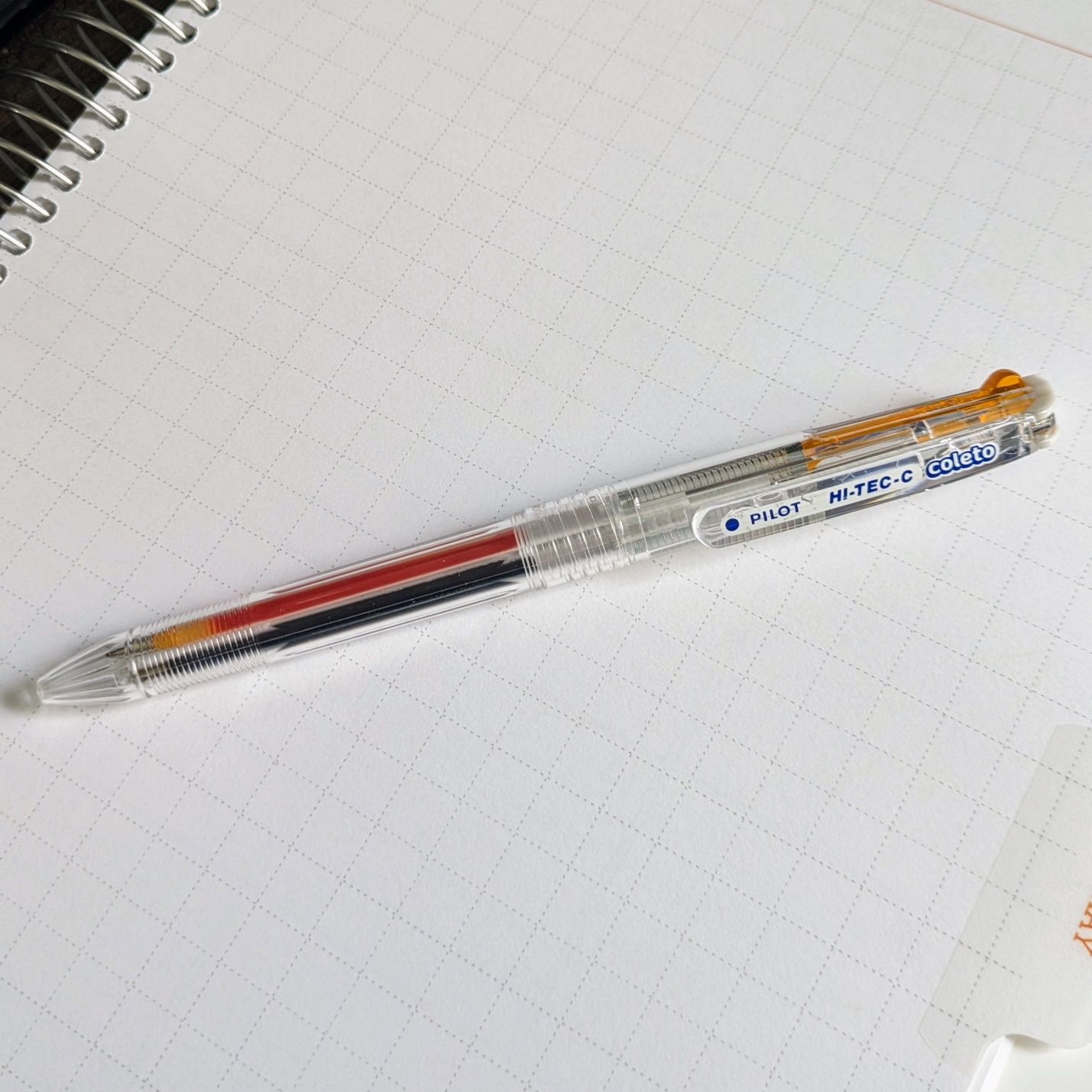 Pilot Hi-Tec-C Coleto 2-component Multipen
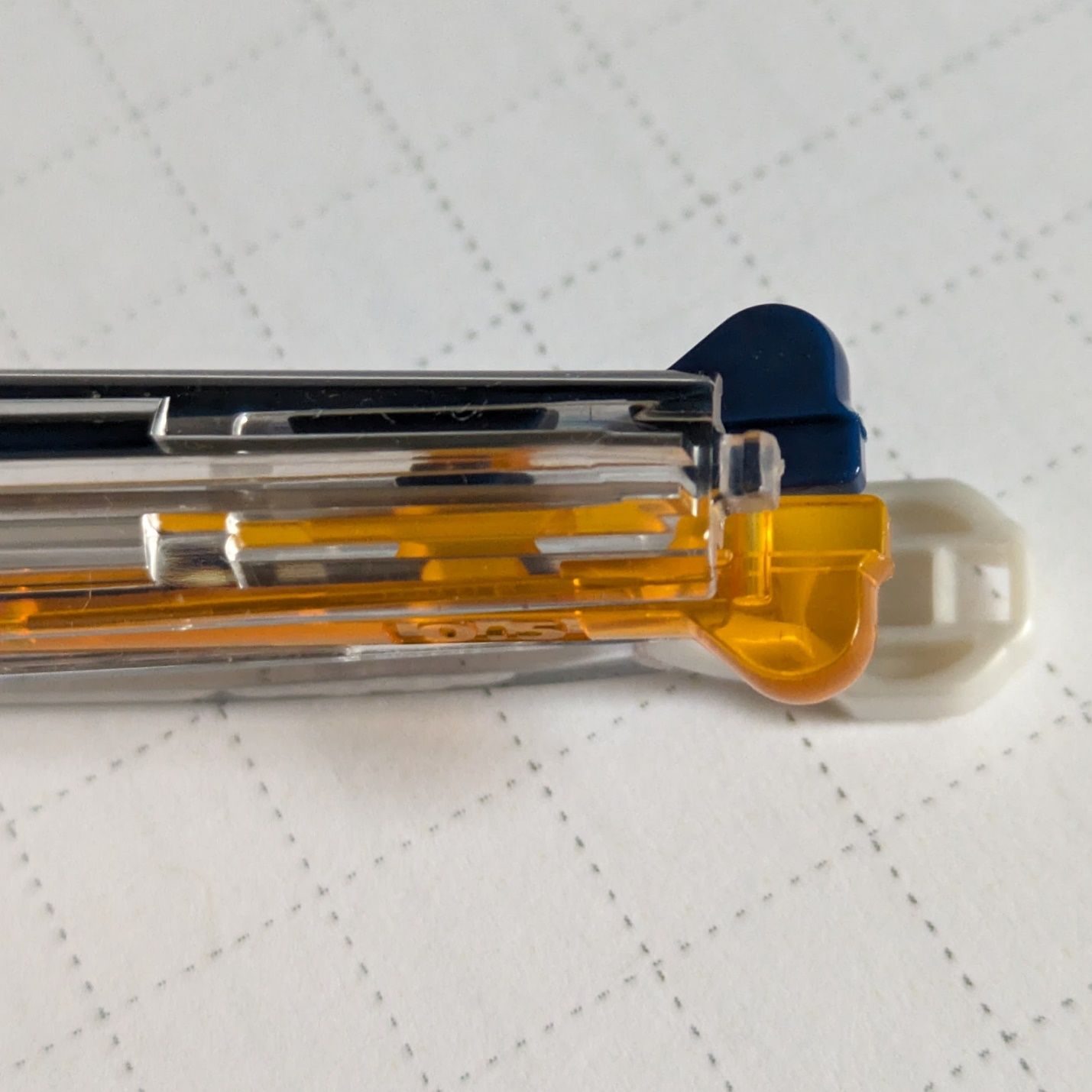 I chose Blue Black and Apricot Orange refills in 0.5 tip size.
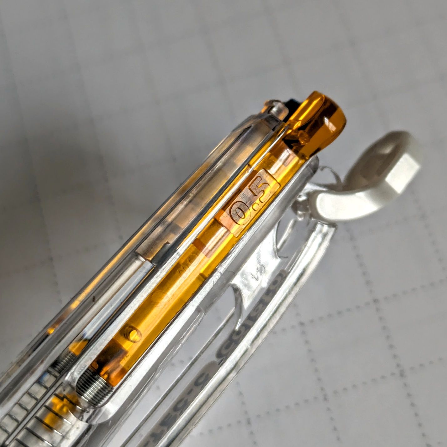
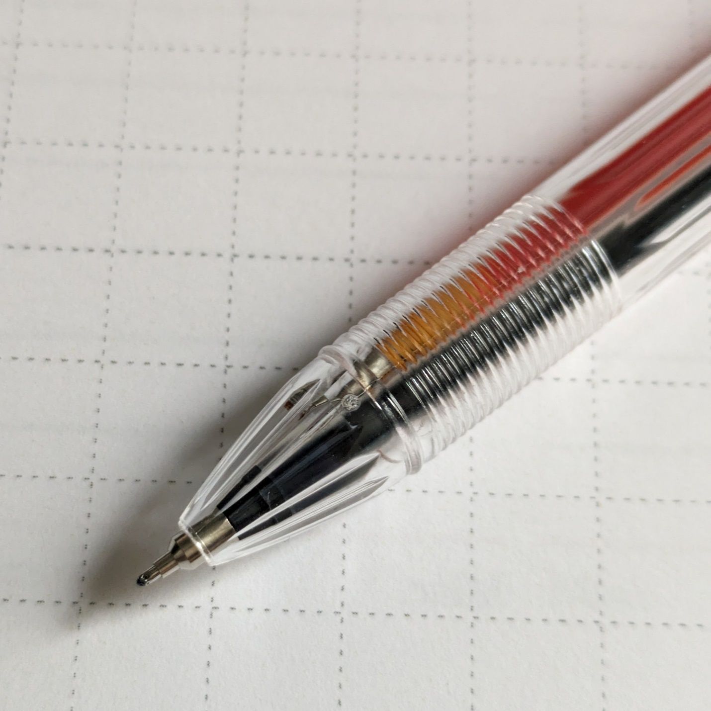 The grip has small ridges that hold your fingertips in place but aren't sharp or uncomfortable. Basic, but they work.
I received and started using the Coleto before ordering the new planner. Because the Coleto has performed well, it led me to choose a different paper weight than I had in previous planners. I had used the heaviest 120 gsm paper to accommodate fountain pens, my preferred daily carry. Now that the planner entries will be done (almost) exclusively with the Coleto, I stepped down to the midweight 105 gsm paper. The change allowed the new planner to come in a hair thinner than the last year’s despite having 10 more sheets of paper. Fountain pens still work fine on the 105 gsm but you’re dying to see side-by-side comparisons, right?
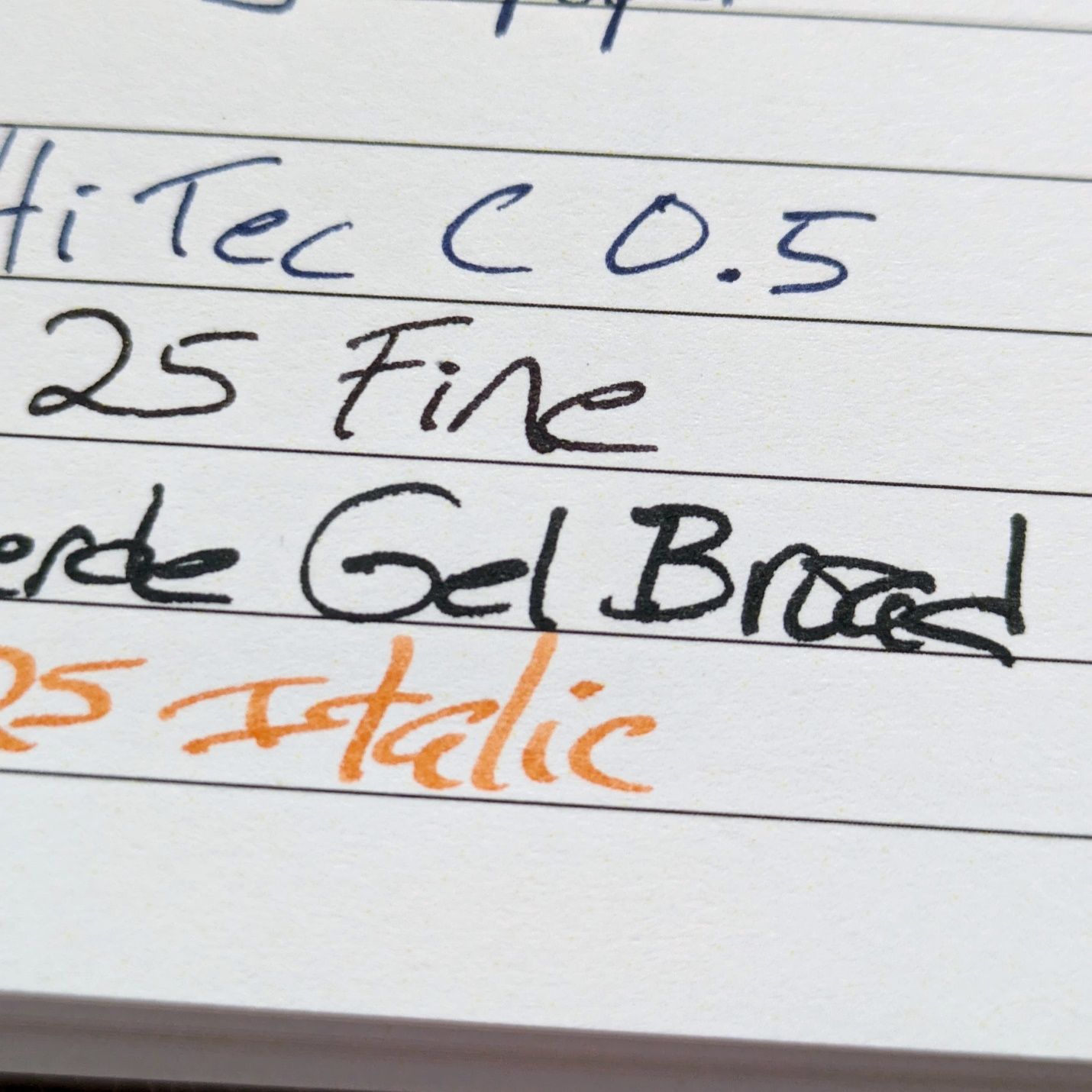
First is the 120 gsm paper.
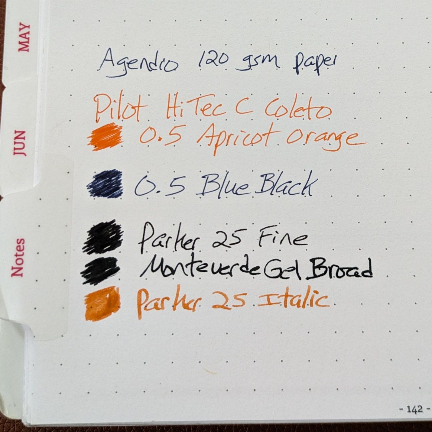
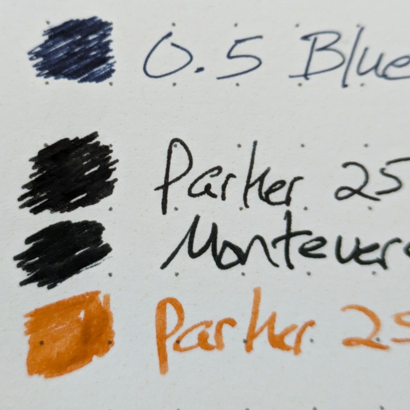
The Coleto refills are fine, as one would expect. The fountain pens dry quickly without feathering. Color representation is good. The Monteverde broad gel is a very wet writer but has no problems on this paper.
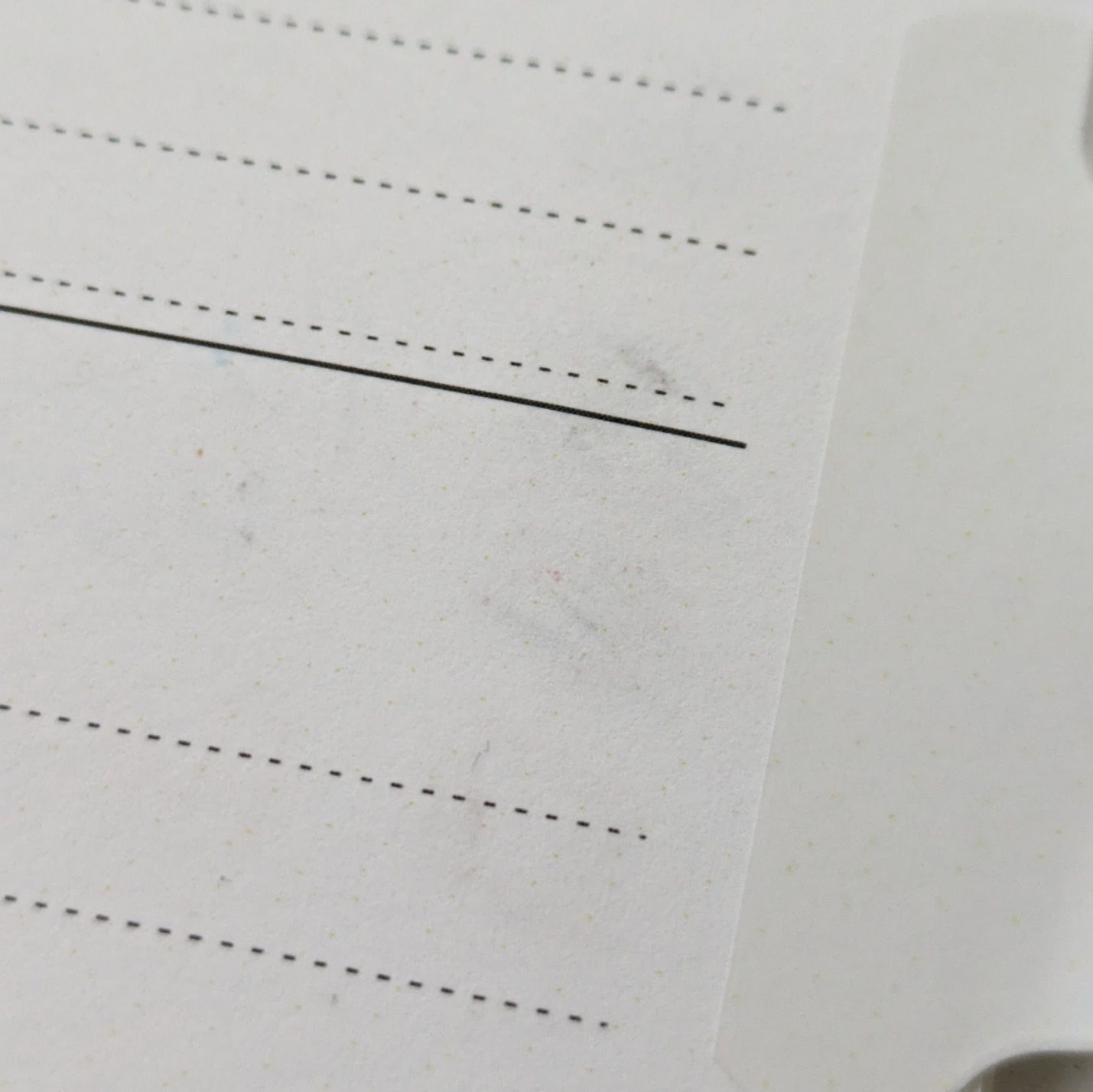 Agendio 120 gsm paper
There is some light show through where the fountain pen and broad gel swatches were made, but no impact to reading or writing on the back side,
Now the 105 gsm paper.
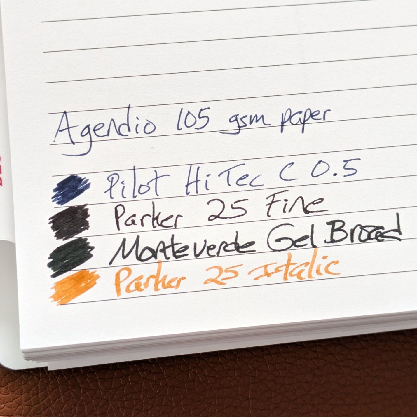
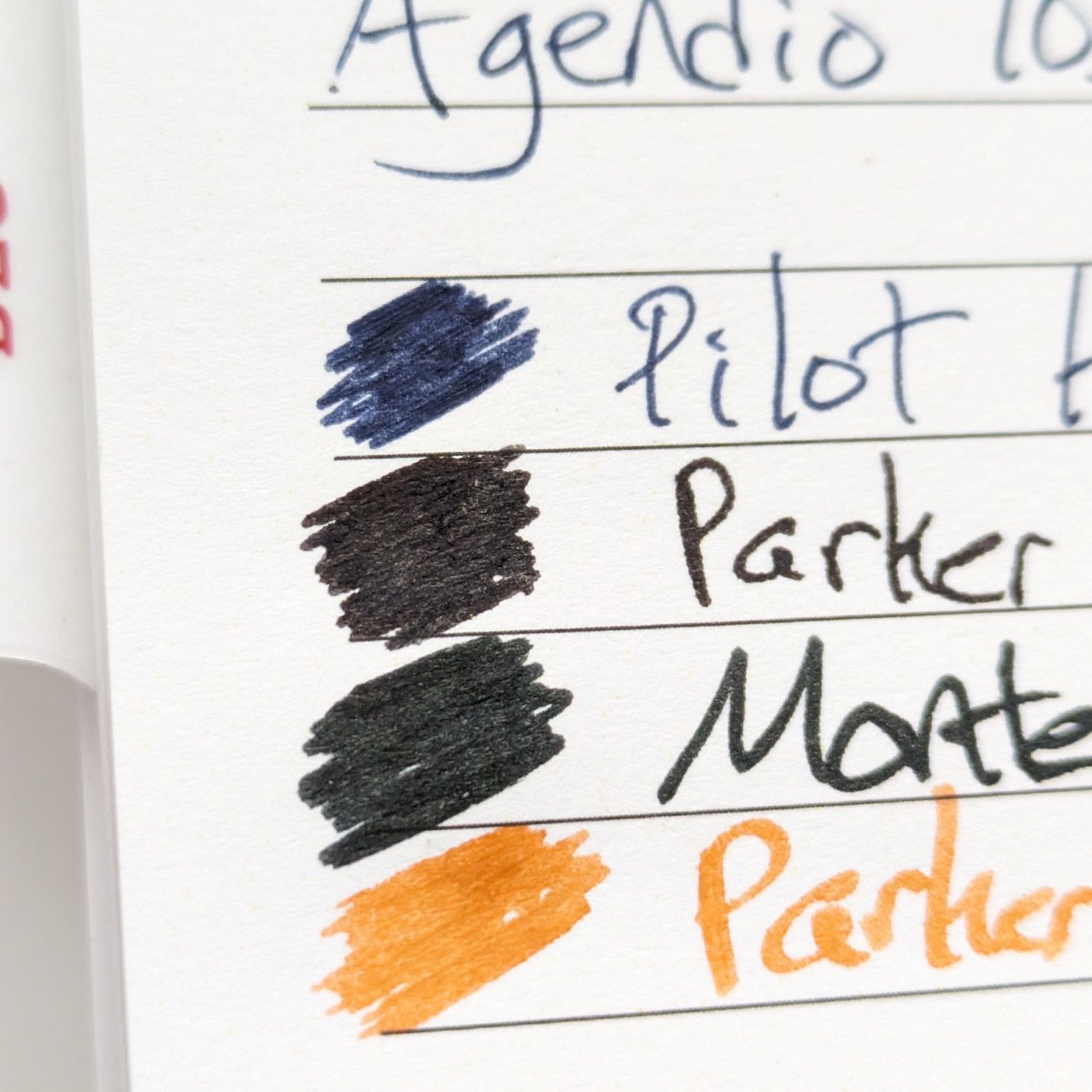
You can see the effect on the paper’s surface where ink is concentrated.
Again, there’s good dry time without feathering. I feel that any roughness at the edges of letters is a result of the paper’s texture rather than ink spread.
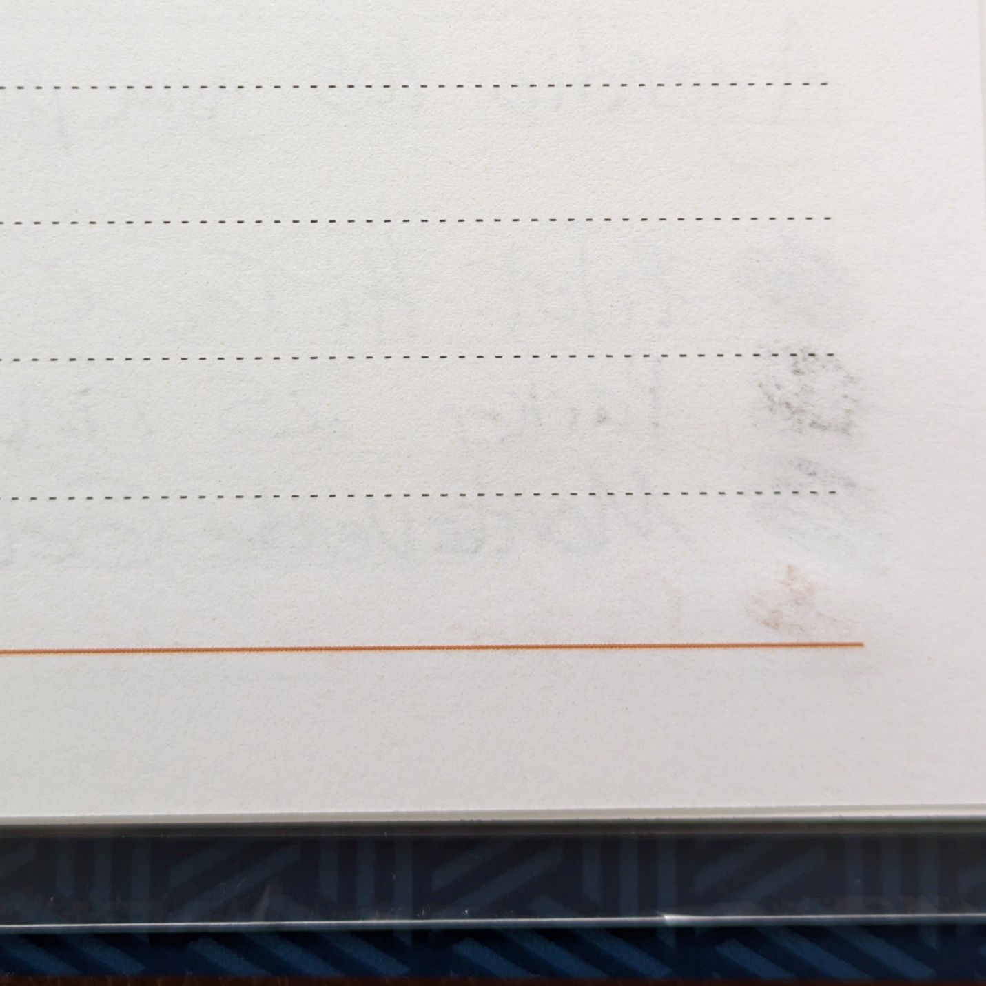 Agendio 105 gsm paper
There’s more show through on the back with this paper than the 120 gsm, but no degradation of usability.
I started with Agendio to overcome the big problems I had with almost every off the shelf planner. Now I’m in a place where I can tweak parts of a proven product to suit my changing needs or wants. Titling a 1 x 1.5” section of paper with “would that it were” is getting into deep reaches of stationery geekdom. But that’s why there’s a market for products like Agendio that recognizes and embraces one’s need to have it just the way you want it. That’s why we own dozens of pens, notebooks, inks, rulers, markers, on and on to the smallest detail of the biggest collection.
I don’t have a standard currently inked lineup to present right now but I would like to show the Parker 25s that were used in the writing samples for the planners.
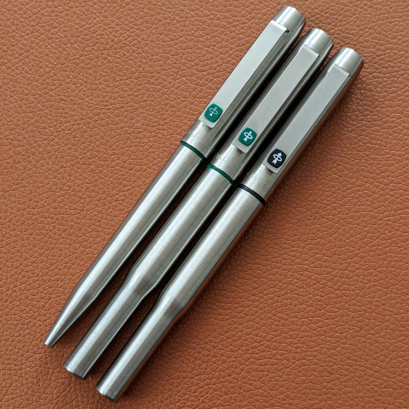
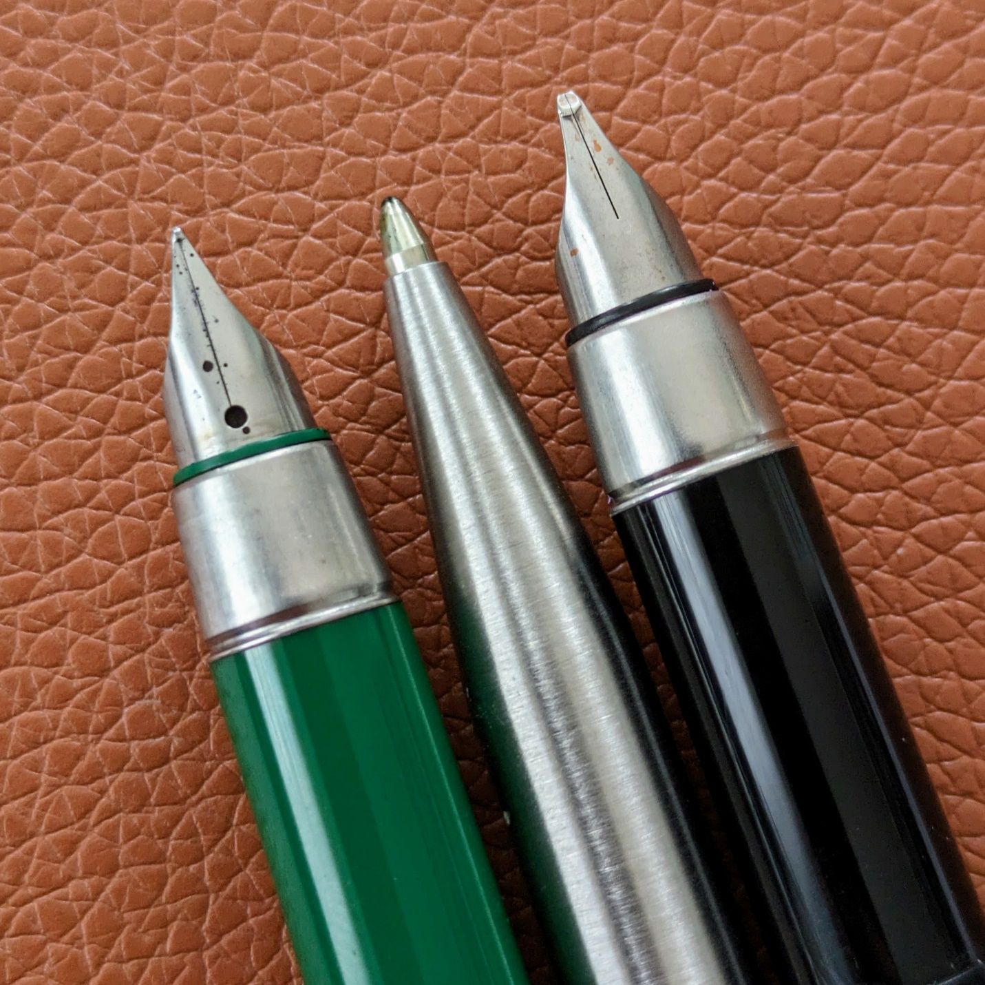
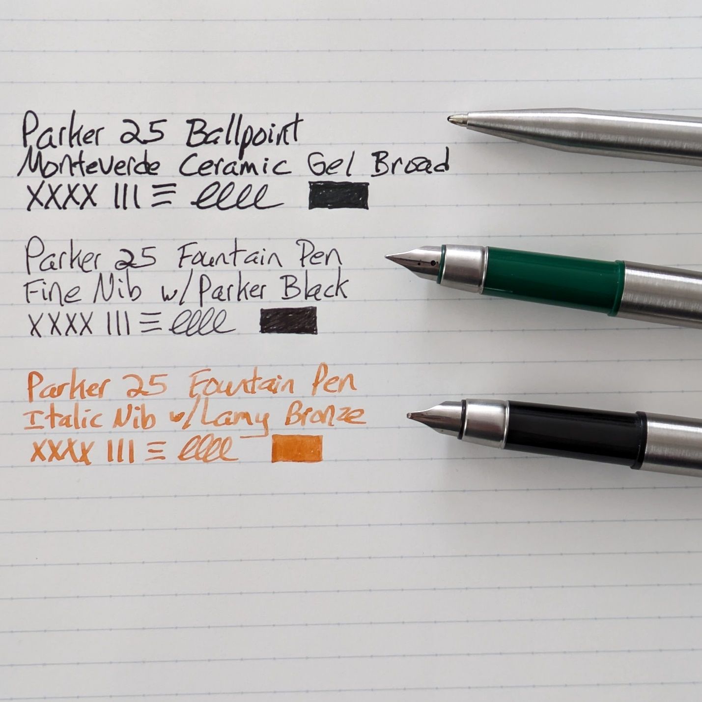
The 25 is a great pen and worth examining in further detail at some point. I inked the fine nib last week and used it at work for a few days. I enjoyed it such that I chose to ink the italic nib too. I don’t normally have two of the same model pens going at once but the simple design and brushed steel finish of the 25 really clicks with me. They also write like champs. The ballpoint came as part of a set with the fine nib pen. I don’t use it as often as my preferred rollerballs but it still has that great Parker knock and a satisfying feel in hand. With the right refill it’s a solid user.
Thanks for coming down the long and winding planner path today even if it wasn’t on your agenda.