 |||
|||
Some new inks to try, getting the one that got away, and a rich girl private eye maneater made my dreams no can do.
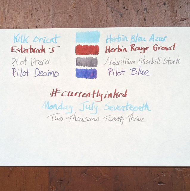
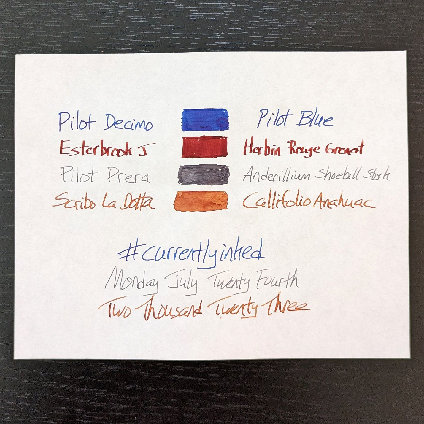
Esterbrook J with J. Herbin Rouge Grenat
Pilot Prera with Anderillium Shoebill Stork Grey
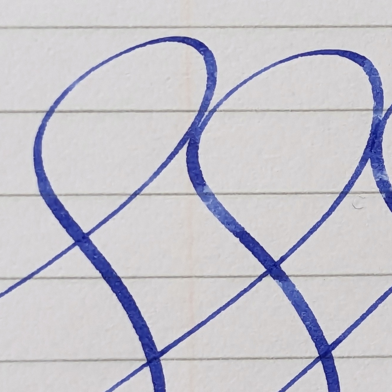
Pilot Deicmo with Pilot Blue
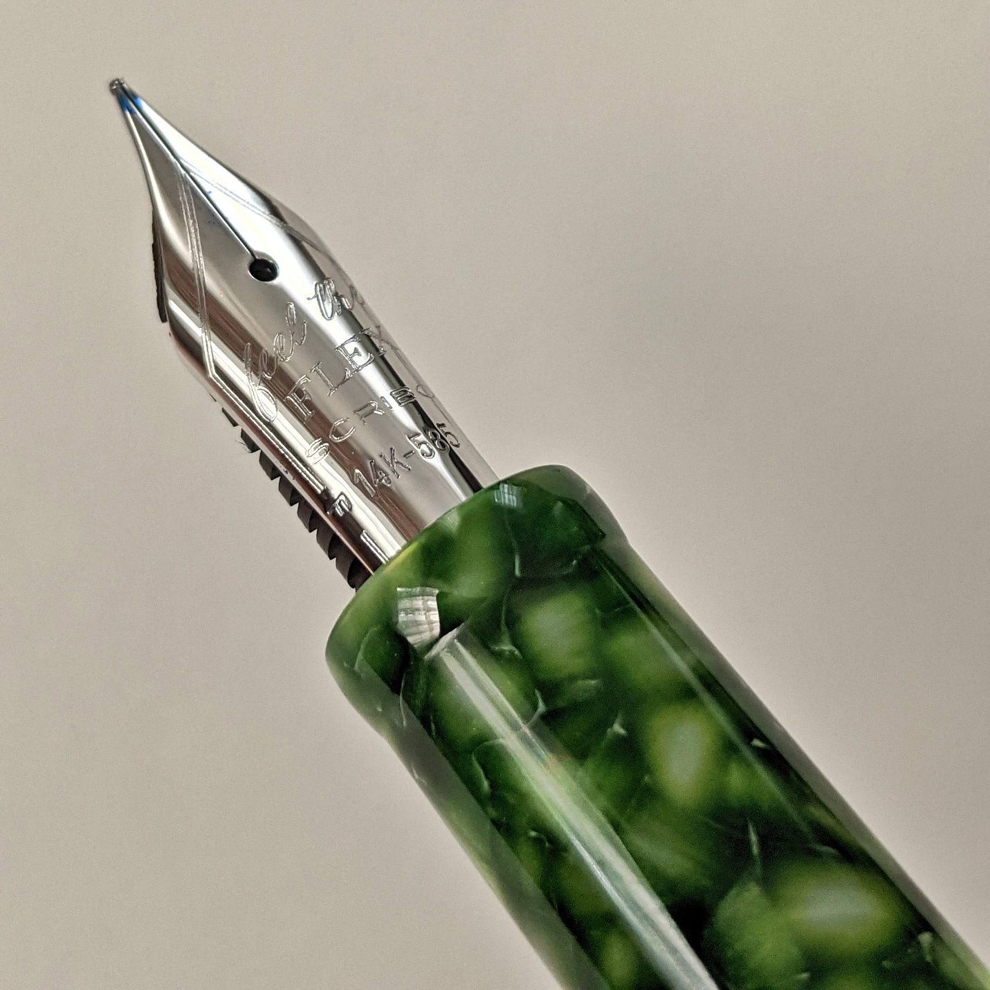
Scribo LaDotta with Callifolio Anahuac
Gone from last week: Kilk Orient. It was a fun combo with the Herbin Bleu Azur. I am leaning towards a reverse architect grind for the Orient because it’s something I’ve never tried.
Three holdovers from last week. The Pilots are doing their thing. The Esterbrook continues to cement its place over some modern would-be usurpers.
The Scribo got picked because of the arrival of new inks that would figure to benefit from its wet flexy nib. Read on for more.
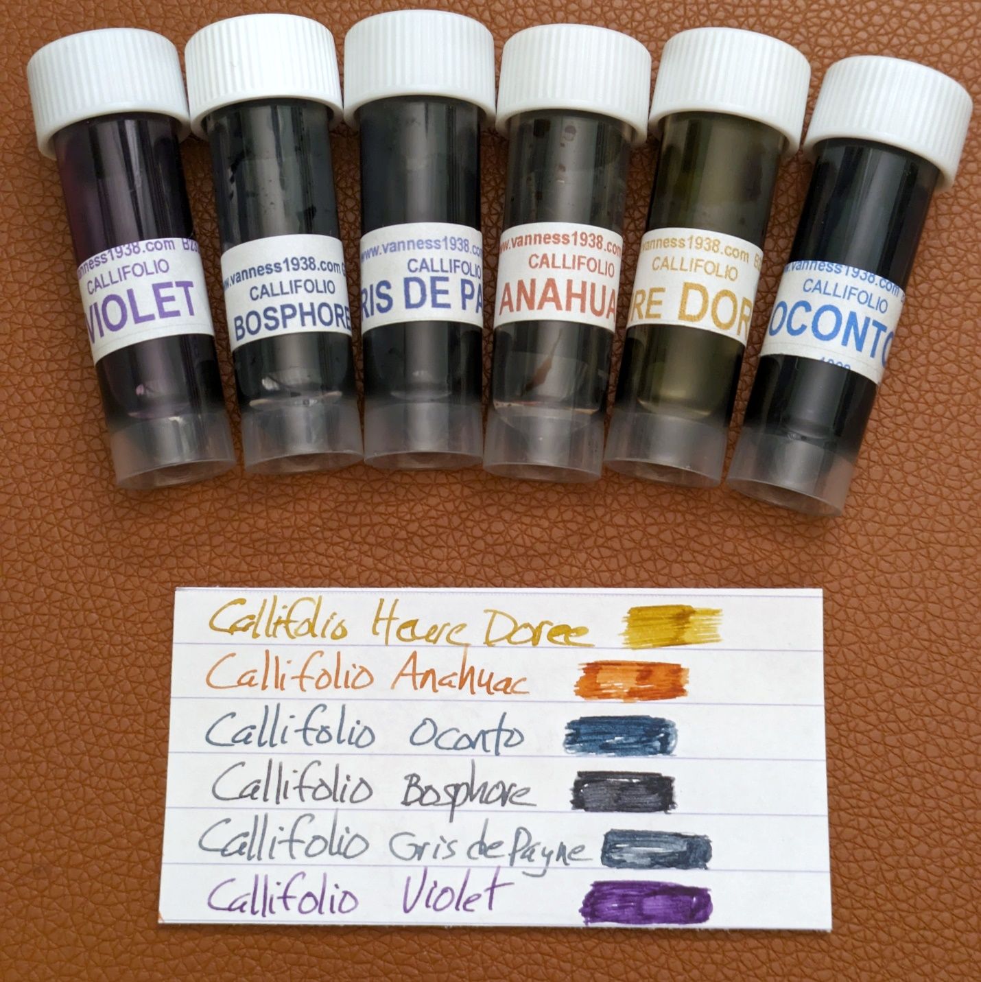
I ventured into an ink brand I’ve never used before — Callifolio. I’d heard the name at different times and had seen pictures of things written with their inks. Some seemed interesting but nothing really drew me in to buy them. Then I was reading this article from Ana at The Well-Appointed Desk about under-appreciated ink brands and Callifolio was mentioned. Ana included pictures of a particular ink they make that piqued my interest, Gris de Payne.
Gris de Payne, or Payne’s Grey, is a dark blue grey that was named after William Payne, an 18th century painter who used it in his work. I don’t paint, draw, or sketch, but the practice of blending colors in those contexts has always interested me. I don’t remember the piece of artwork where I was first drawn to what turned out to be Payne’s Grey but once I read more about the color and its origins, I’ve had a soft spot for it.
Anyway, for all the blues, greys, blue-greys, and grey-blues out in the world of fountain pen ink there isn’t another I recall specifically named Payne’s Grey. Callifolio inks are made by L’Artisan Pastellier, a French art supply company. Translated from their website:
The specificity of the Artisan Pastellier is to offer its customers various authentic products based on natural, mineral and vegetable colours, available in ranges for the arts and decoration.
Now it made more sense, that a company specializing in color and art supplies would make an ink representing a particular color that was known from and for its use by a watercolorist. The hook had been cast and reeled me in. I wanted to try this ink, like right now. Vanness Pen Shop sells Callifolio inks. 36 of them, in fact. That’s a lot to choose from and I didn’t need 36 new inks to try all at once. So, I did some reading and scrutinizing of various reviews of Callifolio’s lineup at different websites.
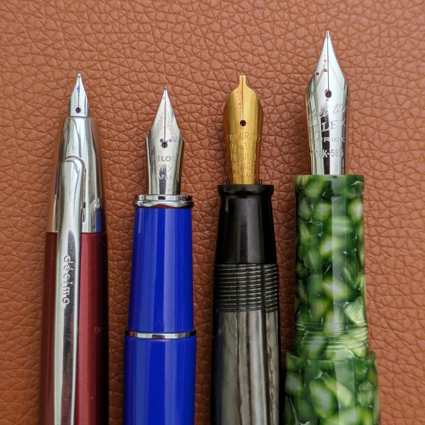
It’s worth noting here that several reviews and comments about Callifolio inks mention they have a dry/drier/dryish flow. Everyone’s mileage varies, but I like a medium-wet flow with my writing. These are some cool colors but what can I do if the inks may tend to have a property I don’t prefer? I can use them in a pen for which the idea of dry flow is laughable. Hello, Scribo.
 Fill it with dust. See if it cares. Still gonna put down a line you can smudge tomorrow.
Now with an appropriate tool chosen, I settled on six Callifolio samples to get me started.
 It always starts with just a taste.
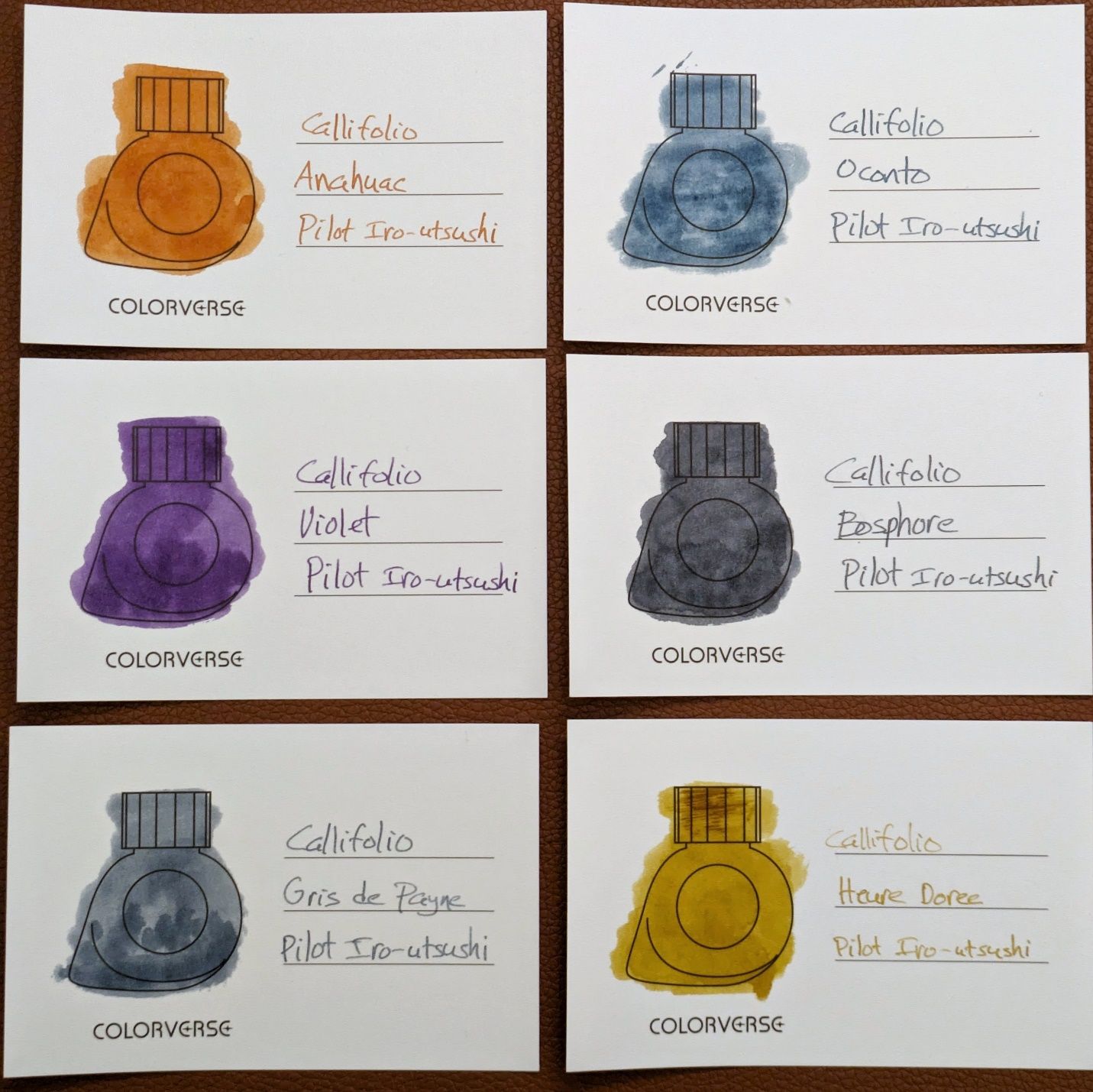 Callifolio ink swatches using a Q-tip and Pilot Iro-utsushi dip pen on Colorverse swatch cards.
I chose Anahuac as the first to load up in the LaDotta and it doesn’t have any issues with dryness. It writes the normal wet fine line with a good amount of flowback. If I flex the nib, it doesn’t give the same thick bead as other inks I’ve used in this pen, so perhaps that’s where the dry nature, if it is to be found, presents itself. More testing is needed. My plan is to try each Callifolio sample in the Scribo one after another to get a baseline, then try them in some of my other regular EDC pens to allow for comparison. It’s a mini project, something fun to keep track of provided I don’t slack off.
When I did the 21 Pen Questions I mentioned that Montblanc UNICEF ink was perhaps the one pen or stationery product that got away. After reading the aforementioned article on under-appreciated inks I was browsing around The Well-Appointed Desk and saw that Ana was selling off some excess Montblanc ink bottles. UNICEF was one of them. I deliberated the choice for a bit and then realized I was being silly to do so. It would be unlikely to find the ink for less than Ana had priced her bottle and I know I will be getting exactly what was advertised.
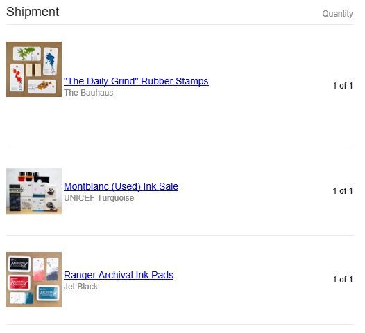
I got a stamp and ink pad to have some fun with as well. Look for UNICEF to go in a pen as soon as it arrives, maybe multiple pens. Thanks Ana!
You’re still wondering, he said confidently, about the last bit of the introduction to this week’s post. If you thought that combination of words sounded like a bunch of song titles you were right.
I was at a friend’s house the other week and they mentioned they’d been cleaning out some old stuff. There were a few boxes of CDs among the items they were looking to get rid of and offered for me to take any that I might want. One of them was this…
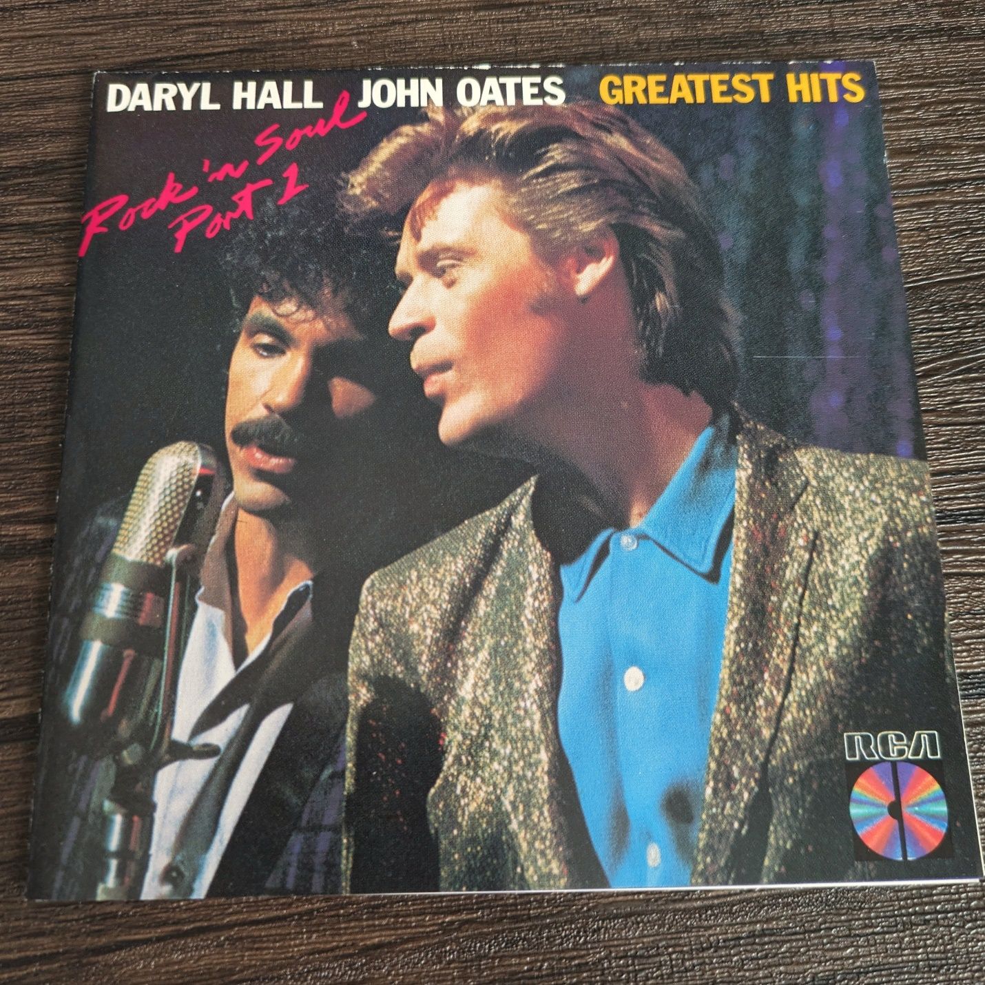
Hall & Oates mostly had their heyday before I was in junior high and it was never my music. That said, I can appreciate many more flavors of music as an adult than I could as a kid and things once passed off as not cool by a teenager come back around. I’ve been driving around with this in my car having a good time. The CD box also had a Foreigner compilation with even more hits than this one. Wait until I cram a bunch of those titles into a sentence someday.
What greatest hits CDs are lurking in your closet? linevariation@gmail.com