Very metal days, it’s in the bag, and what does Massachusetts look like?
Karas Fountain K with Sailor Studio 460
Pilot Quatro with Colorverse Delicious Sleep
Kaweco AL-Sport with Sailor Massachusetts
Parker 25 with Parker Quink Black
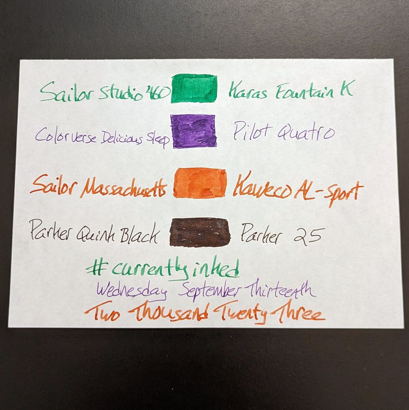
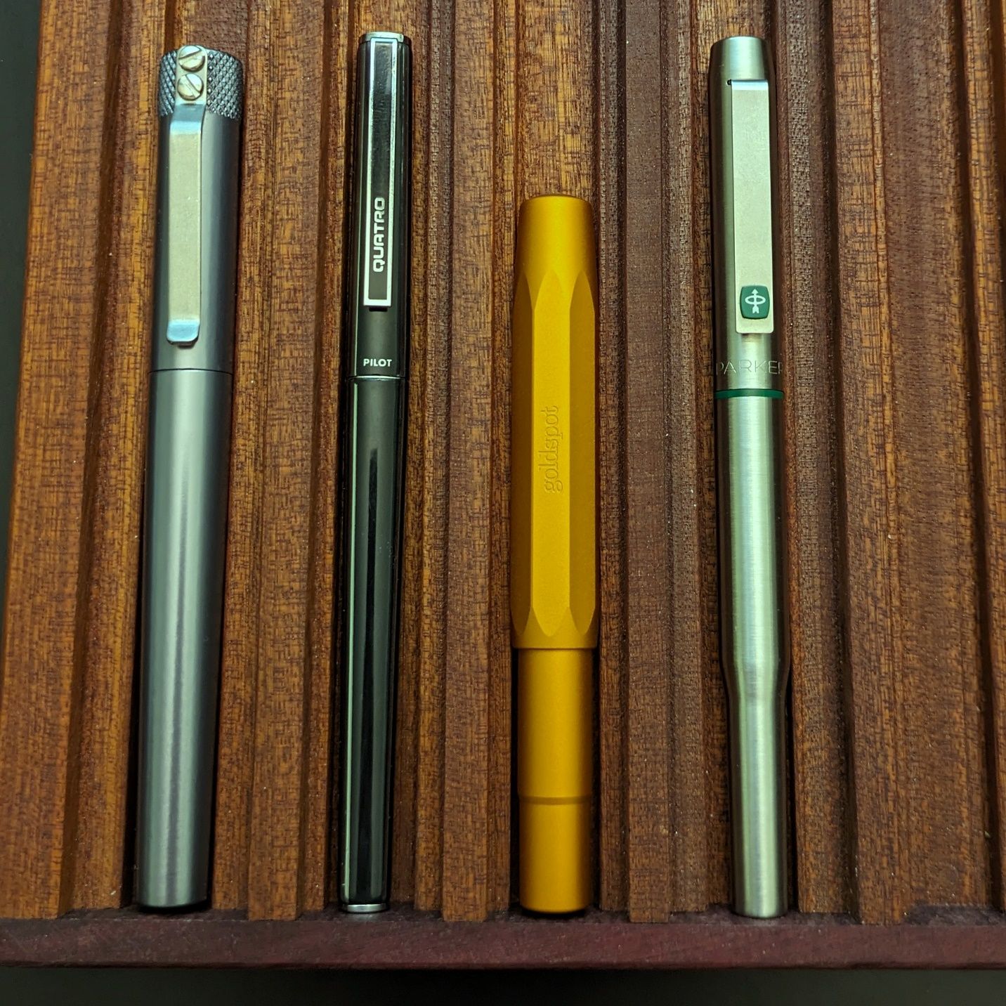

All metal bodied pens right now with a useful mix of fine nibs in darker colors for work and bigger nibs in brighter colors for fun. Not much ink left in the 25. Everything else should still be running next week.
Gone from last week: Pilot Decimo and the unidentified Waterman. One of the Decimos will likely be back next week for work.
Not a pen, not an ink, not a notebook. But it can hold all those things…
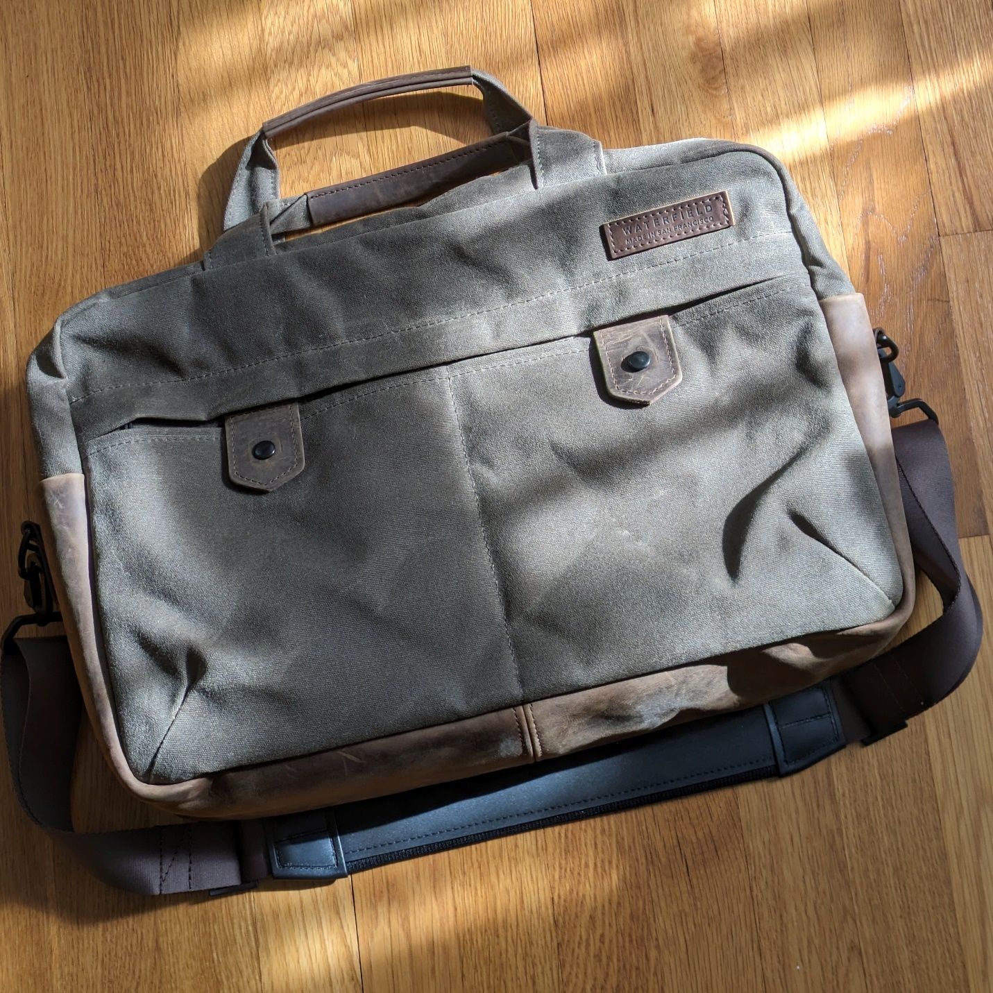
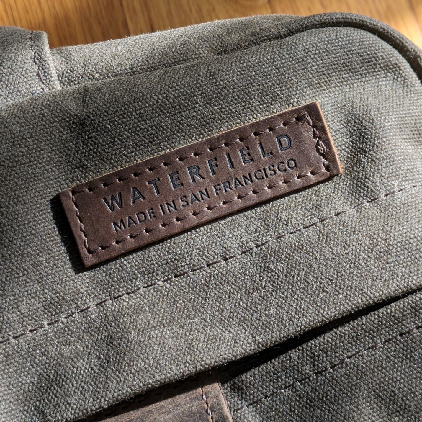
This is the Bolt Briefcase from Waterfield Designs. I bought it as an upgrade/reward for myself to mark getting a new position at work. I have no shortage of bags. Lots of Tom Bihn and technical fabrics. This time, I felt a different style and look was worth exploring. I had browsed Waterfield in the past but not seriously considered buying one. Saddleback and Filson have an attractive aesthetic but they lack the more detailed interior design considerations that make Tom Bihn so great. So, I ended up back at Waterfield and the more I looked the more I realized they’re the better combination of traditional materials like canvas and leather with modern components and sophisticated organization options.
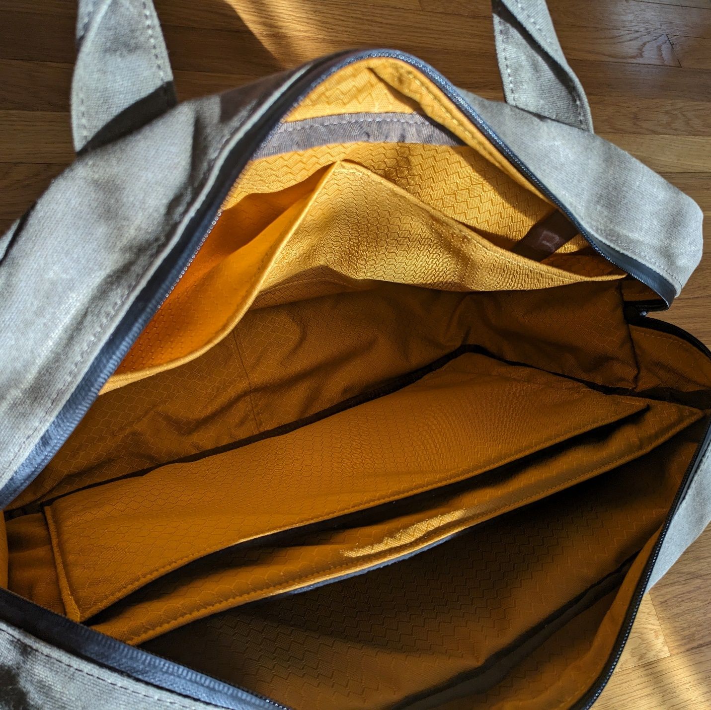
Bags having a fully lined, brightly colored interior is an obvious thing to me. More bag makers do it now than used to but a lot still don’t. I consider this is a feature worth paying for because it makes using the bag easier every time.
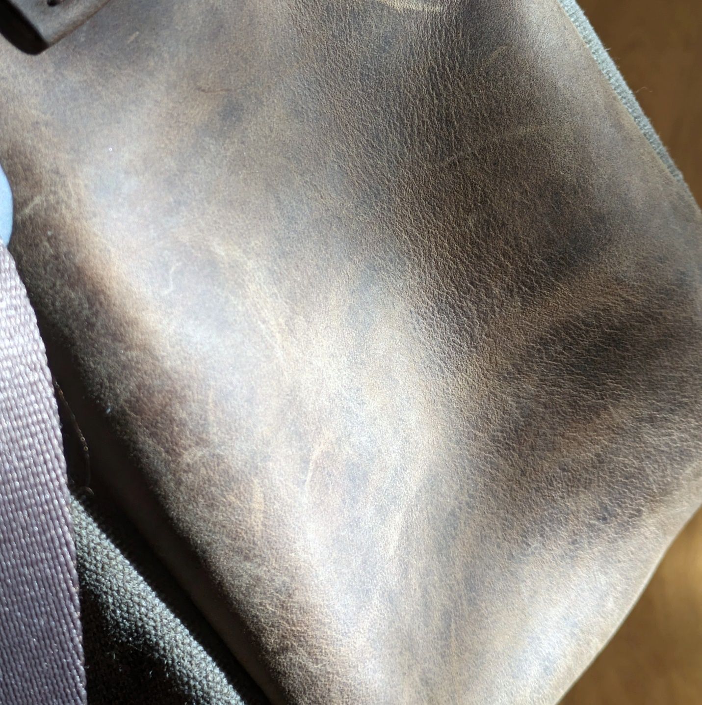
The sides and bottom of the Bolt are leather. Combined with the waxed canvas on the rest of the exterior it makes for a classic look and feel I haven’t had on a bag in a long time. The Bolt represents the most I’ve ever paid for a single bag and part of that came from the treat yourself to something nice for what you’ve accomplished mindset. That said, when one considers the quality of materials and construction, coming from a workshop in one of America’s most expensive cities to live & work in, the value of what you’re getting for the money feels quite good.
It signifies something when you put together some ink swabs and say to yourself “Hmm, I didn’t know I had this many inks in the same neighborhood.” So it was when I went to make comparisons with newly arrived Sailor Massachusetts against other inks in my desk.
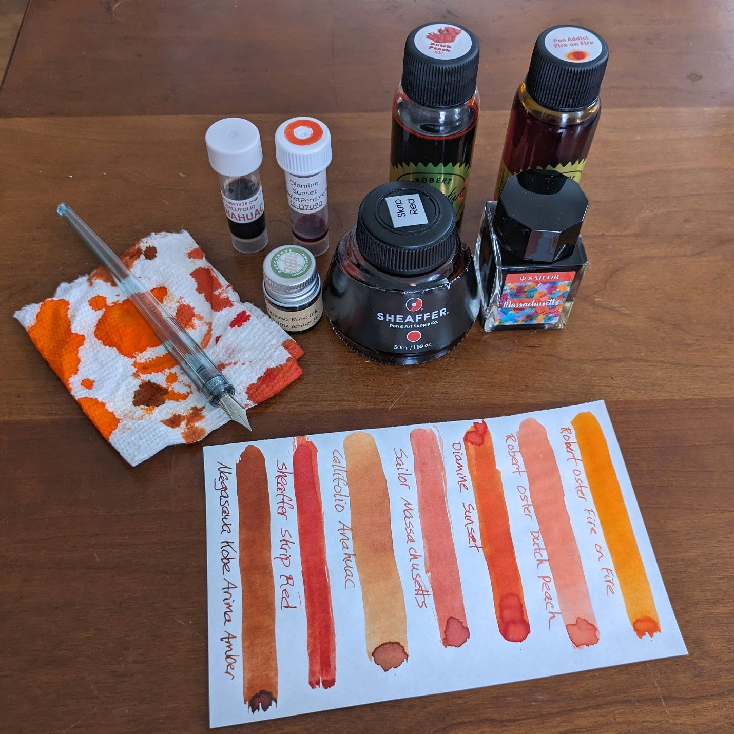 I would not have predicted using six other inks against Massachusetts . Guess I'm more fond of this color range than I realized.
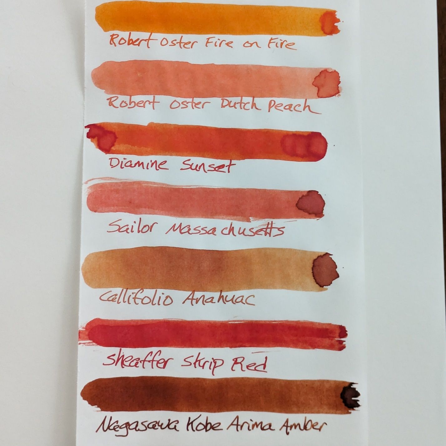 Large swabs made by dipping a rubber-gloved fingertip into each ink and drawing it across the paper. Ink names written with a Pilot Iro-utsushi dip pen. Paper is Tomoe River 52gsm.
The lighting for these pictures was overcast and inconsistent. I tried not to make any white balance adjustments unless something seemed distinctly off. I think the representation on most colors is accurate to the environment, although Skrip Red is better shown in the words than it is in the swab.
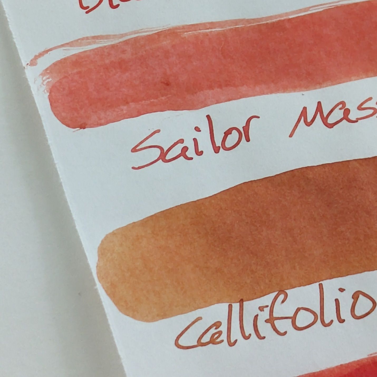
Callifolio Anahuac looks like the closet match to Massachusetts. I think Anahuac is less saturated and has more natural variation. Massachusetts looks pinker than Anahuac to me in some views.
I tried Massachusetts on a few other papers using the AL-Sport.
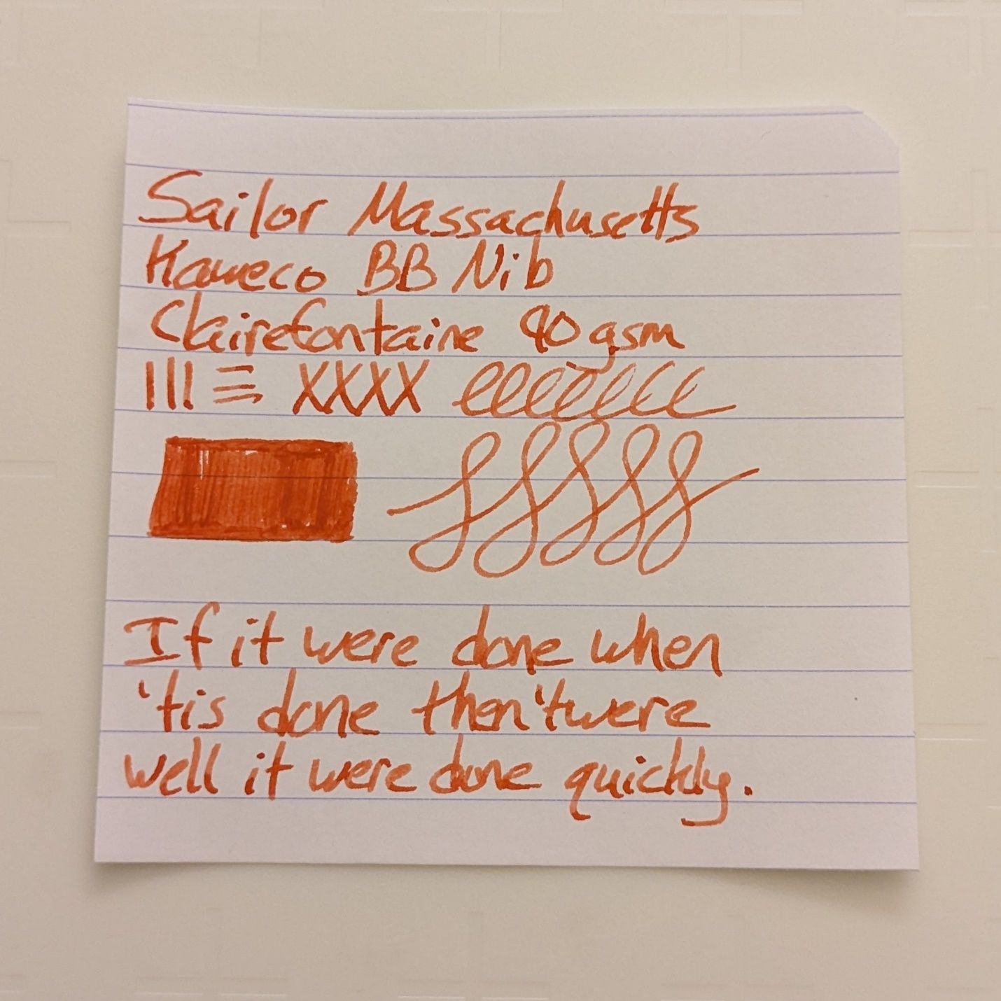 Sailor Massachusetts on Clairefontaine 90gsm.
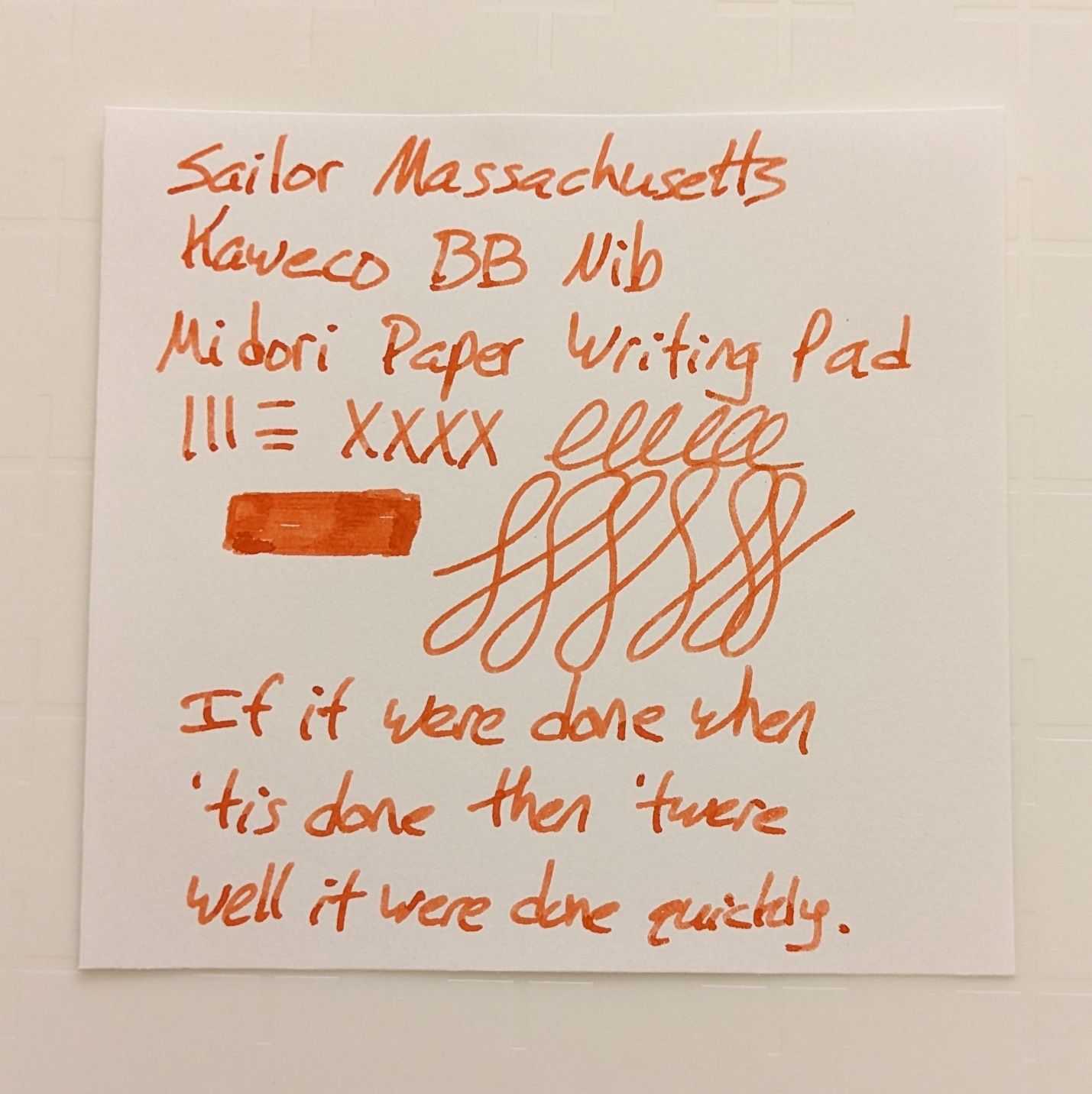 Sailor Massachusetts on Midori MD paper.
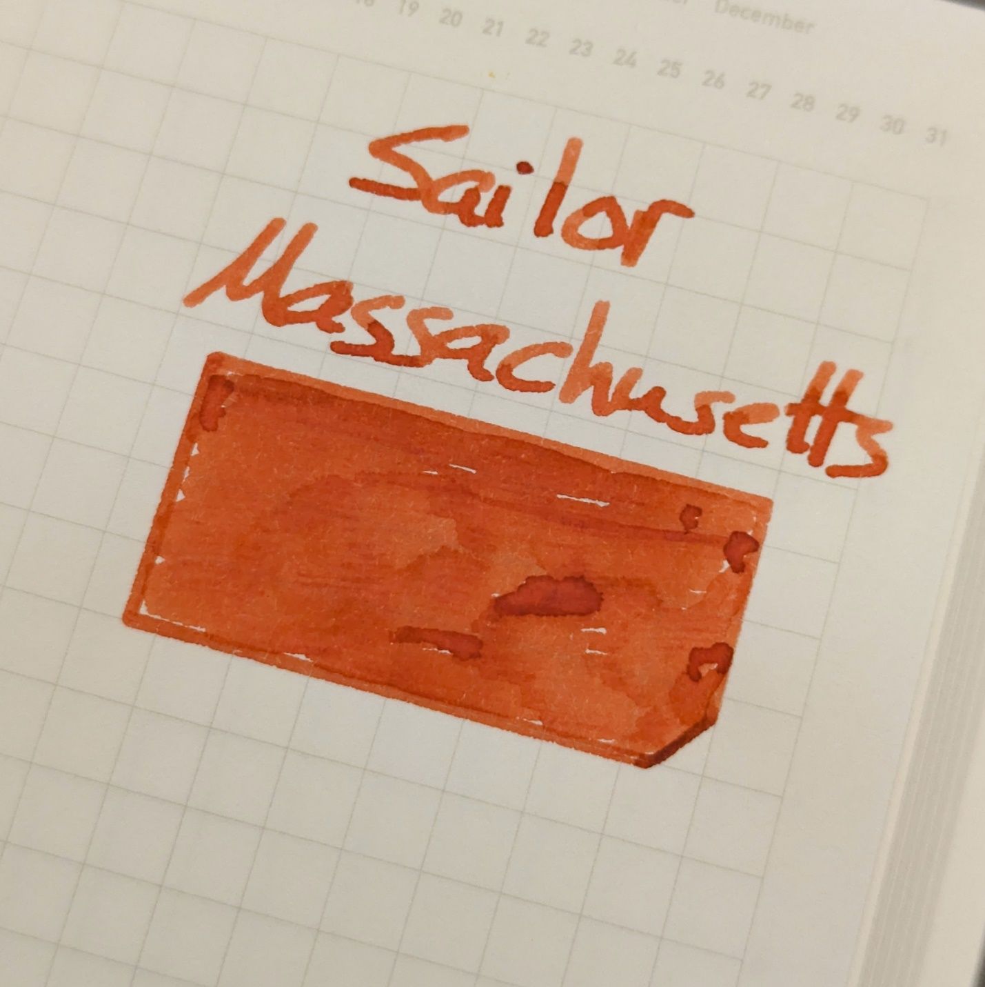 Sailor Massachusetts on Stalogy Editor's Series 1/2 Year notebook.
The AL-Sport’s double broad nib shows off the shading properties of Massachusetts better than the Pilot dip nib. Massachusetts presented consistently on all the papers I used and it behaves nicely, which I would expect from a Sailor ink.
As always, your results may vary. I’m curious to see what Massachusetts will look like in a fine steel nib, if it will hold enough depth to stay readable.
What inks have you tried in the Sailor 50 States series?